Quick Summary: Nothing is possible online unless you have data. Running a business online is no different. You need to have segregated and refined data so you can review and make an informed decision. And, for a clear view of data, you need an attractive and easy-to-navigate Dashboard UX. This article will help you understand Dashboard design guidelines for UX. Let’s explore.
Dashboards are all-screen mothers. In data-heavy sectors, software can be overwhelming. Essential information is centralized in dashboards. For analytical, operational, and strategic goals, teams and departments of all sizes must quickly comprehend the correct information. When developing a data dashboard for your enterprise product, your team must choose data points carefully, or you Hire a UI UX Designer. You can also use AI tools to create modern dashboard designs easily within a shorter period. Data dashboard UX is complex, but we can help. This article shares our dashboard design best practices from years of experience.
What is a Dashboard UI?
Dashboards provide a powerful way to change user behavior and boost retention rates. Using the study findings, designers can produce a dashboard that presents valuable and pertinent information. The users will have simple access to the information needed if you develop a decent and contemporary UI dashboard. The dashboard information must be simple to scan and limited to the most essential details to make this happen. With so many options, choosing one to utilize or avoiding overusing features could take effort; therefore, you can opt for professional UI Design services for an excellent dashboard design. One of the many duties of a UX designer is to handle this. Hence, it is essential to master specialized handling methods.
What is a Dashboard UX?
In software applications and websites, " UX dashboard design," or "user experience dashboard," refers to the layout and style of a digital dashboard interface that consolidates data and information. A good dashboard design should adhere to specific fundamental standards like clarity, simplicity, and personalization, which can be achieved by following dashboard UX design principles. By frequently utilizing graphs, charts, and widgets, it seeks to provide data aesthetically pleasingly while enabling users to customize their views to meet their requirements and tastes. Additionally, a UX design dashboard that is well-designed prioritises the data hierarchy, ensuring the most critical information is presented and easy to access. In contrast, less crucial information is accessible through drill-down or filtering choices.
Types Of Dashboards
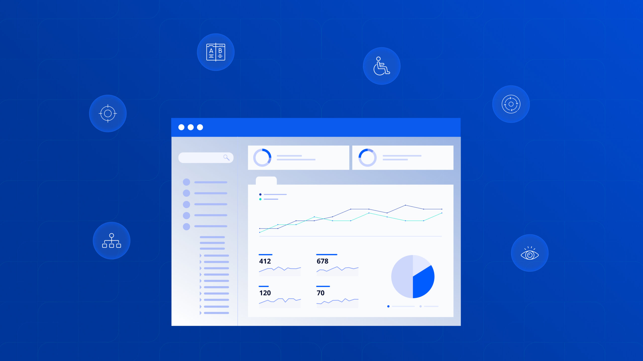
Dashboard designs differ greatly depending on their intended usage. But cards make up every dashboard. Each card may have profile information, notifications, fast connections, a navigation design feature, essential data, graphs, and data tables, depending on the type of dashboard. Use the appropriate card types of dashboard designs for each component carefully.
Operational Dashboards
By design, operational dashboards frequently concentrate on processes and monitor short-term objectives. Their metrics often change and develop quickly day after day. Actionable data and how simple or difficult it would be to update it should serve as the foundation of the dashboard's user experience (UX).
Strategic Dashboards
Strategic dashboards are used by businesses to track performance against a set of KPIs and support long-term strategy. They influence the organisation by monitoring KPIs and developing action plans and strategies. Although less frequently than operational dashboards, strategic dashboards routinely receive data updates.
Senior-level management, including executives and directors, mostly use them to keep track of KPIs using straightforward data visualisations. They seek to address top-line organisational KPI issues through monthly, quarterly, or yearly performance reviews.
Analytical Dashboards
The odd ones are analytical dashboards made by or for analysts. Here, the data is either presented for further action by analysts or is provided following an analyst's synthesis. The objective is to make as much high-quality data available to analysts as possible so they may view it and draw conclusions and observations from it. In general, dashboard UX designers aim to provide the analyst with as many data categories and analytical tools as feasible to make their job as simple as possible. Google AdWords is an analytical dashboard enabling professionals and novices to gain valuable insights about their adverts.
10 Ways to Create an Excellent UI UX for better Dashboard Design
Here are ten ways to design a fantastic user interface and experience. Check out these ways and practices of dashboard design to create a highly practical, aesthetically pleasing, and user-friendly dashboard.
1: Dashboard Design Basics
It's critical to build on a solid basis. Fundamental concepts, including unambiguous layouts, succinct labeling, and simple navigation, are all covered in the section on dashboard design basics. A well-designed dashboard should seamlessly lead users through each branch, enabling them to access and use the required information immediately. Setting these fundamentals first creates the foundation for a user-friendly interface.
2: User-Centered Design Approach
Dashboards that are built following Dashboard design guidelines, and prioritize the needs and preferences of their users are more likely to be successful. A user-centered design strategy includes gathering user feedback, conducting usability testing, and creating personas to understand your audience better.
3: Simplifying Complex Data
Dashboards commonly display large amounts of complex data. To maintain user attention and comprehension, designers must simplify complex facts and UX storyboards. This involves using effective data aggregation, summarization, and visualization techniques to transform enormous amounts of data into easily understandable insights that people can act upon.
4: Visual Hierarchy and Information Architecture
It is crucial to construct the dashboard's structure logically and methodically based on dashboard design principles. Users may categorise important information using visual hierarchies and information architecture and understand the connections between diverse pieces. A UI UX Design company can help you create a structured dashboard can that provides all the information to the users.
5: Data Visualization Best Practices
As per dashboard UX best practices for data visualization, effective data visualization is the key to communicating information clearly and practically. The best practices for data visualization recommend using the correct chart types, reliable colour schemes, and clear tooltips and labels. With well-designed visualizations, complex data can be more easily interpreted and applied.
6: Mobile-Friendly Design
Dashboards today must be responsive and designed for mobile devices. It is crucial to guarantee that the dashboard works flawlessly across various screen sizes and orientations. Improved accessibility and mobile access to vital information are both made possible by mobile-friendly design.
7: Loading Speed
Dashboards that take too long to load might irritate users and reduce productivity. The dashboard's loading time can be increased by using effective coding, reducing unused materials, and, if necessary, content delivery networks (CDNs). A dashboard that loads quickly enables users to interact with the content without pauses or delays, which enhances the entire user experience.
8: Make it Simple
Today, designers have several tools to create great images. It takes less time to create intricate and user-friendly dashboard designs than before. Although it is a significant breakthrough, current dashboard designs should employ enhancements judiciously. Since simplicity is an evergreen UI UX design trends, it should be prioritized for long-term results. To keep things simple, remember only to use photographs when necessary, Avoid overdoing shadows and textures, and Use clear labeling. The dashboard should be simple and show crucial images and points.
9: Keep Consistency
Users are subconsciously guided and given the tools to operate naturally by a consistent dashboard design. Users are helped by consistency in labeling, formatting, and organisation to reach their objectives more quickly. Conversely, inconsistent designs perplex customers and impede a positive dashboard user experience.
10: Insert interactive components
The dashboard design is further improved in terms of usefulness by interactive features. It enables users to investigate particular patterns or insights thoroughly. An important Dashboard design guideline is the integration of elements like click to filter, period, and drill down, which completes a dashboard. Users can utilize click-to-filter to filter values across a dashboard based on their specified filter criteria, such as filtering data unique to a country. As the name implies, drill-down enables users to delve deeply into specific dashboard data or features. Users can view data over time, such as days, weeks, or months, using the time interval widget.
Additional to Read: Product Design Process: A Comprehensive Guide
Final Thoughts
Dashboards have emerged as one of the most popular and practical methods for customers to access various data types and take helpful action. During the past ten years, you can go for UX Design services to get your fantastic dashboard designed. But only the quality of the dashboard's user experience can be used to judge how effective the component of dashboard design is. As a result, poorly designed dashboards need more use and adoption. Hopefully, this article has improved your comprehension of dashboard UI UX design and given you the skills to create one with a cutting-edge user experience and the best dashboard design.
Drashti Talajiya
Business Development Head
Drashti Talajiya is the Business Development Head at TheFinch Design, where she bridges creativity and strategy to drive meaningful client partnerships. Passionate about transforming ideas into impactful solutions, she thrives on collaboration that brings visionary designs to life.