Quick Summary: Understanding the principles of design is crucial not just for creating a visually appealing mobile application and website but also for establishing and upholding the values of a website and mobile apps. So, if you are designing your new website, knowing the design principles is vital for both experts as well as new designers. We have listed out the most crucial principles of design that will help you make informed decisions that help make consistency across design projects. Let’s explore;
Exploring the principles of design? Whether it is mobile applications, web applications or websites, design for every product is crucial to bring value to your project. A website that brings a good first impression, builds trust, and guides your users to take action is considered excellent artwork. And, to achieve this goal, understanding the principles of design is crucial one.
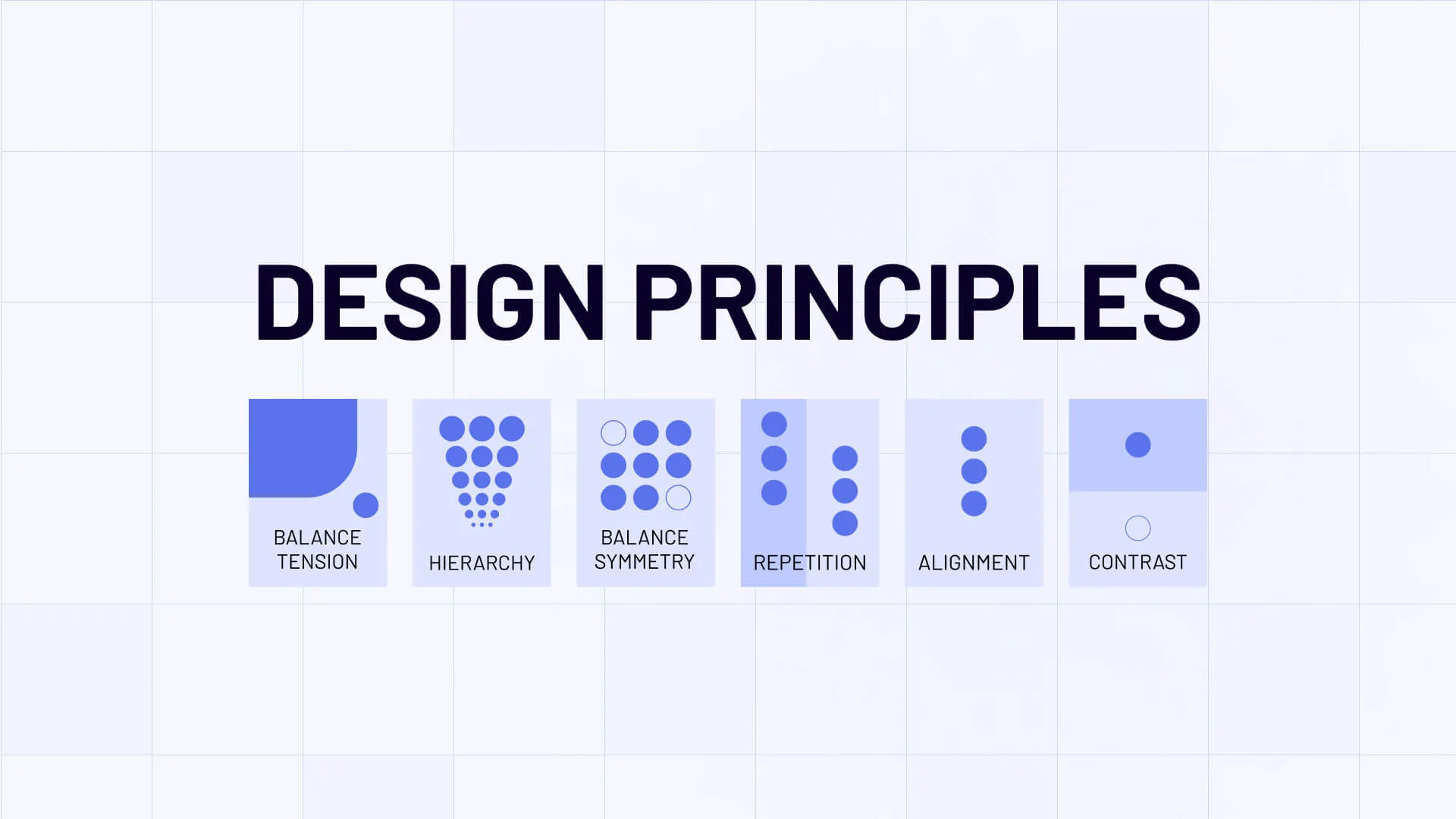
In this article, we will discuss the basics of UX design principles, starting from classics to modern digital design principles that appear regularly in the list.
These design principles are;
- Emphasis
- Balance and alignment
- Contrast
- Repetition
- Proportion
- Movement
- White space
- Hierarchy
- Rhythm
Let’s explore these principles of design one by one;
Top 9 Principles of Design You Should Know
Do you know how many principles of design? It’s the subject of debate now as some answer 7 principles of design while others say 9 or 12 or even more design principles. The answer, according to us, is the number of principles of design that come into use. We have selected the 9 that our designers at TheFinch Design bring into practice. Let’s find the details for each design principle now.
Emphasis in Design
While designing a project, such as a website or a web application, there are some instances when a designer needs to put more focus on some part of the design. For example, creating a focal point in design to draw the attention of users to a particular area.
How to Use Emphasis
There are many but you can use four important things, such as color, size, shape, and visual elements. Using these elements, you can emphasize or highlight a particular aspect where you want users to navigate and comprehend the information. It can be a CTA button or a particular part of the design. This is a crucial UX design principle that not only draws attention but also ensures it follows the other principles of design, such as balance, design consistency, proportion, hierarchy, and others.
Balance and Alignment
When designers create a website, there are plenty of elements placed in between. With balanced principles, designers ensure the visual elements are distributed properly throughout the design. Balance in design principles creates cohesiveness and satisfaction. Basically, there are four types of balance and alignment in design;
- Symmetrical balance: It’s graphic design basic which ensures the distribution of visual weight between sides of the graphic.
- Asymmetrical balance: When visual weight is placed unequally between the two sides thoughtfully. Asymmetrical balance is crucial to differentiate without altering the balance.
- Alignment: If you have various visual elements in design, alignment helps you create balance, structure, and connections between elements.
- Proportion: When you have to give more importance to particular elements the relative size of objects within a design.
How to Maintain Balance
You need to ensure strategic arrangement of design elements by ensuring symmetrical, asymmetrical, and radial crystallographic balance. You can achieve this goal by thoughtfully using color, size, texture, shapes, positions, etc.
Contrast in Design Principles
In design, you have various important information and each needs to be highlighted from the other. Designers, in this case, need to use visually different elements to guide users' attention to a focal point.
How to Use Contrast in Design
Designers can differentiate the primary characteristics of design elements by using varying layouts, colors, texts, and images. Besides, contrast can be achieved by implementing the principles of design contrast, such as;
- By placing a large text next to a small text and vice versa
- By contrasting with dark and light colors, color hue and temperature
Repetition in Design Principles
Repetition is one of the basic design principles that ensure consistency in design and designers use repetition in design to achieve this.
How to Use Repetition in Design
Design elements, such as color, text, structure, size, shapes, and textures are used with a sense of unity and coherence. Designers need to understand the crucial aspects of using repetition in design principles. It is important for a design easily recognizable and establish brand identity. Here are some important points to consider while using repetition in design.
- You need to think of universal design principles
- Need to be consistent but not rigid
- Follow and create a hierarchy
- Use the same shapes, colors, and lines to maintain usability
- Repeat graphics and images at particular points so consumers know what to expect
Proportion in Design
Proportion is when designers use two or more different visual elements in a relatable composition. For example, think about the title, sub-title, and paragraph. Or, think of headers and footers on your website —they showcase perspective, realism, balance, and relatable concepts. Similarly, in design visual size and weight are put in composition that easily relate to each other.
How to use Proportion in Design
Designers achieve this goal by thoughtfully placing elements with proper size and placement. The other best way to achieve proportion in design is to master balance & alignment, and contrast. If you are sure these three are done properly, the proportion will organically be fine.
Movement in Principles of Design
Movement in design principle is the visual flow and the intentional path that guides users' eyes to follow. Designers create movement by using color, size, lines, and shapes. It enables viewers to perceive information in a structured and coherent manner. For example, a car with lines suggests the movement and speed of the car. It indicates direction, such as a line around suggesting the car is moving forward.
How to Use Movement in Design Principles
To ensure the right movement, you need to master repetition, rhythm, emphasis, and lines of sight. Use the focal points carefully to guide users to the movement. Similarly, use lines of sight to guide users to the main figure or point.
White Space in Design Principles
The White Space is the basic design principle that designers use to separate one element from others. In simple words, it’s an area between elements. Despite its name, the white element does not mean every space in the design needs to be white. Patterns, color, textures, text, shapes, background images, etc. can be used to differentiate the visual elements.
How to Use White Space in Design
Expert designers achieve this goal by removing unnecessary elements, like borders, shapes, icons, or vice versa if they add value to the design.
- The other crucial method to add white space in design is to;
- Separate elements, such as the header from the body
- Create a visual hierarchy so users identify focal points easily
- Focus on readability by properly placing white space between lines
Hierarchy In Design
Expert designers know how to control the visual information in an arrangement and convey the importance of each element systematically. The rightly used hierarchy ensures what users see and how they perceive information. The proper arrangement and placement of elements on an interface design. It’s a graphic design basic that uses various key principles emphasizing the design with a unique and relatable set of size, color, contrast, alignment, repetition, and brightness.
How to Use Hierarchy
Designers use various hierarchy methods to achieve this goal. For example,
They use a typographic hierarchy, suggesting to users which point they need to focus on more.
Whitespace is also crucial to drawing the attention of users to a particular point.
Texture to suggest which element in the design or page is more important.
Similarly, designers can use positioning, space, and color to emphasize the potent part of the design and attract users.
Rhythm in Design
Rhythm is the last but not the least in our principle of design list. We have already discussed movement in design in the paragraph above, Rhythm plays a crucial role in suggesting movement or action with repeating visual elements. It does the same as movement —guides views eye through the design
How to Show Rhythm in Design
Designers use five different ways to show rhythm in design. They are;
- Alternating: It refers to the same design with a different set of colors.
- Flowing: It refers to design with movement.
- Progressive: It refers to a showcasing sequence of motifs or forms with progression in each step.
- Random: Random rhythm refers to showing something with no pattern. For example, an image of a crowd has no pattern whatsoever.
- Regular: It refers to showing something with an identical motif with a regular arrangement of parallel lines.
Here are some other design principles:
- Variety
- Visual hierarchy
- Color
- Integrate design principles
- Principles of design contrast
- Grids
- Negative space
- Prioritize consistency
- Unity
- Alignment
- Harmony
- Proximity
- Consistency
- Good design is aesthetic
Final Thoughts
With the principle of the design process, you achieve design thinking principles that solve complex problems by putting the UX at the center point. We have explained all crucial principles of design in this article with motifs to help not just designers but also clients who want to create outstanding designs for your product. This will help them understand the basics of design when taking complete control of the design project when it is being crafted by a UI/UX design agency. At TheFinch Design, we follow stringent design principles to achieve our client’s goals as we have a vetted pool of design engineers with good hands-on experience in creating designs to solve unique problems of your business. Contact us today if you want a consultation or have a project to discuss.
