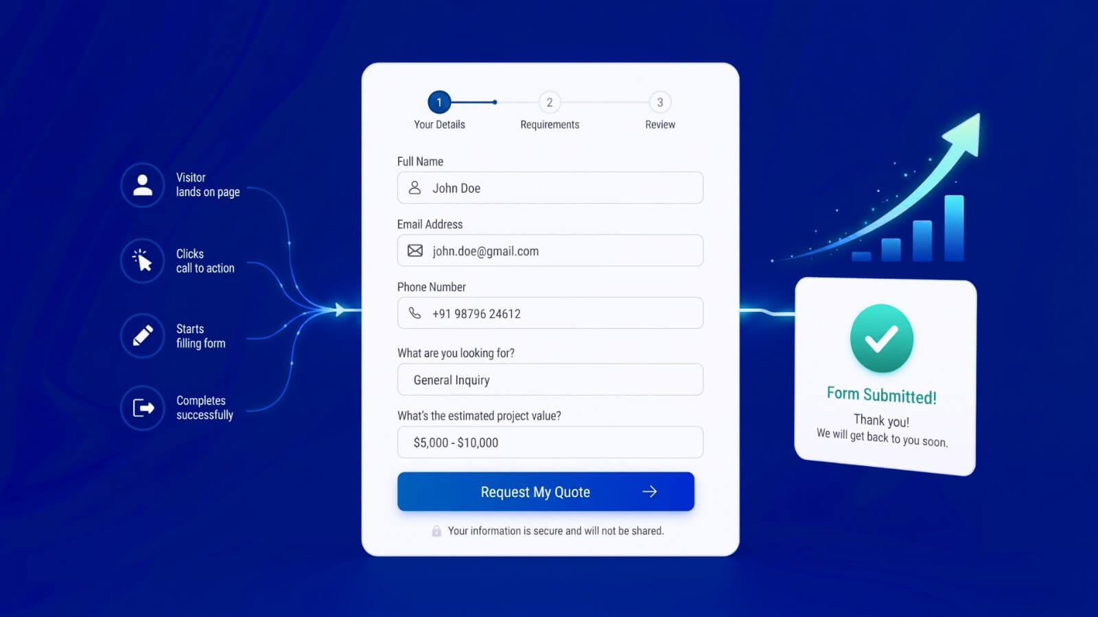
You are bringing visitors to your website. People are clicking your call to action, opening your form and showing enough interest to begin. Then they leave.
They do not request the quote. They do not finish creating their account. They do not complete the application. They do not reach the payment page. In many cases, the problem is not the quality of your traffic or the strength of your offer.
The problem is the form standing between interest and conversion.
A form UX optimisation service identifies why users hesitate, make mistakes or abandon a form, then redesigns the experience to make completion clearer, faster and easier.
At TheFinch Design, we optimise forms across websites, SaaS products, mobile applications, onboarding journeys, checkouts and complex digital services. We examine more than the visual appearance of the fields. We study the questions being asked, the order in which they appear, the effort required from users and what happens when something goes wrong.
The goal is simple: turn more form starts into successful submissions.
What Is Form UX Optimisation?
Form UX optimisation is the process of improving how users understand, complete and submit a digital form.
It can involve redesigning:
- Contact and enquiry forms
- Demo request forms
- Quote forms
- SaaS signup flows
- Customer onboarding forms
- Insurance and finance applications
- KYC and identity verification flows
- Ecommerce checkout forms
- Booking and reservation forms
- Loan and mortgage applications
- Healthcare intake forms
- Property enquiry forms
- Job and membership applications
- Surveys and assessment forms
Form optimization is not simply about reducing the number of fields.
Some forms must collect detailed information for operational, regulatory or qualification reasons. The real challenge is deciding what should be asked, when it should be asked and how the information should be collected without creating unnecessary effort.
A shorter form can still be confusing. A longer form can still perform well when it is logically divided, clearly explained and designed around the user’s situation.
Effective form UX design balances three requirements:
- What the business needs to know
- What the user is willing and able to provide
- What is required to complete the transaction or process
Is Your Form Costing You Conversions?
A form can technically work while still performing poorly.
The submit button may function. Data may arrive in your CRM. No obvious development error may appear. Yet users may still struggle with the experience.
These are common signs that your form needs optimization.
Users Start but Do Not Submit
A high number of forms starting with a low number of completions usually indicates friction inside the form.
The problem could be a confusing question, an unexpected requirement, an unclear error message or a step that asks for information the user does not have available.
Page-level analytics may tell you that users left. They rarely explain which field or interaction caused the decision.
One Step Has an Unusually High Drop-Off
A multi-step form may perform well until users reach a specific section.
This often happens when the form suddenly asks for:
- Personal contact details
- Financial information
- Identity documents
- Business revenue
- A phone number
- Payment details
- Information the user has already provided
- A question with no suitable answer
The step may be necessary, but the timing, wording or interaction may need to change.
Users Frequently Enter Incorrect Information
Incorrect email addresses, phone numbers, delivery details or payment information can create problems long after a form is submitted.
These errors can lead to:
- Failed customer communication
- Missed sales opportunities
- Delivery problems
- Rejected applications
- Additional customer support work
- Incorrect CRM records
- Failed identity verification
- Payment errors
Form UX optimisation considers data quality as well as completion rate.
Your Customer Support Team Receives Form-Related Questions
Users should not need to contact support to understand what a form is asking.
Repeated questions such as “What should I select here?”, “Why do you need this?”, “What format should I use?” or “Why is the form not accepting my answer?” reveal problems that analytics alone may not show.
These conversations are valuable UX research.
Mobile Users Abandon More Often
A form that appears acceptable on a desktop can become extremely difficult on a phone.
Common problems include small fields, inappropriate keyboards, long dropdown menus, hidden buttons, awkward document uploads and error messages appearing outside the visible screen.
Mobile form UX must be designed around touch, limited screen space, interruptions and users who may be completing the form while moving between locations.
Paid Traffic Is Not Producing Enough Enquiries
Increasing advertising spend will not solve a form that loses interested users.
When campaigns generate clicks but few submissions, the full journey needs to be examined. That includes the message before the form, the transition into the form and every interaction required to complete it.
Form UX optimisation can improve the value generated by traffic you already have.
Why Users Abandon Online Forms
People do not usually abandon forms without a reason. Something in the experience makes continuing feel difficult, risky, irrelevant or not worth the effort.
The Form Asks for Too Much Too Early
A new visitor may be ready to create an account but not ready to explain their company structure, annual revenue, business goals and complete marketing profile.
Collecting every useful data point during the first interaction can reduce the number of people who reach the product.
Non-essential questions can often be:
- Moved after signup
- Collected progressively
- Made optional
- Answered through existing data
- Requested only when relevant
- Removed entirely
The first form should support the user’s immediate goal, not every future requirement of the business.
The Same Information Is Requested More Than Once
Users become frustrated when they have to repeat an address, company name, contact detail or personal record they have already entered.
Where possible, forms should use:
- Autofill
- Saved account information
- Address lookup
- “Same as” options
- Conditional prepopulation
- Data already available in the system
WCAG 2.2 also includes guidance around redundant entry, particularly when users are asked to provide the same information within a process.
Questions Are Not Relevant to Every User
A form may force users to choose between options that do not reflect their situation.
For example, a business form may assume every applicant is incorporated. A property form may offer only two ownership situations. An insurance form may show questions that apply to one policy type but not another.
When users cannot find an accurate answer, they may abandon the form or provide incorrect information.
Conditional logic can show questions based on previous answers and keep irrelevant fields hidden.
The Form Does Not Explain Why Sensitive Information Is Needed
Users are more cautious when a form requests phone numbers, identity documents, financial details or business data.
A short explanation can answer questions before concern becomes abandonment.
Useful supporting copy can explain:
- Why the information is required
- How it will be used
- Whether the user will be contacted
- How the information is protected
- Whether the field is optional
- What will happen after submission
Trust is part of form usability.
Error Messages Do Not Tell Users What to Do
“Invalid input” is not a useful error message.
A good error message explains:
- What went wrong
- Which field needs attention
- What a valid answer looks like
- How the user can correct it
GOV.UK’s design guidance recommends showing errors next to the affected fields, keeping the user’s previous answers and clearly explaining how to fix each problem.
Users should never have to search through an entire form to discover why it cannot be submitted.
Validation Rules Are Too Restrictive
Real information does not always follow one perfect format.
Names may contain apostrophes, hyphens, accents or spaces. Phone numbers vary by country. Postcodes may be entered with or without spaces. Users may paste card numbers containing separators.
A form should reject information that is genuinely unusable, not harmless variations that the system could interpret.
The Form Uses Generic Calls to Action
A button labelled “Submit” explains what the system will do, not what the user will receive.
More specific button text can clarify the outcome:
- Request My Quote
- Create My Account
- Book My Consultation
- Continue to Payment
- Send My Application
- Get My Assessment
- Review My Details
The call to action should match the user’s intention and set expectations about the next step.
The Process Feels Longer Than Expected
Users are more likely to continue when they understand the size of the task.
Long forms may need:
- Clear steps
- Progress indicators
- Section headings
- Estimated requirements
- Save-and-return functionality
- A list of documents needed
- A review page before submission
W3C accessibility guidance recommends dividing long forms into logical stages and informing users about their progress.
The Form Is Not Accessible
Form accessibility affects far more than screen reader users.
Clear labels, logical structure, understandable instructions and larger interaction areas make forms easier for users with visual, motor, cognitive and temporary impairments.
W3C recommends properly associated labels, grouped controls, useful instructions, understandable validation and clear notifications. It also advises asking only for information required to complete the process.
An accessible form is usually a more usable form for everyone.
Forms We Optimise
TheFinch Design’s form UX optimisation service can be applied to a single high-value form or an entire collection of forms across your product.
Lead Generation and Enquiry Forms
We optimise forms used for service enquiries, consultations, pricing requests, project briefs and demo bookings.
The objective is not always to collect the highest possible number of submissions. It may be to increase qualified enquiries while reducing low-intent or unusable entries.
We examine the balance between conversion and qualification.
SaaS Signup and Onboarding Forms
SaaS products often lose users before they experience the product’s value.
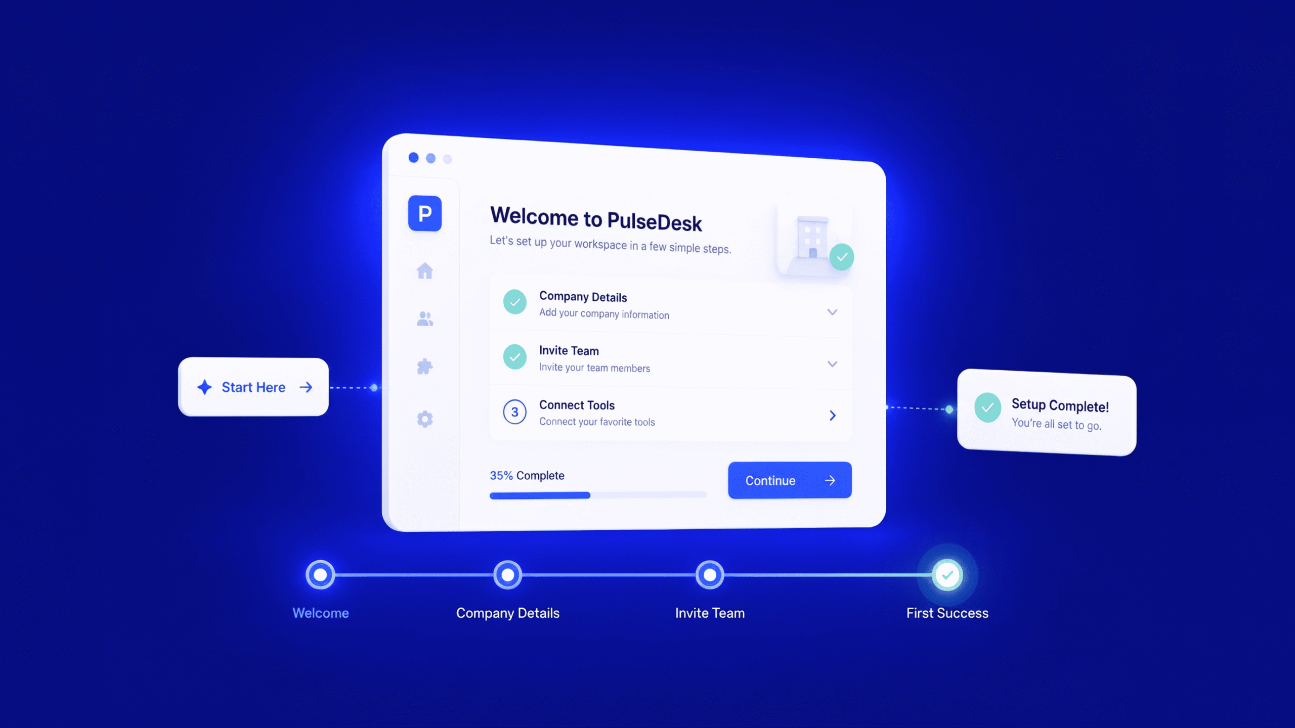
We simplify account creation, workspace setup, team invitations, profile completion, plan selection and initial product configuration.
Where appropriate, we move non-essential questions away from signup and into progressive onboarding.
Quote and Application Forms
Insurance, finance, property, healthcare and professional services often require detailed forms.
We organise complex questions into manageable steps, improve eligibility paths, clarify terminology and design conditional journeys for different user types.
Checkout and Payment Forms
Baymard’s 2026 statistics report an average documented cart abandonment rate of 70.22%. Its research also found that 18% of surveyed US shoppers had abandoned an order because the checkout was too long or complicated.
We review checkout forms for:
- Unnecessary account creation
- Repeated information
- Address-entry friction
- Payment field usability
- Coupon field distraction
- Poor error recovery
- Unexpected costs
- Mobile issues
- Missing trust indicators
- Unclear delivery information
KYC and Identity Verification Forms
KYC flows require users to provide information they may consider sensitive or difficult to access.
We improve the sequence, explanation, upload process, document requirements, error handling and mobile experience while respecting compliance requirements.
Booking and Reservation Forms
Travel, hospitality, healthcare and service businesses rely on forms that combine dates, availability, participant information, add-ons and payment.
We design booking flows that make options understandable and prevent users from losing their progress.
What Our Form UX Optimisation Service Includes
Every project is shaped around the form, business model and available user data. Depending on the scope, the engagement may include the following.
Form UX Audit
We conduct a detailed review of the current form experience across desktop and mobile.
The audit can cover:
- Form structure
- Number and relevance of fields
- Field order
- Question wording
- Input types
- Conditional logic
- Progress indicators
- Error messages
- Validation behaviour
- Mobile usability
- Accessibility
- Privacy and trust communication
- Calls to action
- Confirmation and next steps
Analytics and Behaviour Review
Where data is available, we examine form starts, completions, abandonment, step-level drop-off, error rates and device differences.
Tools such as GA4, Microsoft Clarity, session recordings, heatmaps or dedicated form analytics can reveal different parts of the problem.
General analytics may show where users leave. Field-level analytics and user research can provide stronger evidence about why they leave.
Field and Question Strategy
We assess every field against its business purpose.
For each question, we ask:
- Is this information required now?
- Can the system collect it automatically?
- Can it be requested later?
- Does it apply to every user?
- Is the wording understandable?
- Does the user know where to find the answer?
- Could this question create privacy concerns?
- What happens if the user cannot answer?
This prevents internal data preferences from silently becoming user-facing friction.
Information Architecture and Flow Redesign
We reorganise questions into a sequence that matches how users think and act.
That may involve:
- Converting a long form into logical steps
- Combining fragmented fields
- Moving sensitive questions later
- Introducing conditional branches
- Separating eligibility from data collection
- Creating review and confirmation stages
- Supporting save-and-return journeys
- Designing alternative paths for different users
Form Copy and Microcopy
Form copy has a direct effect on understanding, trust and confidence.
We refine:
- Form headings
- Field labels
- Supporting instructions
- Placeholder text
- Optional and required indicators
- Privacy explanations
- Validation messages
- Error messages
- Button labels
- Progress messages
- Confirmation pages
Every word should make the next action easier.
Mobile Form Optimisation
We design forms for actual mobile behaviour, not merely smaller screens.
This includes appropriate input keyboards, touch-friendly controls, visible progress, simple uploads, address autofill, readable text and error messages that remain close to the affected field.
Accessible Form Design
We consider labels, focus order, keyboard navigation, instructions, grouping, contrast, target sizes, errors and assistive technology compatibility.
Accessibility is integrated into the form experience rather than treated as a final checklist.
Wireframes and Interactive Prototypes
We create revised form flows and interactive prototypes so stakeholders can understand the proposed experience before development.
This gives teams the opportunity to test structure, wording and logic before investing in implementation.
Usability Testing
Where required, we test the redesigned form with representative users.
Testing can reveal whether users understand questions, notice supporting information, recover from errors and successfully complete the journey.
Developer Handoff and Design QA
We prepare states, validation behaviour, responsive layouts, components and implementation notes for developers.
Design QA can also be included to check whether the final build matches the intended form experience.
Our Form UX Optimisation Process
1. Understand the Conversion Goal
We begin by defining what a successful completion means.
This could be a sale, qualified lead, completed application, activated account, verified identity or confirmed booking.
2. Review Existing Evidence
We examine available analytics, recordings, support conversations, form entries, customer feedback and previous experiments.
This helps separate assumptions from observable problems.
3. Map the Current Form Journey
We document every step, question, decision, error state and outcome.
For conditional forms, we review the different paths users may encounter.
4. Identify and Prioritise Friction
Not every issue has equal commercial impact.
We prioritise findings based on severity, frequency, conversion importance, implementation effort and the number of users affected.
5. Redesign the Experience
We create a clearer form structure, revised interaction model and improved content.
The redesign addresses both user needs and business requirements.
6. Test the Proposed Flow
The solution can be reviewed through stakeholder walkthroughs, usability testing or controlled experiments.
7. Support Implementation
We provide developers with the specifications required to build the experience correctly.
After launch, performance can be measured against the original form.
What Results Can Form UX Optimisation Deliver?
The exact outcome depends on the form, traffic quality, offer, audience and implementation.
A form UX optimisation project may contribute to:
- Higher form completion rates
- More qualified enquiries
- Fewer checkout abandonments
- Faster completion times
- Fewer field errors
- Better CRM data
- Lower customer support volume
- More successful account activations
- Fewer failed applications
- Better mobile conversion
- Higher return from paid campaigns
- Greater user trust
- Improved accessibility
- Reduced development rework
The aim is not to make every form as short as possible. It is to remove unnecessary difficulty while preserving the information the business genuinely needs.
Do You Need a Form Audit or a Complete Redesign?
A form UX audit may be enough when:
- The form is already built and functioning
- You need to identify the largest friction points
- Your team can implement recommendations internally
- You need evidence before approving a redesign
- You want to prioritise improvements
A complete form redesign may be more appropriate when:
- The current structure cannot support conditional logic
- The form has grown without a clear strategy
- Mobile performance is poor
- The flow must accommodate several user types
- The product or service has changed significantly
- Existing components are inconsistent
- The form requires new validation or error states
- The entire onboarding or checkout journey needs restructuring
TheFinch Design can support either approach.
Why Work With TheFinch Design?
Why Choose TheFinch Design for Form UX Optimisation?
Form UX optimisation requires more than making fields look cleaner.
It involves understanding user behaviour, reviewing the purpose of every question, simplifying complex journeys, improving instructions, designing clear validation states and making forms easier to complete across devices.
TheFinch Design brings together the capabilities required for this work, including:
- UX research
- Heuristic evaluation
- UX audits
- User-flow design
- Interaction design
- UX writing
- Wireframing and prototyping
- Usability testing
- Accessible interface design
- Design systems
- Developer handoff and design QA
These are established parts of TheFinch Design’s broader UI/UX and product design practice, not services added only for form projects.
Proven Experience Simplifying Complex User Journeys
Our work across SaaS platforms, healthcare products, financial experiences, websites, mobile applications and enterprise systems demonstrates the outcomes that thoughtful UX improvements can create.
For a women’s healthcare product, TheFinch Design created a user-focused experience that increased task success by 15% and reduced user errors by 20%. Reducing errors and improving task completion are also central goals of effective form UX optimisation.
For another digital product, our team simplified a complex experience from nine pages to five while maintaining clarity. The same approach is applied when reviewing long application forms, onboarding journeys and multi-step workflows. We identify what can be removed, combined, reordered or requested later without compromising essential business requirements.
Our redesign of a fitness application improved onboarding and overall usability, contributing to a 63% increase in daily active users, stronger retention and improved profitability. This experience is directly relevant to signup forms, account setup, first-time user journeys and progressive onboarding.
TheFinch Design has also delivered measurable conversion improvements. A website redesign for TASC AIQU contributed to a 20% increase in conversions, while the redesign of Omneky’s enterprise platform produced a 2.9% conversion boost through a clearer, performance-focused experience.
Across our portfolio, we have also designed:
- Payment and financial experiences
- Appointment-booking journeys
- SaaS onboarding flows
- Recruitment experiences
- Healthcare applications
- Ecommerce platforms
- Enterprise workflows
- Identity and data-heavy product interactions
- Mobile and web application interfaces
This experience allows us to approach form UX as part of the full customer journey rather than treating it as an isolated set of input fields.
What TheFinch Design Can Improve in Your Form
Depending on the problem, our form UX optimisation service can improve:
- Form completion rates
- Signup and onboarding journeys
- Lead quality
- Checkout and payment flows
- Application completion
- Field-level errors
- Mobile usability
- Conditional question paths
- Error messages and validation
- Sensitive-information requests
- Progress indicators
- Form accessibility
- Confirmation and next-step communication
- Developer-ready form states and components
We can work with an existing live form, redesign a form before development or review several forms across a website or digital product.
Turn More Form Starts Into Successful Outcomes
Your website or product may already be generating interest.
The missing conversions may be inside the form users are expected to complete.
TheFinch Design can review your current form, identify where unnecessary effort or confusion may be occurring and redesign the experience around clearer questions, better interactions and stronger completion paths.
Whether you need to optimise a lead form, SaaS signup, checkout, quote journey, application, booking process or onboarding flow, our team can turn a frustrating form into a clearer and more effective user experience.
Book a form UX consultation with TheFinch Design to discover what may be preventing users from completing your form.
Frequently Asked Questions About Form UX Optimisation
What is a form UX optimisation service?
A form UX optimisation service analyses and redesigns digital forms to reduce confusion, errors and abandonment. It can include analytics review, field strategy, flow redesign, UX writing, accessibility, prototyping, usability testing and developer handoff.
Can you optimise a form without redesigning the full website?
Yes. A form can be audited and redesigned as a focused project. However, we also review the surrounding page and user journey because messaging before the form can influence completion.
Can you optimise forms built with WordPress or form builders?
Yes. We can review forms built with WordPress plugins, CRM form tools, ecommerce platforms, SaaS applications and custom technology. Recommendations are shaped around the capabilities and limitations of the existing system.
How do you identify where users are abandoning a form?
We can review funnel analytics, step completion, field interaction, session recordings, error data, support conversations and user testing. The available evidence depends on the current tracking setup.
Should every long form become a multi-step form?
No. Multi-step forms are useful when questions can be grouped into a logical sequence. Splitting a short form unnecessarily can introduce more navigation and make the process feel longer.
The correct structure depends on the complexity of the task and the user’s expectations.
How many fields should a form have?
There is no universal ideal number.
Every field should have a clear purpose. The question is not simply “Can this field be removed?” It is also “Does this need to be asked at this point in the journey?”
Can form UX optimisation improve lead quality?
Yes. A clearer qualification flow can collect more useful information without overwhelming users. Conditional logic can also ask detailed questions only when they are relevant.
Does the service include form copy?
Yes. We can improve headings, labels, instructions, validation messages, error messages, button copy and confirmation content as part of the form experience.
Do you optimise mobile forms?
Yes. Mobile usability is included because field entry, document upload, keyboard selection and error recovery behave differently on smaller touch screens.
Can you make our form accessible?
We can identify accessibility problems and design a more accessible experience based on recognised form and interaction guidelines. Development implementation must also follow the recommended semantic and technical requirements.
How long does a form UX optimisation project take?
The timeline depends on the number of forms, complexity, available analytics, research requirements and whether you need an audit or full redesign.
A single lead form requires less work than a multi-step insurance application, onboarding journey or checkout system with multiple user paths.
How much does form UX optimisation cost?
The cost depends on scope.
Important factors include the number of forms, number of steps, conditional paths, platforms, research requirements, prototype depth, usability testing and implementation support.
TheFinch Design can review your existing form and recommend an appropriate engagement.
Turn More Form Starts Into Successful Conversions
Your website may already be generating enough interest.
The opportunity could be inside the final interaction between that interest and the outcome your business needs.
TheFinch Design’s form UX optimisation service identifies hidden friction, improves complex form journeys and creates clearer paths to submission.
Whether you need to improve a lead form, signup flow, checkout, quote journey, application or onboarding experience, we can review the current process and show you where users may be getting stuck.
Request a form UX review from TheFinch Design and discover what may be preventing users from completing your form.
Ravi Talajiya
CEO of TheFinch
With over a decade of experience in digital design and business strategy, Ravi leads TheFinch with a vision to bridge creativity and purpose. His passion lies in helping brands scale through design thinking, innovation, and a deep understanding of user behavior.