Picture a typical product review. A teacher says the gradebook "ate" a grade. A student says they missed an assignment because the app never told them it was due. An IT director asks why the reporting screen takes nine clicks to export a CSV.
That's the real cost of designing an e-learning platform as if it had one user. It doesn't. It has at least three, and they almost never want the same thing from the same screen.
That's the core argument of this guide. The most common design failure in education technology isn't a missing feature, a dated color palette, or a slow load time. It's the assumption that students, teachers, and administrators can be served by one undifferentiated interface.
This blog walks through what each role actually needs, why most platforms get it wrong, and what a role-differentiated approach to edtech app UX design looks like in practice.
Why "one interface for everyone" breaks down
Learning management systems are now close to universal infrastructure in education. EDUCAUSE's research on the digital learning environment found LMS adoption at 99% of institutions and 88% of faculty. That puts it in the same adoption category as cars and cellphones.
Yet the same research found student satisfaction dropping sharply once you move past basic functions. Submitting assignments scored 77% satisfaction. Collaboration-heavy features like group projects scored just 43% (EDUCAUSE, 2018). The LMS has become indispensable plumbing, but it still under-delivers as a learning experience the moment it asks different user types to share a workflow.
That gap shows up everywhere once you look for it. RAND's 2024 survey of American teachers found they work an average of 53 hours a week. Roughly a quarter of that time falls outside contracted hours, and administrative work ranks among their top stressors (RAND, 2024). The OECD's TALIS 2024 survey of 280,000 educators across 55 education systems found a similar pattern: administrative burden is one of the most consistent, cross-country sources of teacher stress and declining well-being (OECD, 2025).
None of that stress is caused by teaching. Much of it is caused by software.
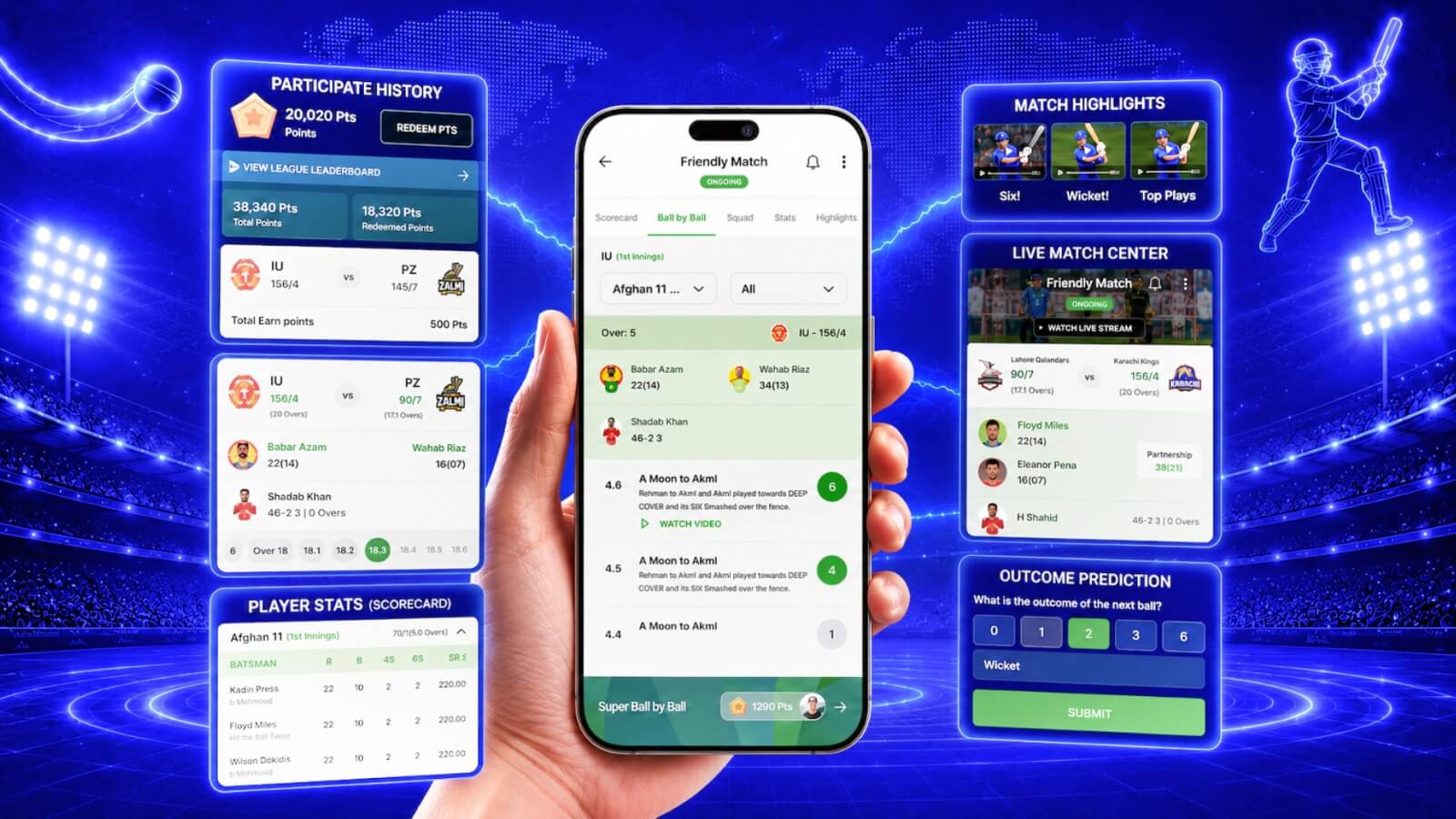
The fix isn't a single redesign. It's recognizing that learning management system UX has to account for three fundamentally different contexts of use. A student checks their phone between classes. A teacher sits at a desktop juggling 150 students across five sections. An administrator runs bulk operations across an entire district. Same underlying data, three different jobs, three different interfaces.
Designing for students: deadlines, not dashboards
Ask students what they actually want from a learning app and the answer is rarely "more features." Feedback on platforms like Canvas and Schoology converges on a small set of recurring frustrations, and they're more about timing and clarity than missing functionality.
The most damaging pattern is the mismatch between what gets pushed to students and what they actually need to see. Canvas reviewers on Capterra repeatedly cite notification overload and cluttered menus as their top complaint: too many low-value alerts arriving across app and email. At the same time, students report that the dashboard's "to-do" view often surfaces only what's due today. Anything due tomorrow can slip through unnoticed unless a student remembers to check manually.
That's the worst of both worlds. Noise on the channels that don't matter, silence on the one that does. App Store reviews of the Canvas Student app echo the same theme: a flood of notification types, but a persistent gap around due-date reminders that actually land before the deadline, not after.
Mobile and web parity is the second recurring failure point. Reviews of Schoology's mobile experience describe features that exist on the desktop site (live class links, certain assignment types) disappearing or behaving inconsistently on the app. That's exactly the surface students rely on most. For a platform whose primary users are mobile-native, an app that's a second-class citizen to the web product isn't a minor inconvenience. It's the difference between a student submitting work on time and a student missing it because "the app glitched."
Good student-side edtech app UX design is narrower and more disciplined than most teams expect. It comes down to a short list:
- Color-coded courses that are visually distinct at a glance
- A forward-looking task list that shows the next several days, not just today
- Calendar sync to whatever calendar app the student already lives in
- A notification architecture tuned for relevance over volume, with due-date reminders treated as the highest-priority signal
Designing for teachers: the workflow tax nobody bills for
If students are underserved by noisy, poorly timed information, teachers are underserved by workflows that quietly multiply their workload. The single most consistent complaint across reviews and district documentation isn't a missing feature. It's that grades don't reliably travel from the gradebook into the Student Information System (SIS) that actually generates report cards and transcripts.
District technical documentation for Canvas-to-SIS grade passback shows how fragile this connection is in practice. The sync depends on assignment group names matching SIS "assignment types" exactly. It breaks silently if a due date is missing or a name is too long, and it doesn't automatically re-trigger when a submission status changes from "missing" to "late" to "submitted." One public district RFP for LMS functional requirements spells out exactly why districts now write this into procurement contracts up front. They require systems that log every change at the field level, retain those logs for a minimum of two years, and support FERPA-compliant, role-based access controls before a vendor is even shortlisted.
Grading interfaces add a second layer of friction. Reviewers of Schoology's gradebook describe a cursor that can jump unexpectedly and alter or delete an entered grade with no undo option, forcing teachers to re-check their work constantly rather than trust the tool. Multiply that friction across 30 students per class and five classes per day and you start to understand why "administrative work" shows up so consistently in teacher stress surveys. It isn't abstract paperwork. It's the cumulative weight of software that makes a five-second task take fifty.
This is also where 2026's biggest structural shift in learning management system UX is happening: AI-assisted workflows that genuinely give time back, provided they're designed with teacher trust in mind. The Gallup-Walton Family Foundation survey of 2,232 U.S. public school teachers found that those using AI tools weekly estimate they save 5.9 hours per week, roughly six weeks across a school year, largely by cutting time spent on lesson differentiation, worksheet creation, and administrative tasks (Gallup & Walton Family Foundation, 2025). That's a self-reported figure from a survey, not a controlled study, so it should be read as directional rather than definitive. Still, it lines up with what teachers consistently ask for: reusable comment banks, bulk grading actions, reliable undo functionality, and AI that drafts a first pass at feedback without replacing the teacher's judgment on the final grade.
Designing for admins: procurement is the real interface
Admins rarely interact with a learning platform the way students or teachers do. But they're often the ones who decide whether it gets purchased, renewed, or scrapped, and their priorities are spelled out in remarkable detail.
They consistently demand role-based access control "in compliance with FERPA," audit trails retained for at least two years, support for single sign-on protocols (SAML, LDAP, or providers like Clever and ClassLink), and integration with the district's existing Student Information System. None of this is a "nice to have." It's the gate a platform has to pass through before a demo is even scheduled.
What admins complain about once a platform is live mirrors what teachers complain about, just one layer up: reporting interfaces that require many clicks to extract a simple summary, permission tiers that aren't granular enough to match how a real district is organized (a principal needs different visibility than a counselor, who needs different visibility than a substitute), and data-export limits that turn a routine compliance request into a multi-day project. Good educational app design principles for the admin layer mean treating bulk operations, filterable reporting, and configurable permission tiers as first-class design problems, not an afterthought bolted onto the student and teacher experience.
The pattern that ties it together: design three products, not one
The mature answer to serving radically different users inside one platform isn't a compromise interface. It's a small set of well-established patterns:
- Role-based dashboards that surface only what each persona needs, the way mature SaaS products give leadership outcome dashboards, daily users task-driven views, and admins a separate governance layer entirely
- Progressive disclosure, which respects the limits of working memory by showing the three to five most important items first and revealing depth only on demand
- Permission-aware UI, where modules simply don't appear for roles that shouldn't see them, rather than appearing greyed out and confusing
In practice, this often means building what are functionally three separate products: a student app, a teacher console, and an admin dashboard. They're unified by one shared design system, one identity and permissions layer, and one underlying data model. That's the difference between e-learning platform design that scales cleanly across a pilot of 50 students and a statewide rollout of millions, versus a platform that has to be partially rebuilt every time a new user type gets added.
Accessibility is no longer optional, it's a procurement gate
For any platform serving U.S. public schools or universities, accessibility has shifted from best practice to binding legal requirement. The Department of Justice's ADA Title II rule adopts WCAG 2.1 Level AA as the technical standard for public entities' web content and mobile apps, explicitly including LMS course materials. An April 2026 interim rule extended the compliance deadlines: April 26, 2027 for public entities serving populations of 50,000 or more (most public universities and large districts), and April 26, 2028 for smaller entities (Federal Register, 2026).
The underlying obligation hasn't moved, only the dates. One analysis found only a small share of institutions describe their current accessibility posture as fully defensible against that standard (Accessibe, 2026). For any team designing or redesigning a learning platform right now, building to WCAG 2.1 AA isn't a future milestone. It's a today problem.
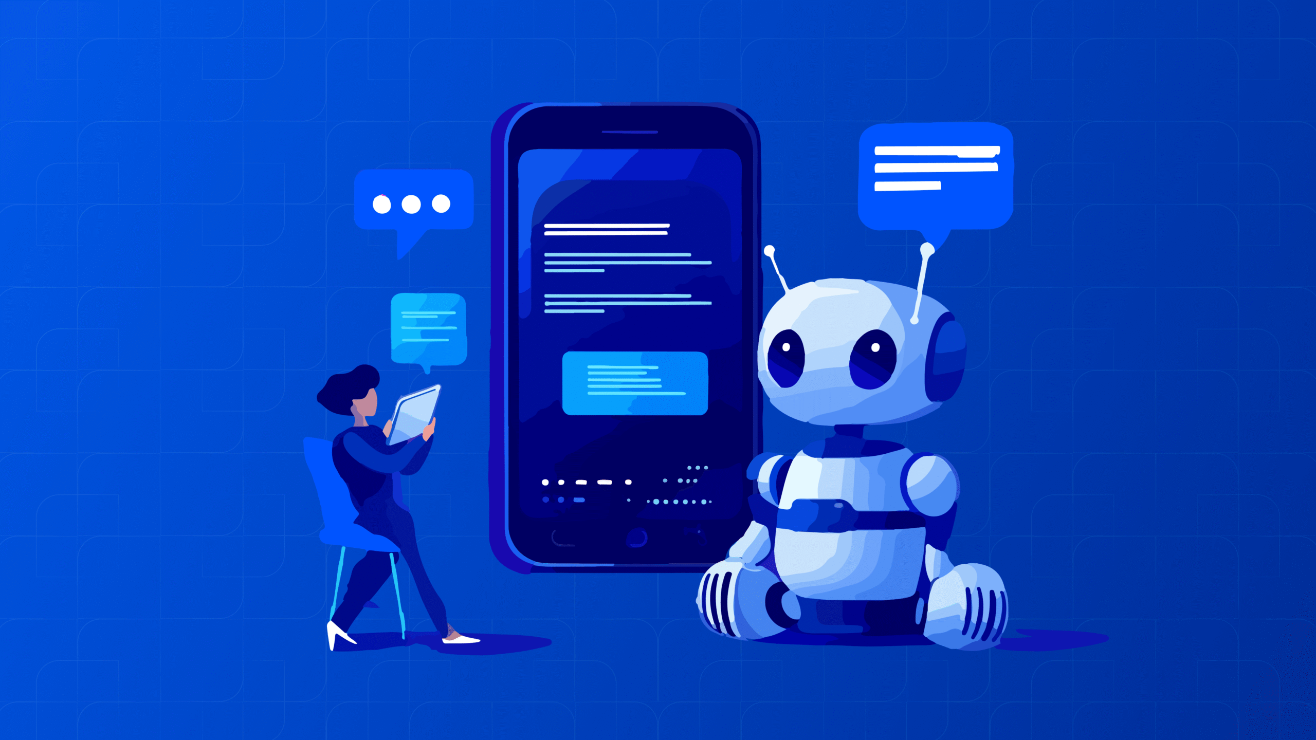
AI in 2026: the upside is real, and so is the backlash
No conversation about educational app design principles in 2026 is complete without addressing AI, because adoption has moved faster here than almost anywhere else. Microsoft's 2025 AI in Education report, citing IDC research, found that 86% of education organizations now use generative AI, the highest adoption rate of any industry tracked (Microsoft, 2025). The Center for Democracy & Technology's October 2025 survey of over 1,000 high school students, more than 800 middle and high school teachers, and over 1,000 parents found that 85% of teachers and 86% of students used AI tools during the 2024-25 school year (CDT, 2025).
But adoption and trust aren't the same thing. A College Board survey of more than 3,000 college faculty found that 84% agreed AI tools make students more dependent on technology and less likely to develop critical thinking skills or engage deeply with course material (College Board, via All Access, 2026). A separate Education Week report on RAND survey data found that nearly 7 in 10 middle and high school students, and 70% of college students, say they're worried AI use is eroding their own critical thinking (Education Week, 2026).
The design implication is clear. AI features in a learning platform need to keep the educator and the learner visibly in the loop: review-before-use checkpoints, visible reasoning rather than black-box answers, and personalization that scaffolds thinking instead of substituting for it.
A cautionary tale: what happens when daily users are never consulted
The clearest illustration of what's at stake comes from teacher reviews of platforms imposed top-down without input from the people using them daily. On Common Sense Education, teacher reviews of Schoology following changes after its acquisition by PowerSchool include accounts from veteran educators describing years of mandated use, broken grade-sync workflows, and clunky gradebooks. Many also note they were never once asked for feedback on the product they were required to use every day.
The lesson generalizes well beyond any single vendor. Platforms purchased on a procurement checklist but designed without continuous input from teachers and students tend to generate sustained frustration, and eventually get replaced, at real cost in money, training time, and trust.
What this means if you're building or rebuilding a learning platform
If you're evaluating whether your current platform needs a redesign, a few questions tend to surface the real problem fast:
- Does your student experience prioritize upcoming deadlines over notification volume?
- Does a teacher's grade entry reliably and visibly reach your SIS, with clear error messages when it doesn't?
- Can an admin filter, export, and audit data without engineering help?
- Is your accessibility posture something you could defend against WCAG 2.1 AA today, not in 2027?
- If you're adding AI, does it keep the teacher and student in control of the outcome, or quietly take the decision away from them?
Most platforms that struggle with adoption aren't failing because of one bad screen. They're failing because they were designed around a single generic "user" instead of the three (or more) very different people who actually have to live inside the product every day. Getting this right takes dedicated discovery work: observing real classrooms, mapping the specific friction points of each role, and designing role-based dashboards, permission-aware interfaces, and a unified design system that scales from a 50-student pilot to a statewide deployment without breaking.
This is the kind of work TheFinch Design does as an edtech UI design agency. We combine UX research grounded in real classroom and admin-office behavior with design discovery, usability testing, and heuristic evaluation to find exactly where a student, teacher, or admin experience is breaking down. Then we rebuild it with a unified design system that holds together across roles and devices.
If you're scoping a new learning platform or trying to figure out why an existing one isn't getting adopted, a focused UX design audit is usually the fastest way to find out what's actually costing you completion rates, support tickets, or renewal decisions. Our team has done this work for SaaS-style admin and analytics dashboards as well as full student- and teacher-facing product design.
If any of the friction points above sound familiar, book a discovery call or reach out to our team. We'll walk through where your platform's role-based UX is likely losing students, teachers, or admins, and what it would take to fix it.