


Augmented Kaamfu’s
Platform through UX Audit
-
DELIVERABLES
UX Audit
-
INDUSTRY
Project Management
-
DURATION
3 Days
-
PLATFORM
Web App
Overview
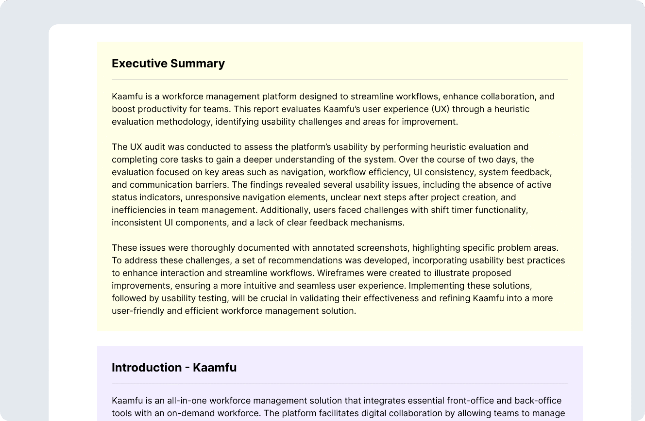
This case study focuses on the UX audit of Kaamfu, a workforce management platform designed to streamline workflows, enhance collaboration, and improve productivity. The audit aimed to identify usability challenges and optimize the platform’s design to create a more seamless and efficient experience for users.
-
Product Design
-
Design Discovery
-
PMS
-
Time Tracking
-
Chat

About Kaamfu
Kaamfu is an all-in-one workforce management solution that integrates essential front-office and back-office tools with an on-demand workforce. The platform facilitates digital collaboration by allowing teams to manage tasks, track shifts, communicate effectively, and oversee work processes. However, for Kaamfu to maximize user engagement and efficiency, a strong focus on usability is essential. A heuristic evaluation was conducted to assess the platform’s UX, identifying design inconsistencies, workflow inefficiencies, and areas where user guidance can be improved.


Problems
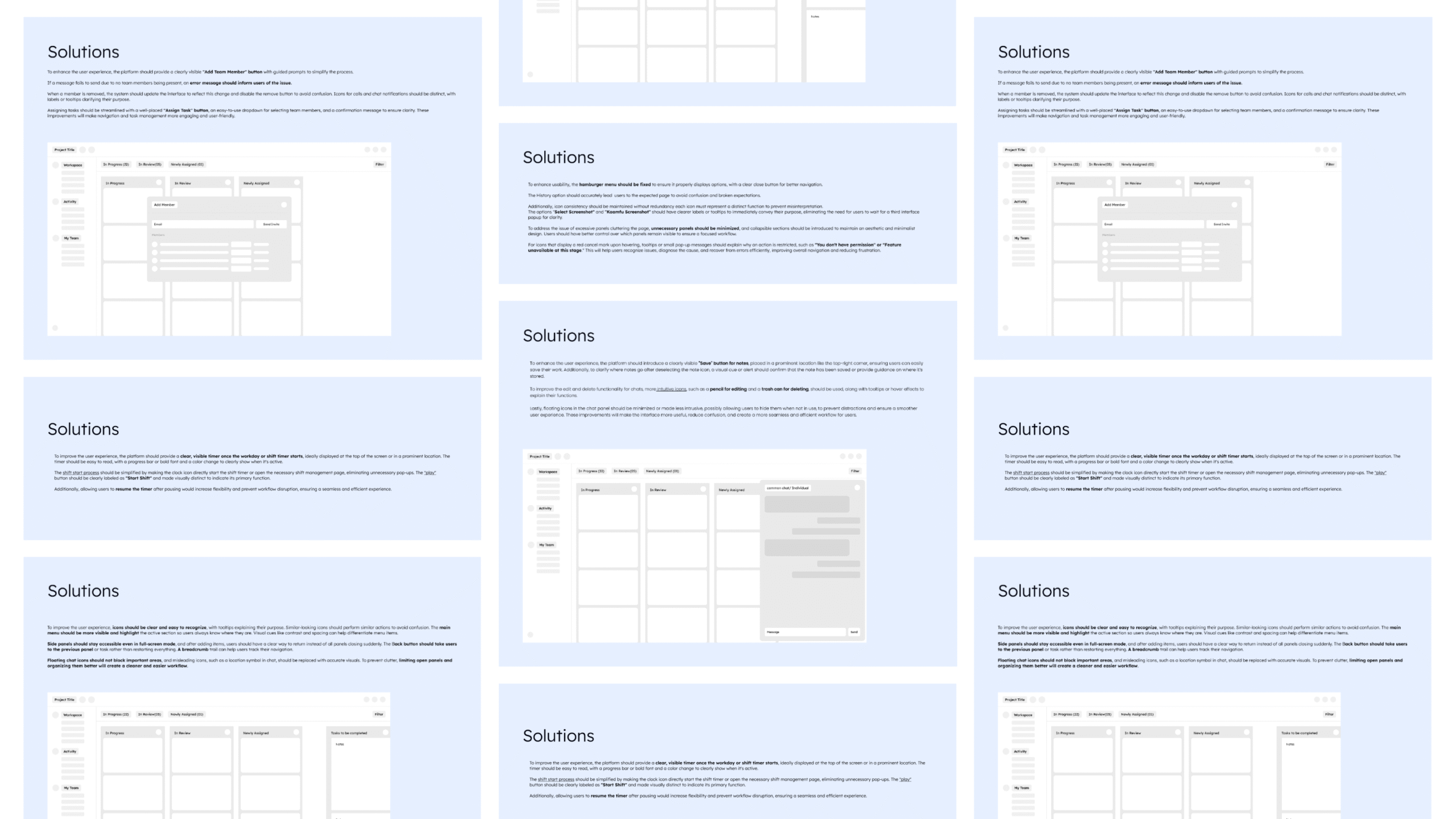
We performed a Heuristic Evaluation and found that users are frustrated by complex navigation, inefficient team management, and inconsistent system feedback, making workforce management less intuitive and disrupting overall productivity.
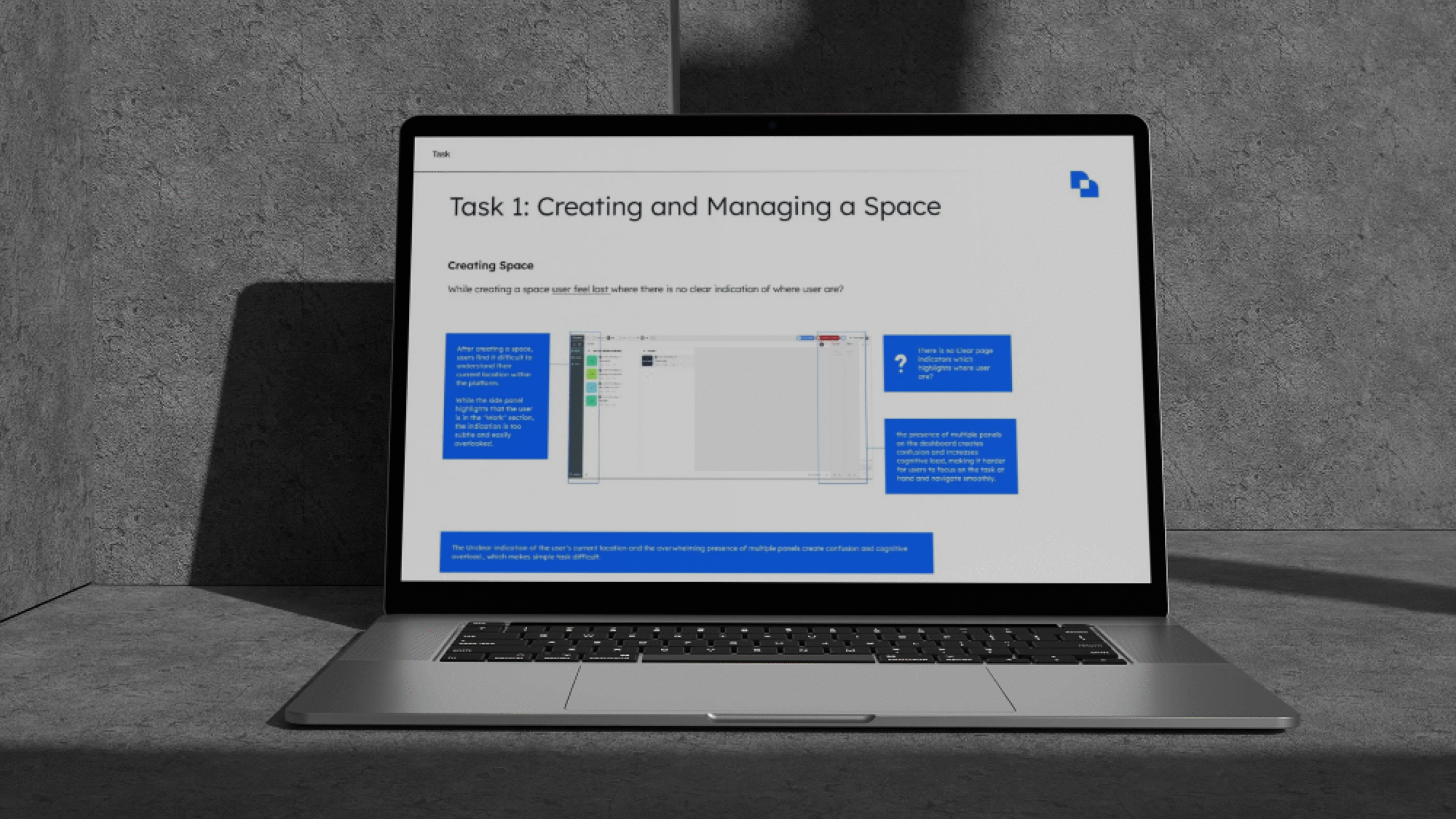
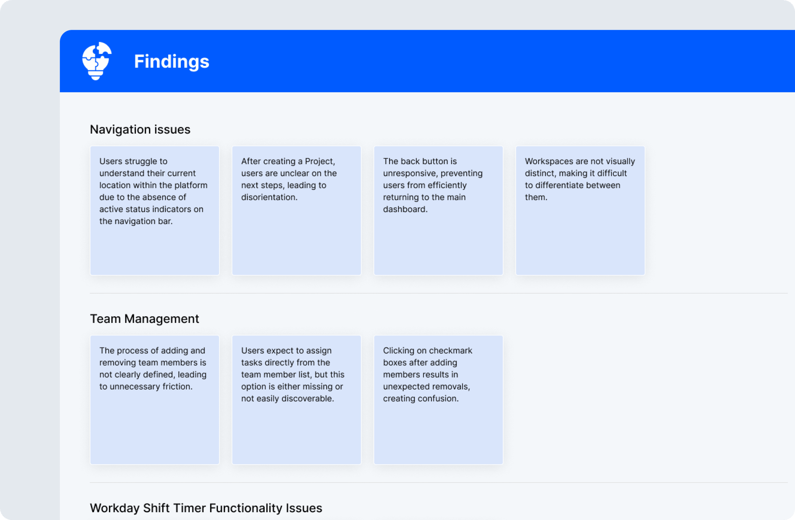
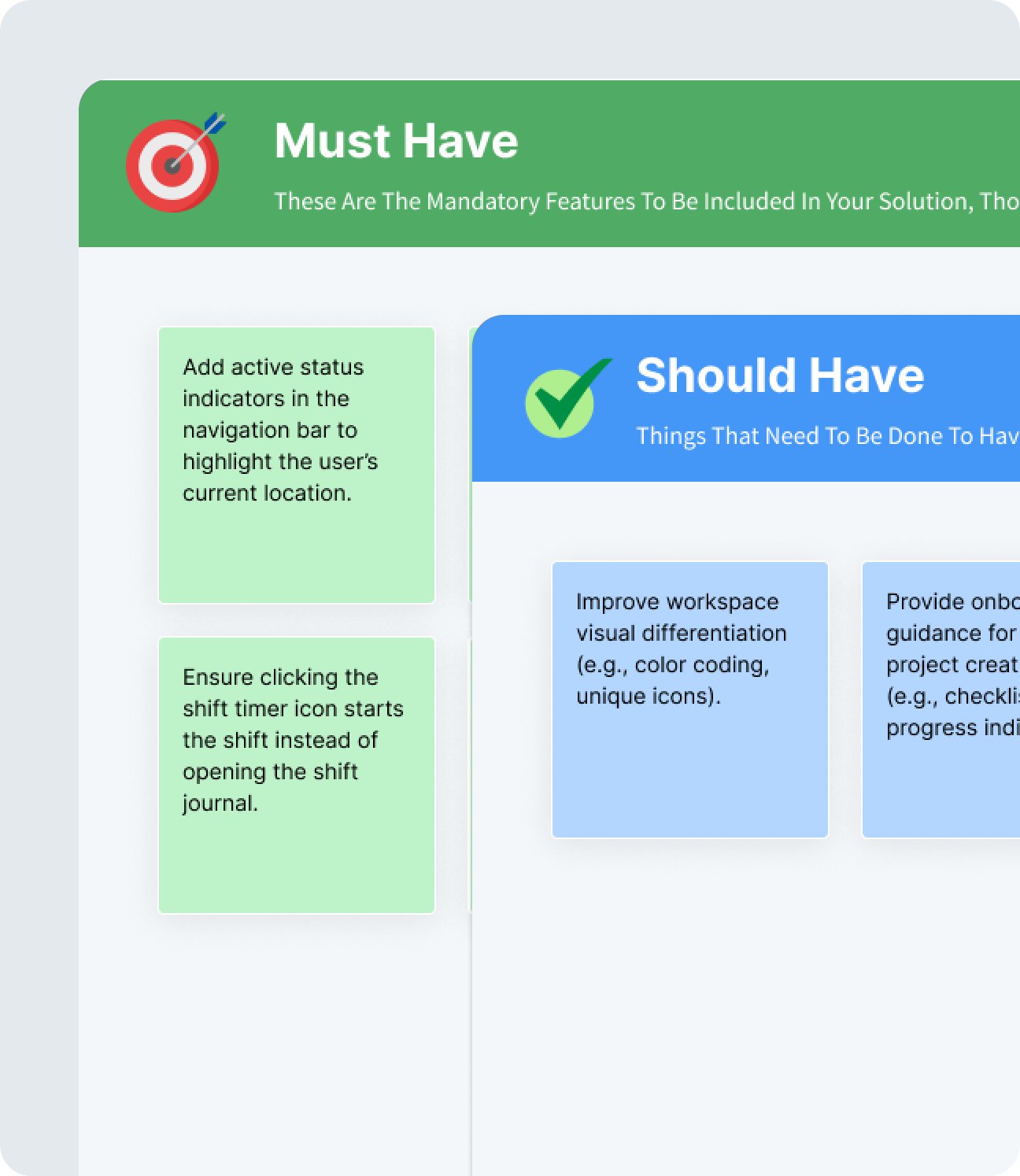
- Users struggle to understand their current location due to missing active status indicators.
- The back button is unresponsive, making it difficult to return to previous screens.
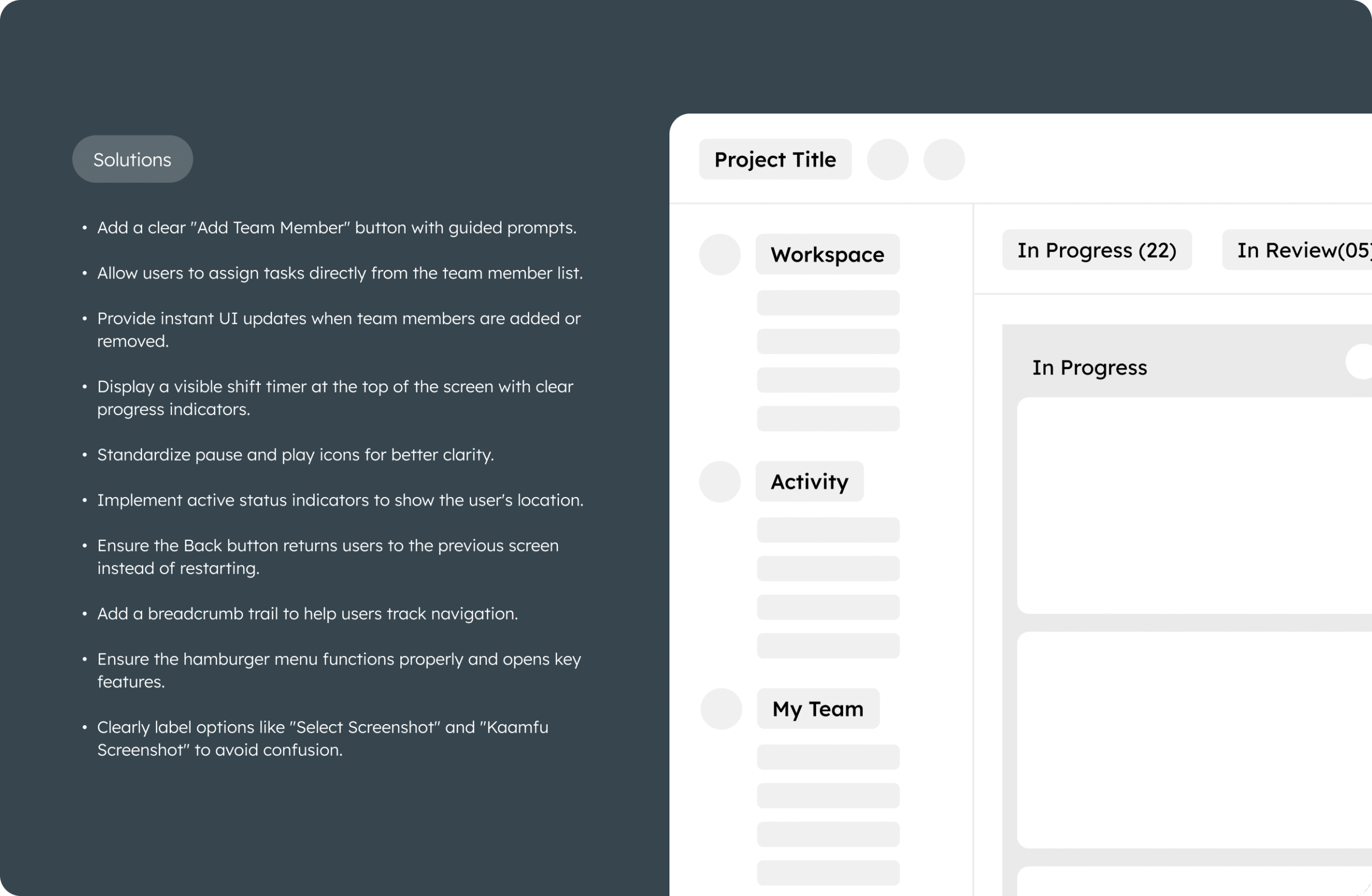
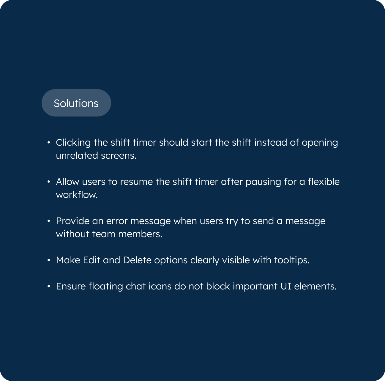
- Adding and Removing Team Members is Unclear, Causing Friction in Collaboration.
- Users Expect to Assign Tasks Directly From the Team Member list, but This Feature is Either Missing or Hard to Find.
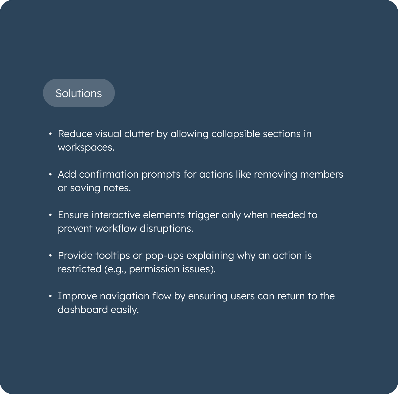
- Users Cannot Determine If Their Shift is Running Due to the Absence of a Visible Shift Timer.
- The Pause and Play icons are Inconsistent, Leading to Confusion.
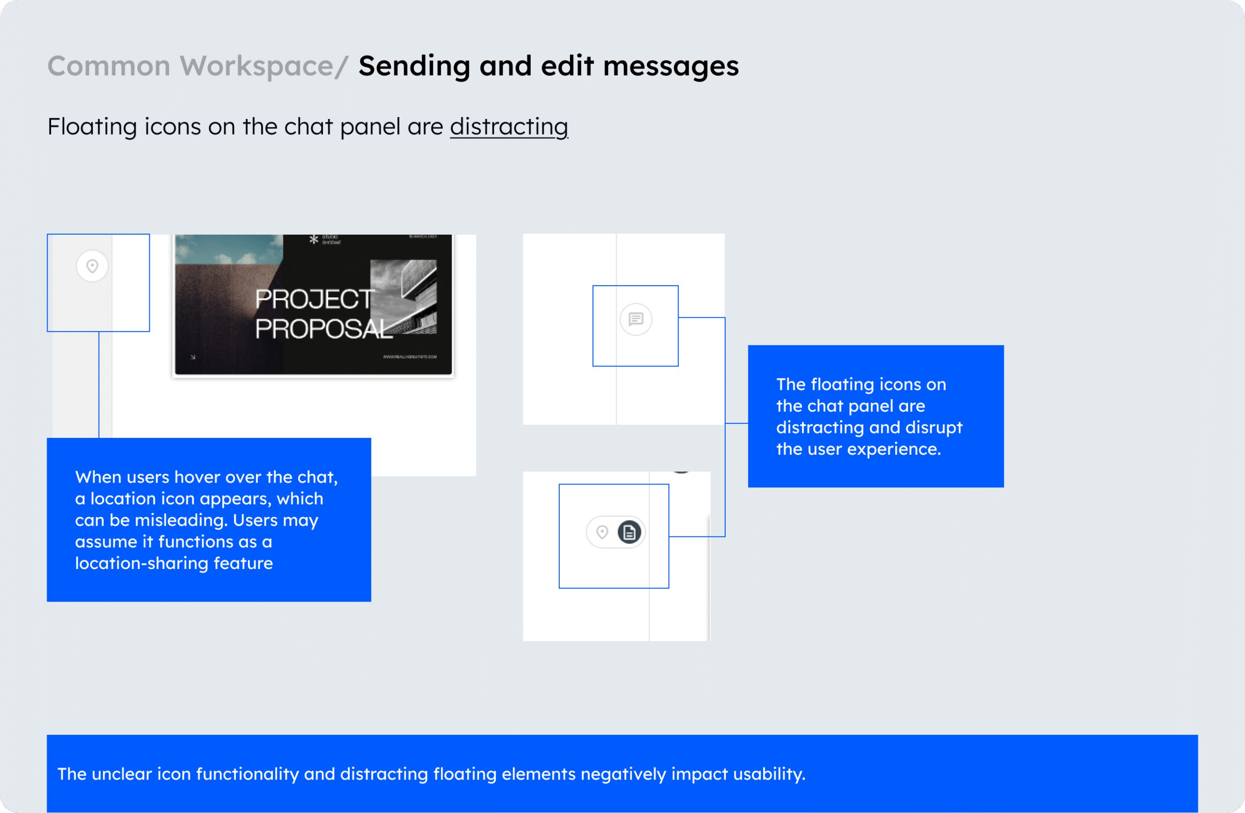
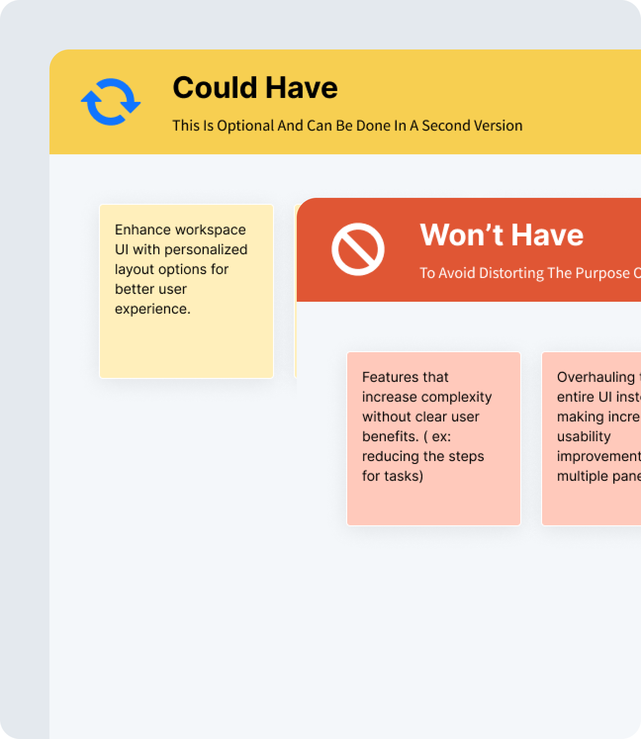
- No feedback is provided when attempting to send a message without team members, leaving users confused.
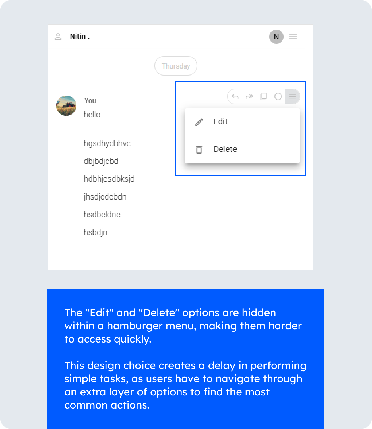
- The “Edit” and “Delete” options are hidden, making them difficult to locate.
- Critical actions lack confirmation prompts, such as removing team members or saving notes, leading to potential mistakes.
- Some interactive elements trigger unexpectedly, disrupting user workflows.
- The hamburger menu is unresponsive, preventing users from accessing key features.
- Icons do not behave as expected, leading to confusion (e.g., clicking the shift timer opens the shift journal instead of starting the shift).
The process We followed
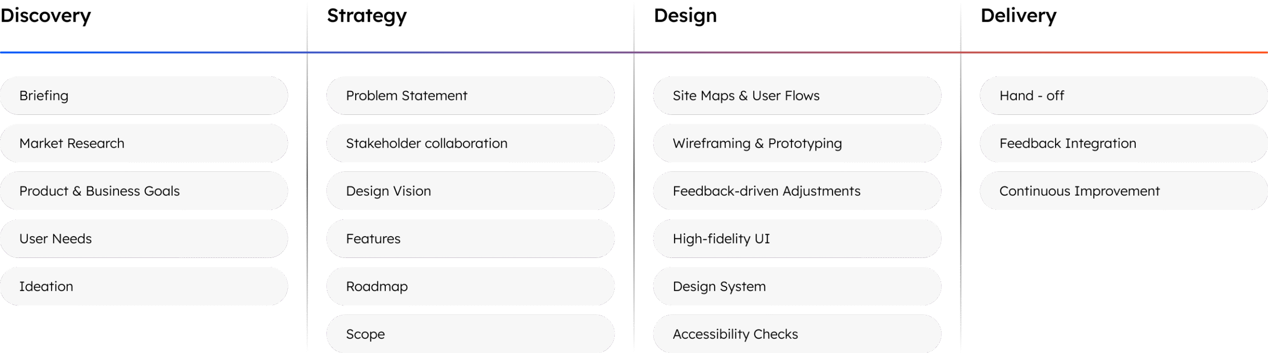
Method Used
The UX audit of Kaamfu was conducted using a combination of Heuristic Evaluation and Task-Based User Journey Assessment over two days. These methods helped identify usability issues, interface inconsistencies, and workflow inefficiencies, ensuring a more seamless user experience.
1.Heuristic Evaluation
- A usability inspection method where the interface was evaluated against Jakob Nielsen’s 10 Usability Heuristics to identify design flaws.
- Focused on aspects like system feedback, error prevention, UI consistency, and user control.
Why It Was Used:
- Quickly detects major usability problems without requiring user testing.
- Helps uncover navigation challenges, interface inconsistencies, and workflow inefficiencies
2.Task-Based User Journey Assessment
Involved performing critical user tasks such as:
- Project creation
- Team management
- Shift tracking
- Messaging
- Workspace navigation
The goal was to simulate real-world usage and uncover usability barriers affecting the experience.
Why It Was Used:
- Ensures usability issues are tested in real scenarios rather than just theoretical evaluation.
- Highlights task flow breakdowns and friction points that impact productivity.
Outcome & Next Steps
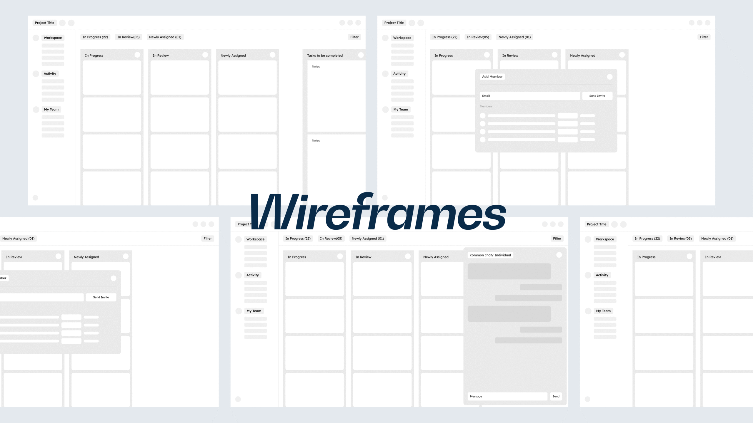
- Issues were documented with screenshots and categorized based on severity.
- Wireframes and design recommendations were developed to address the findings.
- The final report includes a roadmap for implementation to enhance navigation clarity, system feedback, team management, and UI consistency.
Conclusion
The UX findings reveal several usability challenges in Kaamfu, particularly in navigation, team management, shift tracking, messaging, and system feedback. These issues create friction in core workflows, making it difficult for users to efficiently interact with the platform. Key pain points include a lack of clear navigation cues, inconsistent UI components, and missing system feedback, all of which contribute to confusion and inefficiency.
Addressing these issues through structured UX improvements such as refining navigation, improving workspace distinction, enhancing shift tracking visibility, and streamlining communication—will significantly enhance user experience.
Ultimately, implementing these changes will lead to a more intuitive, efficient, and user-friendly platform, fostering smoother workflows and increased user satisfaction.
Thank You!

Thank you for taking the time to explore our case study on Kaamfu.
We’re proud to have worked with such an innovative and forward-thinking client to develop a recruitment management platform that streamlines the hiring process for agencies and HR departments.
At TheFinch, we’re passionate about turning ideas into reality through the power of digital solutions. If you’re looking to transform your customer experiences and solve complex problems, let’s connect and explore how we can help. Say hello at www.thefinch.design today!
More Projects!

CricksLab – Smarter Cricket UX
We redesigned CricksLab from scratch, enhancing 10x usability and effortless match tracking for cricket fans. Post-launch, the successful revamped app…
-
Product Design
-
Dashboard Design
-
Mobile App
-
Interface Design & UX
-
Data Insights
-
Fantasy App
-
Saas
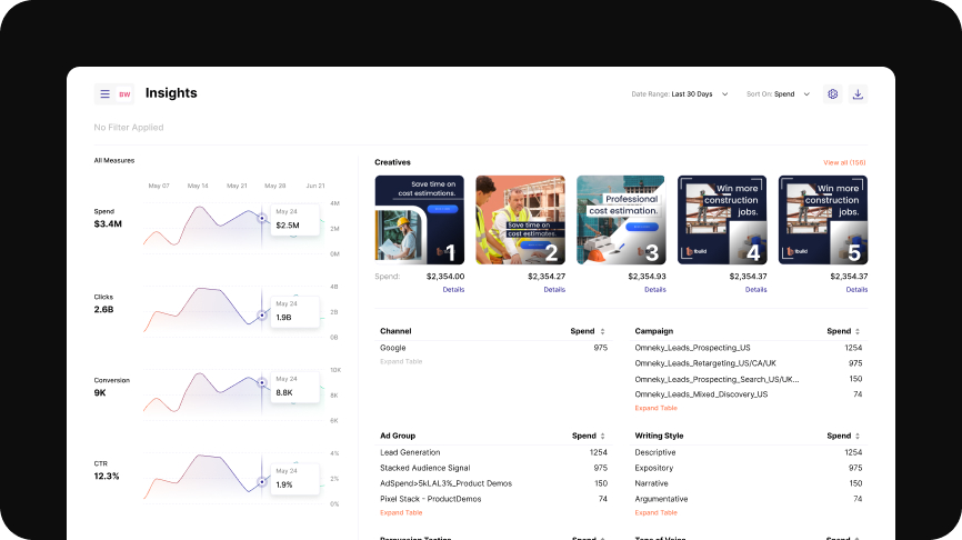
Omneky – AI Meets UX
By analyzing Omneky’s enterprise users, we redesigned their ad platform into a streamlined 2.0 Version. A clear and performance-driven UX…
-
Enterprise Product Design
-
Enterprise AI
-
UI/UX
-
Web App
-
MarketingTech
-
Design Discovery
-
Saas