


Improved Arootah’s
Coaching Platform
with UX Audit
-
DELIVERABLES
UX Audit
-
INDUSTRY
Education, Wellbeing & Counselling
-
DURATION
3 Days
-
PLATFORM
Web App
Overview
The UX audit of Arootah was conducted to assess and enhance the user experience of its platform. The evaluation focused on identifying usability barriers, navigation challenges, and workflow inefficiencies that impacted user engagement and productivity.
-
Product Design
-
Design Discovery
-
Time Management
-
Personal Coach
-
Planner
About Arootah
Arootah is a premier advisory and executive coaching firm specializing in alternative investments. The company provides strategic guidance in business development, due diligence, leadership training, and executive coaching. By combining expertise, structured processes, and technology, Arootah helps finance professionals and teams maximize their performance and optimize decision-making.
The Arootah platform offers various tools designed to enhance productivity, including AI-driven recommendations, structured task management, and decision-making frameworks. Despite these features, user adoption and efficiency were hindered by UX-related challenges, necessitating a detailed usability audit to improve overall engagement and effectiveness.
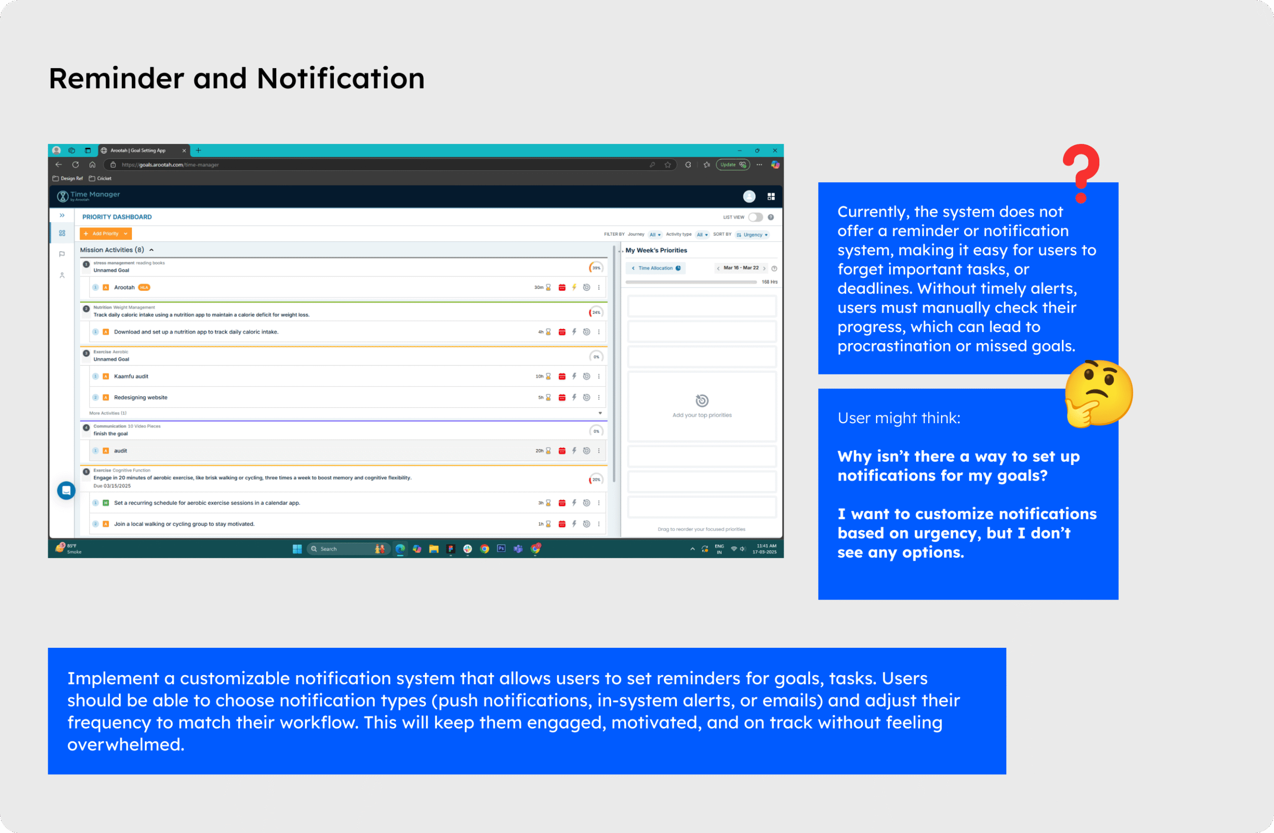
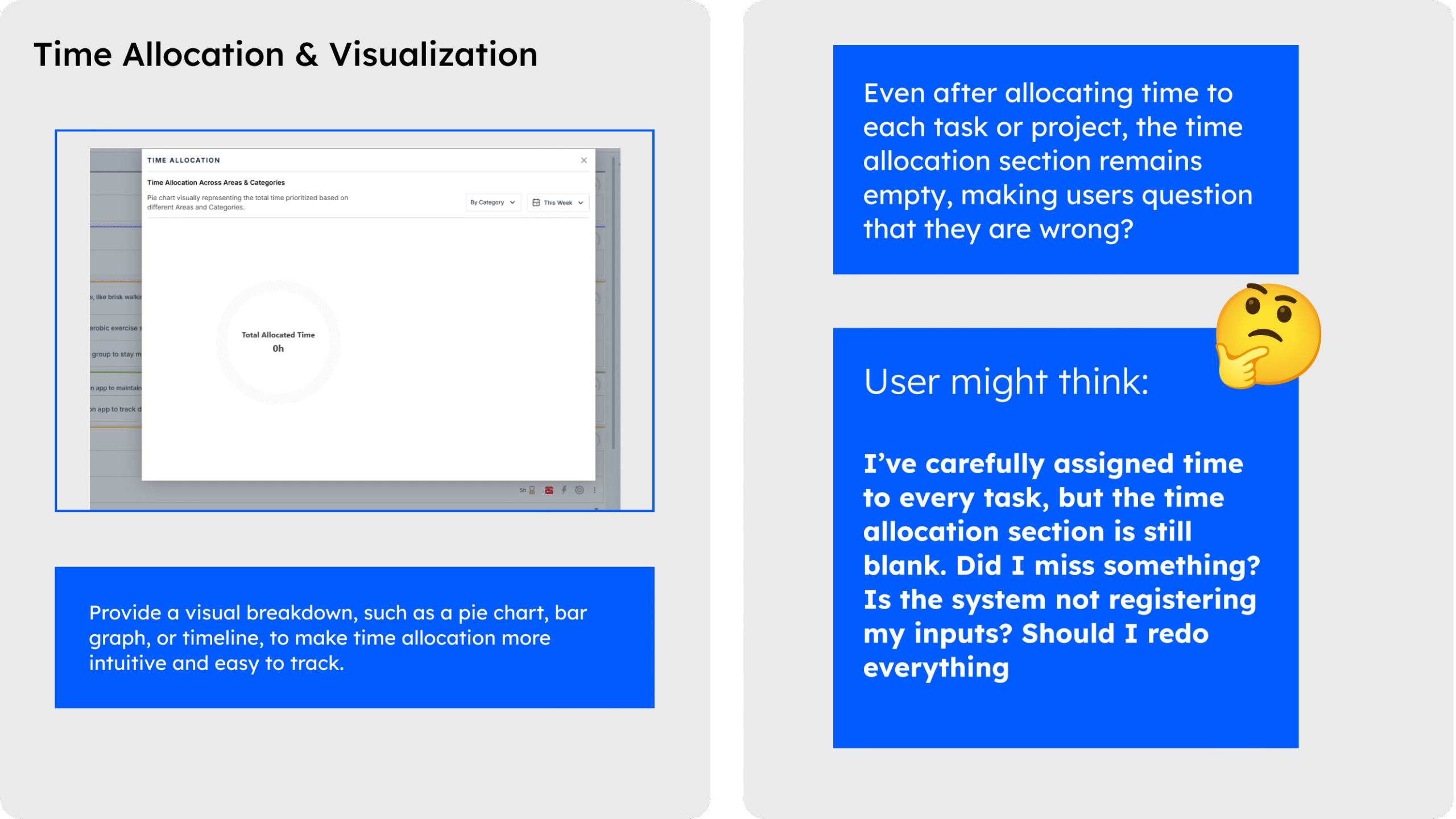
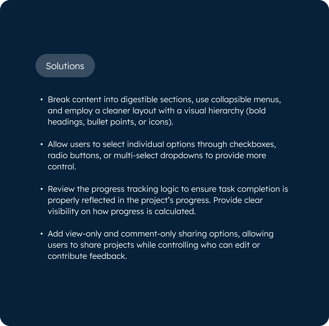
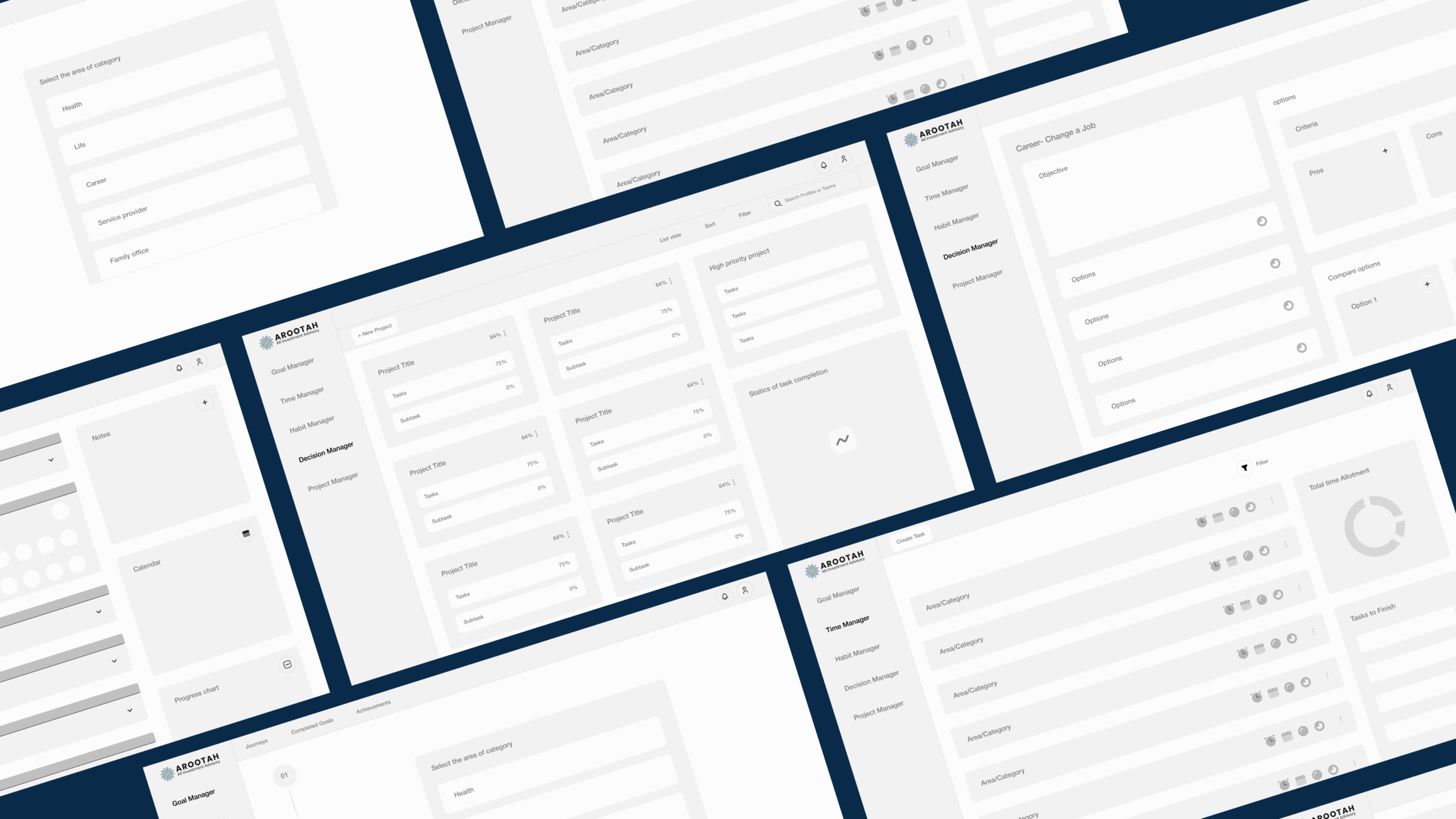
Problems
The UX audit revealed several usability challenges that hinder the effectiveness of Arootah’s platform. These include:
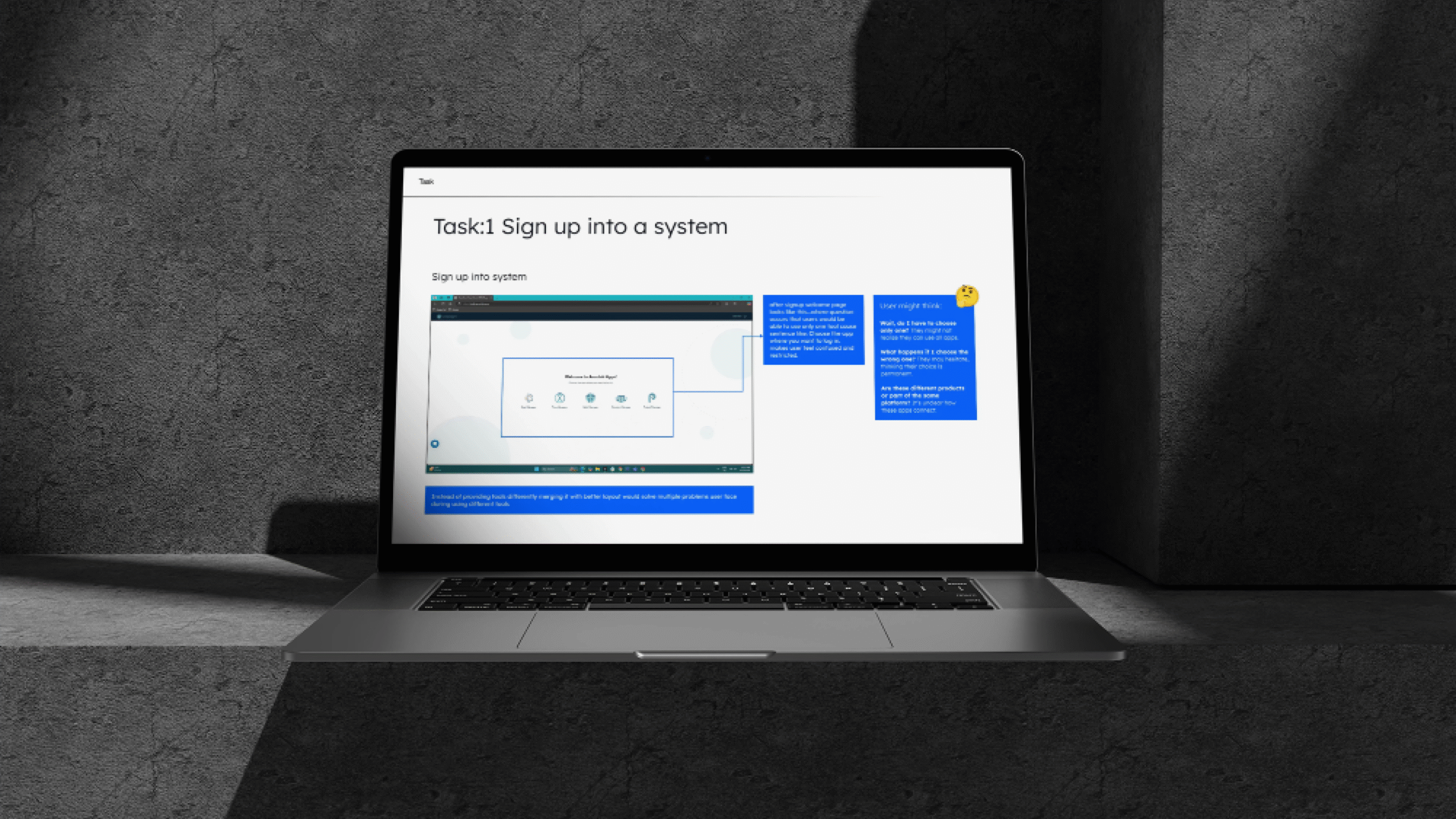
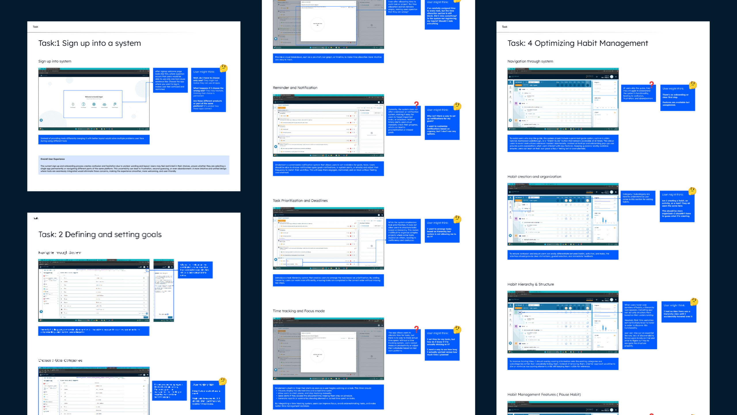
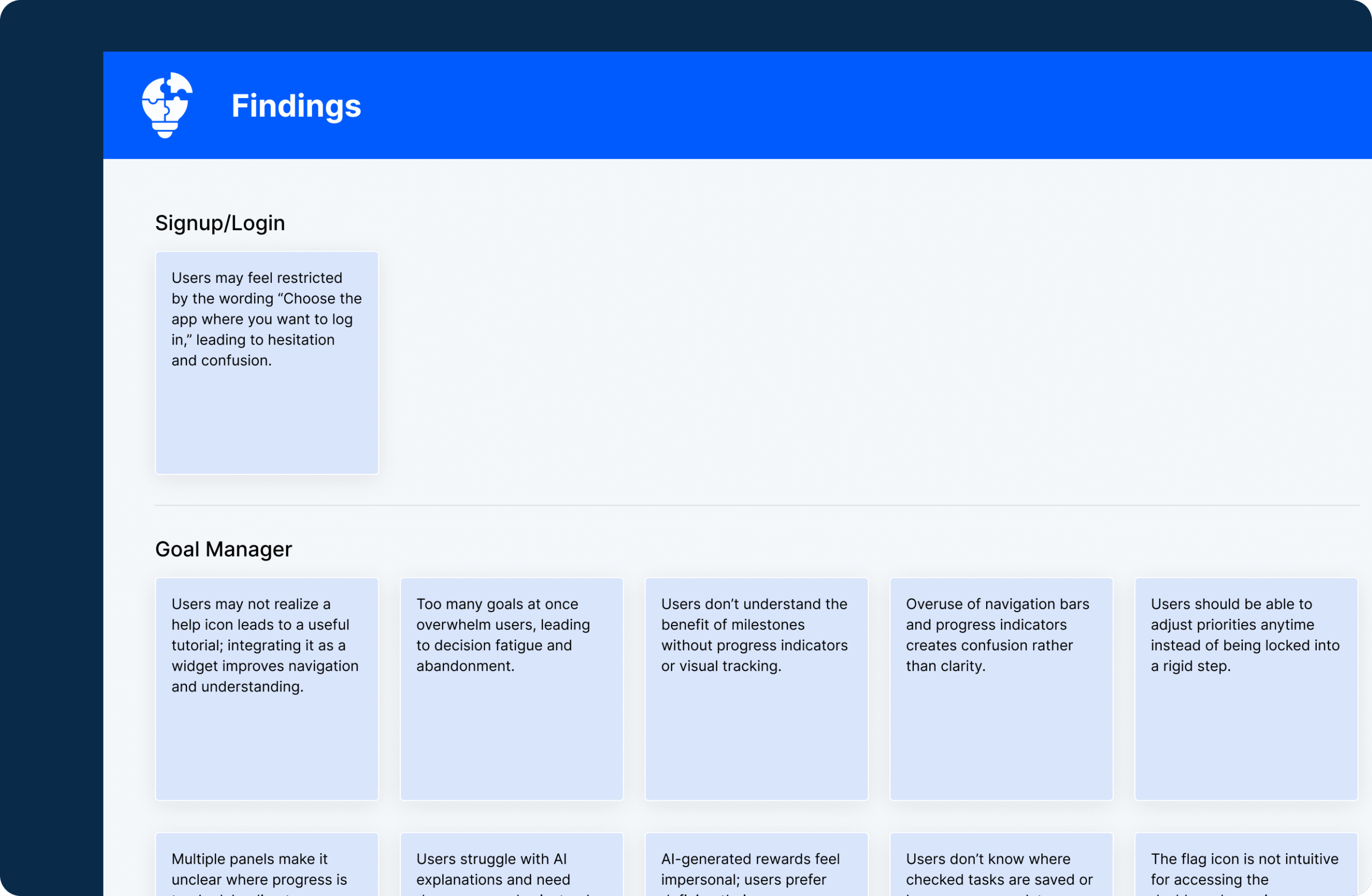
- Users may skip the guide and later struggle with the system’s functionality, leading to confusion and frustration.
- Confusion arises because users are unsure whether they are creating a habit, an activity, or a task due to unclear categorization.
- The hierarchy feature is hidden when users hover over habit numbers, leading to missed opportunities to structure habits.
- There is no option to pause habits, forcing users to either continue or delete their habits, which is frustrating.
- Users cannot adjust the weightage of categories and subcategories while creating them, making it hard to prioritize.
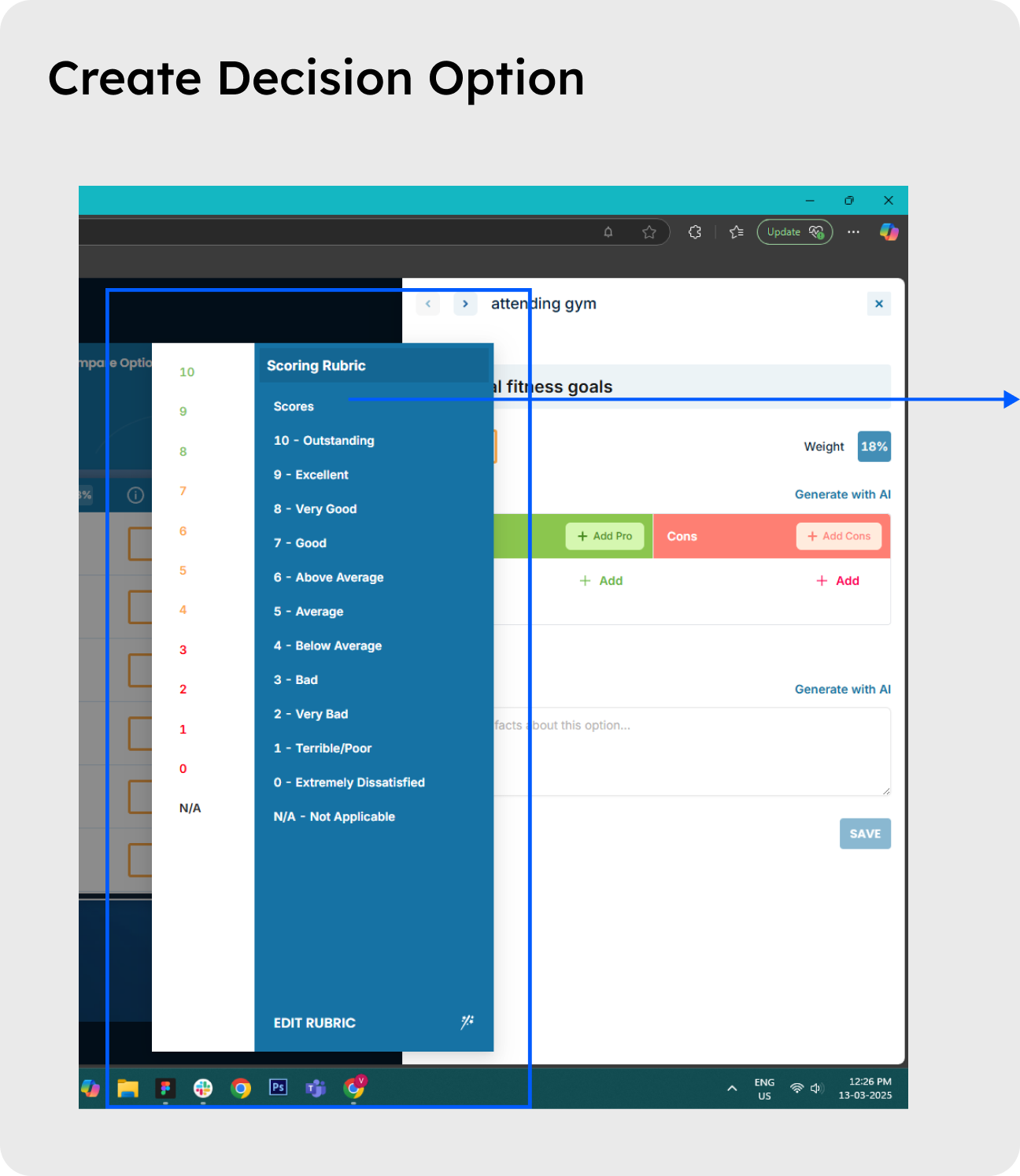
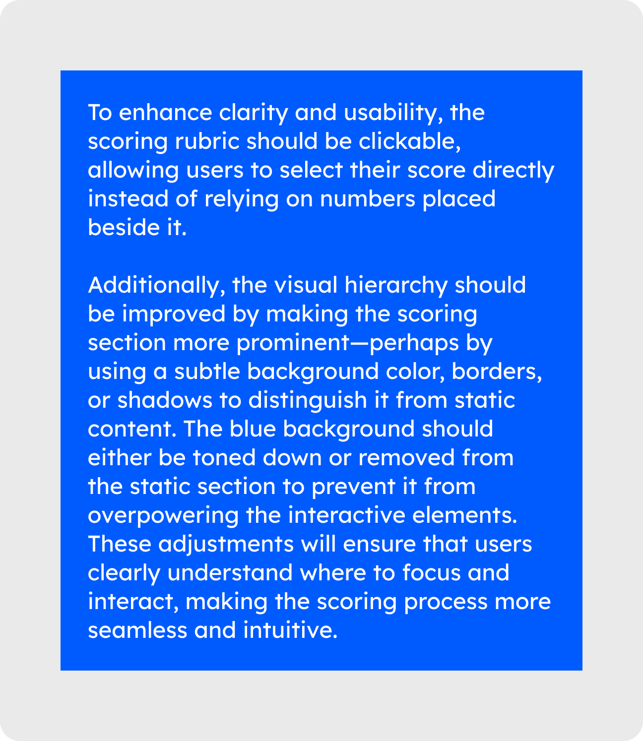
- Enabling the scoring view hides categories and subcategories, which can lead to confusion and disorientation.
- Progress is tracked weekly, which limits long-term analysis.
- The dashboard calendar only shows the current week, making it impossible to access past data.
- The interface is cluttered and confusing, leading to users not knowing where to start or how to make decisions effectively.
- The AI-powered suggestions are slow to load and often fail to generate useful suggestions.
- Users can share decisions with others, but there is no option to collaborate (edit, comment, or vote).
- The terms “Categories” and “Action Items” are unclear, leading to confusion about their purpose (tasks, subtasks, or something else).
- Providing too much information at once overwhelms users, making it difficult to focus on key actions.
- The chatbox functionality forces users to select all options at once, which is unintuitive and reduces user control.
- Some projects show progress while others don’t, even when all tasks are completed, creating inconsistency and confusion.
- Users can share projects but cannot control editing permissions, leading to inefficiency in collaboration.
- Lack of a visual project timeline and task scheduling feature makes project planning chaotic and disorganized.
- The interface is cluttered with too many views and competing elements, overwhelming users.
The process We followed
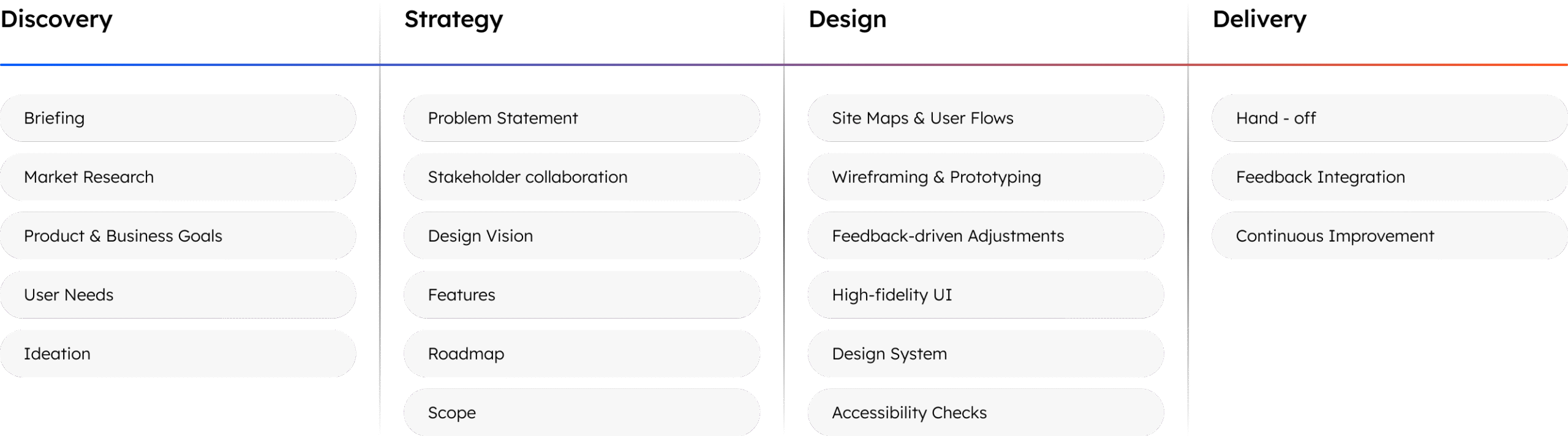
Method Used
The UX audit of Arootah was conducted using a combination of Heuristic Evaluation and Task-Based User Journey Assessment and Contextual Inquiry over two days. These methods helped identify usability issues, interface inconsistencies, and workflow inefficiencies, ensuring a more seamless user experience.
1. Heuristic Evaluation
- A usability inspection method where the interface was evaluated against Jakob Nielsen’s 10 Usability Heuristics to identify design flaws.
- Focused on aspects like system feedback, error prevention, UI consistency, and user control.
Why It Was Used:
- Quickly detects major usability problems without requiring user testing.
- Helps uncover navigation challenges, interface inconsistencies, and workflow inefficiencies.
2. Task-Based User Journey Assessment
Involved performing critical user tasks such as:
- Sign up into System
- Defining and Setting Goals
- Exploring Efficiency Time Management
- Optimizing Habit Management
- Complete Decision Maker
- Complete Project Manager
The goal was to simulate real-world usage and uncover usability barriers affecting the experience.
Why It Was Used:
- Task-based assessments help test usability in realistic scenarios, ensuring that the evaluation reflects actual user needs and behaviors.
- By focusing on critical user tasks, this method revealed friction points that hindered users’ ability to complete tasks efficiently and led to frustration. This was crucial for identifying areas where the user experience could be improved for better task flow and productivity.
3. Contextual Inquiry
Contextual Inquiry involved observing real users interacting with the platform in their natural environment. This method helped uncover cognitive load issues, decision-making challenges, and user behavior in actual usage contexts. It also provided a deeper understanding of how users interact with the platform and what they prioritize during their interactions.
Why It Was Used:
- Contextual inquiry allows us to observe users in their natural environment, providing insights into their real-world usage patterns, needs, and struggles. This method helps identify issues that may not be immediately apparent in controlled environments or theoretical evaluations.
- It provided context for understanding why users struggle with certain tasks or processes, helping us identify root causes of usability problems rather than just symptoms.
- Observing users in context revealed moments where users felt overwhelmed or confused, offering valuable data to streamline processes and make the platform more intuitive.
Outcome & Next Steps
- All usability issues were documented with screenshots and categorized based on their severity. This comprehensive documentation provided a clear picture of areas requiring attention.
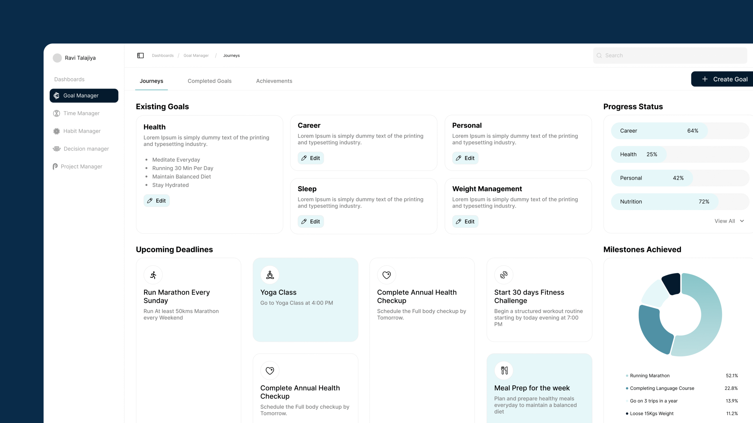
- Based on the findings, wireframes were developed to illustrate proposed solutions for navigation clarity, system feedback, and UI consistency.
- A roadmap for implementing these improvements was created, focusing on areas such as:
- Simplified Navigation: Reworking the navigation structure to make it more intuitive.
- Enhanced System Feedback: Improving feedback mechanisms to reduce user confusion and improve task completion.
- UI Consistency: Ensuring consistent use of UI elements to enhance the user experience.
Conclusion
The UX audit of Arootah, using Heuristic Evaluation, Task-Based User Journey Assessment, and Contextual Inquiry, revealed key usability issues such as unclear navigation, inconsistent system feedback, and complex workflows. Recommendations to address these issues include clearer UI elements, better navigation, improved feedback mechanisms, and streamlined task flows.
Implementing these changes will enhance user satisfaction and productivity. Further usability testing is recommended to refine the platform and ensure it meets user expectations, ultimately improving user retention and business success.
Thank You!

Thank you for taking the time to explore our case study on Arootah.
We’re proud to have worked with such an innovative and forward-thinking client to develop a recruitment management platform that streamlines the hiring process for agencies and HR departments.
At TheFinch, we’re passionate about turning ideas into reality through the power of digital solutions. If you’re looking to transform your customer experiences and solve complex problems, let’s connect and explore how we can help. Say hello at www.thefinch.design today!
More Projects!

CricksLab – Smarter Cricket UX
We redesigned CricksLab from scratch, enhancing 10x usability and effortless match tracking for cricket fans. Post-launch, the successful revamped app…
-
Product Design
-
Dashboard Design
-
Mobile App
-
Interface Design & UX
-
Data Insights
-
Fantasy App
-
Saas
Omneky – AI Meets UX
By analyzing Omneky’s enterprise users, we redesigned their ad platform into a streamlined 2.0 Version. A clear and performance-driven UX…
-
Enterprise Product Design
-
Enterprise AI
-
UI/UX
-
Web App
-
MarketingTech
-
Design Discovery
-
Saas