


More Great reads!

User Interface Design / February 25, 2025
by Ravi Talajiya
Top Digital Healthcare UX Trends to Know in 2025
Healthcare Design/ / 08 Apr, 2026
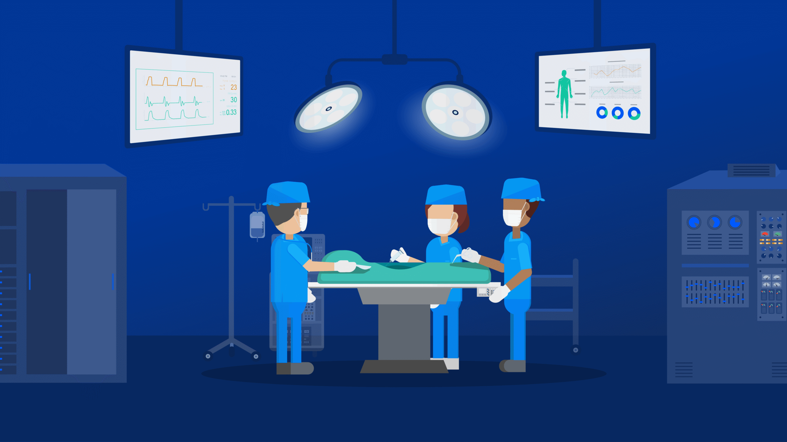
Table of contents
Healthcare interfaces are not “just another app screen”. In a clinical setting, the UI is often part of the treatment pathway. A missed alarm, a confusing label, or a cluttered monitoring view can slow response time and increase the risk of error. That’s why HMI design in healthcare sits closer to safety engineering than trendy UI polish.
Unlike app-only UX work, human-machine interface healthcare design must account for high-stakes decisions, fatigue, interruption-heavy workflows, gloves and PPE, unreliable lighting, and multiple users interacting with the same system. It also needs to stand up to usability engineering and risk management expectations in the medical device world.
This blog breaks down practical healthcare HMI best practices, covering medical device UI design, medical device UX design, and patient monitoring system interface design. See how our team of experts at TheFinch Design approaches complex, system-heavy healthcare interfaces beyond typical “mobile app UX”.
Most healthcare apps are built for scheduled use. HMIs are built for real-time work.
Key differences you need to design for:
That’s why designing user-friendly medical devices is less about delight and more about clarity, predictability, and controlled interaction patterns.
In medical device contexts, usability is directly tied to safety. Standards exist because use errors are common risks that can be mitigated through design.
Two widely referenced foundations:
For teams selling into the US, the FDA also provides guidance on applying human factors and usability engineering to medical devices.
In UI terms, safety design shows up as:
A patient monitoring system interface is a live environment. It must help teams spot changes early, without flooding attention.
Strong patient monitoring system interface design usually includes:
A reliable pattern is:
| Top level | Is anyone deteriorating right now? |
| Next level | What changed and when? |
| Deep view | What evidence supports this? |
| Action | What needs to happen next? |
Alarm fatigue is a real safety issue. Research has linked excessive alarms to missed or ignored alerts, delayed response, and patient harm.
ECRI has repeatedly raised alarm hazards as a patient safety concern linked to inadequate alarm configuration policies and practices.
Healthcare HMI alarm best practices:
If you want to reduce clinician overload, alarm design is one of the highest-impact areas for reducing clinician burnout through UX.
Clinical work is rarely linear. People look up, get interrupted, return, and need to recover context instantly.
UI patterns that support this:
This is where “app-only UX” often falls short. HMI work needs resilience under messy reality.
In a safety setting, clever microcopy and hidden gestures can backfire.
Practical medical device UI design rules:
Good medical device UX design also includes calm visual design:
Unsafe interfaces often hide important states:
When state visibility is weak, clinicians end up guessing, and guessing does not belong in care.
A best practice approach:
Dashboards fail when everything looks equally important.
A strong hierarchy supports scanning:
Group metrics by clinical intent:
This is one of the most practical best practices healthcare UX methods for improving real-world usability without rewriting the whole product.
Telehealth is often treated as “just an app”. Yet it carries clinical risk too.
Useful telehealth UX design guidelines borrowed from HMI:
If you want to improve patient experience healthcare app flows, HMI principles make the experience clearer and less stressful for both patient and clinician.
Explore: Healthcare product UX design services
HMI UX needs scenario-based testing:
This aligns with usability engineering expectations described in IEC 62366-1 and the FDA human factors guidance.
Many agencies are strong at app UI. HMI requires extra depth:
TheFinch Design focuses on complex interfaces where the product behaves like a system, not a single app.
Local experience for Gujarat-based teams: We’ve worked with product teams and organisations in Gujarat on interface-heavy, workflow-driven platforms, including dashboard-style systems and operational tools. That local collaboration helps when teams need faster workshops, tighter iteration cycles, and alignment across engineering and stakeholders.
Safer healthcare interfaces are built through careful hierarchy, strong system visibility, meaningful alarms, and interruption-proof workflows. Great HMI design in healthcare goes beyond aesthetics. It reduces use errors, supports faster clinical decisions, and improves trust in devices and monitoring systems.
Share your current screens or monitoring flows. TheFinch Design will respond with a practical critique focused on risk, clarity, and quick UX wins you can ship in your next sprint.
Start here.
HMI design in healthcare is the design of interfaces used to operate medical devices, monitoring systems, and clinical tools where safety, speed, and error prevention are critical.
Medical device UX design must support high-stakes decisions, multi-role users, alerts, system states, and frequent interruptions. It also needs stronger validation and risk-aware patterns.
Clear patient status hierarchy, trend-first layouts, meaningful alarms, visible system state, role-based views, and drill-down paths from alert to evidence.
When systems trigger too many non-actionable alarms, clinicians can become desensitised, leading to missed alerts and delayed responses. Research has linked this issue to patient safety risks.
IEC 62366-1 supports a usability engineering process focused on reducing use errors, while ISO 14971 covers risk management across the device lifecycle.
User Interface Design / February 25, 2025
by Ravi Talajiya
Top Digital Healthcare UX Trends to Know in 2025