What you see is what sells. Whether it's products or websites, people always notice things that are sleek and eye-catching. 94% of first impressions are due to alluring web designs. Does this mean design alone is enough to boost sales and conversions? Slow loading websites and poor performance on smartphones are enough reasons for customers to not return.
50% of smartphone users prefer to use a mobile-optimized website to purchase their favorite products. These statistics make it clear that it takes more than aesthetically pleasing designs to attract and retain customers. Also, the dynamic market and ever-evolving customer preferences make it essential for companies to adapt and deliver better experiences.
The hallmarks of exceptional UX UI design include a perfect mix of functionality, accessibility, and interaction which brings us to the million-dollar question. How do companies achieve this perfect blend of aesthetics and functionality? This blog will shed light on best strategies to achieve this goal and more. Keep reading.
Let's explore how you can enhance your UI/UX design by integrating beauty and functionality in equal measure.
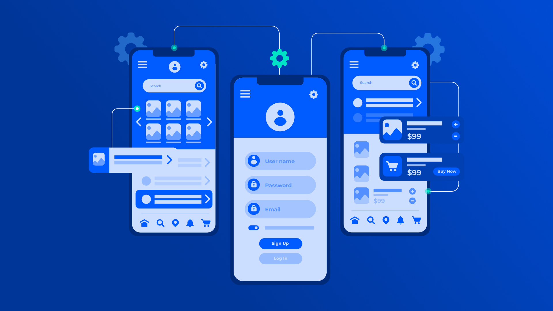
5 Key Aspects of Aesthetics in Web Design
Aesthetics refer to the visual elements of a website. What are the key elements in a website’s design that companies should consider to make a lasting first impression? Let’s find out.
Color
The color combination on a website is crucial because attractive colors get visitors’ attention. Simultaneously, they also reflect the brand identity without compromising elegance.
Typography
Choosing the right fonts and typography is a vital part of the website’s design. Whether it's the font size, headings/sub-headings or the line spacing, everything adds up and affects the readability. It guides users to the right information while holding their interest.
Layout
Structured navigation improves the navigation for website users. Whether it's the elements, images, or the headings on the website, it should be easy for users to find the information they need.
Imagery and Graphics
Using the right images, graphs, and icons is crucial because it helps users understand information better while ensuring visual appeal. The key is to strike a balance and not go overboard.
Whitespace
Content, images and elements cramped in limited space is a turn off. White space or negative space reduces clutter, balances website design, and ensures an optimal visual experience for users.
5 Key Aspects of Functionality in Web Design
Does the website work as good as it looks? Functionality is all about how the website works and if it fulfils user needs and expectations. Below are 5 key aspects of web design functionality.
User-Friendly Interface
The website’s visual and interactive elements including buttons, forms, menus and others enable effective interaction and integration. They allow users to access the information without much difficulty.
Quick and Efficient
A website that helps users find information quickly and complete their actions emerges as a clear winner. An ideal website should have a clear visual structure, reduce the number of steps while helping users accomplish their actions with minimal effort.
Speed
Whether it's accessing different pages, submitting forms or performing other actions, there should be minimal latency. The website should load and process data swiftly without any friction and minimize resource usage.
Error Handling
If users find issues with using/navigating the website, there must be error handling mechanisms in place to enhance user experience. The mix of text and visual feedback and constructive guidance minimizes disruptions.
Interactivity
A website's interactive elements must do more than share information with users. Besides enabling better navigation and enhancing the user experience, interactive elements must guide user behavior and provide clear, real-time feedback (resembling human interactions).
Best Ways to Blend Aesthetics and Functionality in 2025
Now that we know what the aesthetic and functional elements of websites are, let’s explore some potent strategies to blend aesthetics and functionality.
Think From the Audience’s Perspective
Following trends or copying a competitor's UX design is a mistake. Not all audiences are the same. An overly professional website may not go well with the target audience and being too casual can also backfire. Define your target audience by performing some actions like the following.
- Demographics Analysis: Identify age, gender, location, income level, and education of the target audience.
- Psychographics: Understand the interests, values, and lifestyle choices of the audience.
- User Behavior: Pay attention to how the target audience interacts with other platforms. Observe their browsing habits, and analyze their purchase decisions.
- Competitor Research: Conduct competitor research on how they attract and retain their audience.
- Surveys & Interviews: Obtain direct feedback from potential users to gain insights into their needs and problems.
- Analytics & Data Insights: Track real-time user behavior by leveraging tools like Google Analytics, heatmaps and user session recordings.
- Customer Personas: Create detailed fictional representations of your target audience to facilitate informed decision-making.
Focus on Visual Hierarchy
Potential customers may not have the time or patience to scroll through a website in detail. Employ visual hierarchy so that they notice the key elements first, increasing the chances of conversions.
- Size and Scale: Emphasize content with larger fonts for headings and smaller ones for text that provides additional information.
- Color Contrasts: Use contrasting colors for CTAs to grab user attention and encourage them to take the desired action.
- Positioning: Elements like menus and CTAs should be placed in the webpage’s center or places where users notice them instantly.
Simplicity is Key
Adopt a minimalist approach to design. It doesn’t mean the website should be dull and boring. On the contrary, it's about eliminating the unwanted elements and retaining what’s necessary. Below are a few steps to ensure a simplistic yet effective design.
- Redundant Content: Too much text, excessive use of images and repetitive information is a turn off for users. Brands must prioritize precise and meaningful content that provides value.
- Color Combinations: Professional websites must not use too many colors. Sticking to a uniform color palette with two or three colors lends a professional yet aesthetic look.
- Limit Font Styles: Too many fonts make the website look ugly and unprofessional. It makes sense to have two fonts, one for the headings and another for the body text.
- Avoid Excessive UI Elements: Eliminate buttons, icons, and widgets that complicate navigation without offering additional value. Every button must have a specific purpose.
Lastly, use ample white space to improve content readability and maintain a consistent design across all website pages.
Accessibility Matters
Companies must understand that they must cater to a broad audience to ensure optimal functionality. Hence, it is crucial to consider the needs of users with special needs like the visually impaired, people with motor disability or other conditions that make navigation difficult. A website with excellent UX is one that facilitates simple and effective access for all users.
Regular Testing
As stated above, a blend of functionality and aesthetics are the hallmarks of a good website. However, it is important to ensure that the website stands the test of time. Usability testing is the key to achieving this objective. From time to time, companies must gather real-time user feedback to solve customer problems and enhance their experiences.
- Usability testing highlights issues such as poor navigation and readability, unclear CTAs.
- Insights gathered through usability help refine elements like fonts, layouts and images, which enhances usability and improves user engagement.
- Testing also improves user functionality by ensuring that buttons, interactive elements and forms work as expected.
- Usability testing prevents costly redesign post-launch and ensures optimal user experience.
- Without high bounce rates, negative reviews or poor conversions, the website performs well and meets user expectations.
Emotional Connect
Aesthetics and functionality will grab user attention but emotional connection is what turns them into loyal customers. When users feel they connect with your brand on an emotional level, it fosters long-term engagement and trust. The strategies below help with fostering emotional connection.
- Integrate visceral design (first impressions), behavioral design (usability and functionality), and reflective design (long-term impact) to create a positive and long-lasting user experience.
- Define the brand personality. Whether it's professional, casual or luxury/exclusivity, the fonts, typography and tone should reflect the same.
- The colors, fonts, and images should tell the brand story and engage with the users.
Contextually Aware Design
User contexts are unique. A design that works in one particular context may be unsuitable for others. Brands must consider the different environments and conditions that influence user interactions. Based on these factors, brands can implement contextually aware designs.
- Take into account lighting conditions. Enable dark mode for low-light environments to ensure an optimal viewing experience for users.
- Adapt UI based on diverse user locations, devices and internet speeds.
- Leverage dynamic layouts that automatically adjust based on content length or input type.
Personalization and Adaptability
Tailor interfaces, content and user interactions to suit their preferences and behaviors. Such adaptation and personalization techniques enhance user experiences, making them more intuitive and engaging. At the same time, it also improves functionality and fosters emotional connection.
Besides adaption to screen sizes and locations, AI-driven recommendations based on user history can enhance experiences further. These recommendations help users save time by reducing the need for manual searches, and boost engagement by showing relevant and unique content. Companies can implement them in the following ways.
- Providing bespoke product/content recommendations based on past searches or interactions.
- Dynamic UI elements on dashboards (news feeds) can push out content based on the user’s reading/browsing habits.
Prioritize User Needs in UI/UX Design
In UI/UX design, understanding and prioritizing user needs is paramount. The primary goal of any design should be to meet the users' requirements, whether aesthetic or functional. When user needs guide the design process, the result is a harmonious blend of beauty and usability.
For instance, an aesthetically pleasing app layout that doesn't cater to user needs may result in user frustration, leading to lower engagement rates. Conversely, a design that prioritizes user needs — in terms of accessibility, ease of use, and intuitive navigation — enhances user satisfaction and engagement, even if the design isn't visually stunning. Balancing aesthetics and functionality starts with user-centric design.
Follow Design Principles for Balanced UI/UX Design
Maintaining balance in UI/UX design involves adhering to key design principles. Principles like consistency, simplicity, visibility, and feedback ensure that a design is aesthetically pleasing while remaining functional.
Consistency in design elements fosters familiarity, simplicity reduces cognitive load, visibility ensures users find what they need easily, and feedback lets users know their actions have been acknowledged.
When designers adhere to these principles, they can create interfaces that are visually appealing and highly functional, enhancing the overall user experience.
The Role of White Space in UI/UX Design
White space, often overlooked, plays a significant role in balancing aesthetics and functionality in UI/UX design. It refers to the unmarked areas in a design, which can be any color, not necessarily white.
White space provides visual breathing room for the eye, enhancing the aesthetic appeal of a design. Functionally, it helps guide users' attention to key elements, improving readability and comprehension.
When you skillfully use white space, designers can create UI/UX designs that are both visually pleasing and user-friendly.
Responsive Design as a key to Balanced UI/UX Design
Responsive design is a crucial aspect of modern UI/UX design. It ensures that a website or app's layout adjusts seamlessly to different screen sizes, providing users with an optimal viewing experience across various devices.
Aesthetically, responsive design ensures that the visual elements look good on all screens, maintaining design integrity.
Functionally, it ensures that users can easily interact with the interface, regardless of the device they're using. Therefore, responsive design plays a key role in balancing aesthetics and functionality in UI/UX design.
Intuitive Navigation as the Cornerstone of Balanced UI/UX Design
Intuitive navigation is an indispensable element of any successful UI/UX design. It ensures that users can easily find what they're looking for, enhancing their overall experience.
Aesthetically, a well-structured, clean navigation menu contributes to a sleek and organized design. Functionally, it allows users to navigate through a website or app seamlessly, reducing frustration and increasing user satisfaction. By prioritizing intuitive navigation, designers can create a balance between aesthetics and functionality, leading to a more engaging and user-friendly design.
The Role of Typography and Readability in UI/UX Design
Typography plays a vital role in UI/UX design, influencing both aesthetics and readability. The right choice of fonts and text layout can make a design visually appealing and easy to read.
Aesthetically, well-chosen typography can complement the design elements, adding a layer of sophistication. In terms of functionality, good typography enhances readability, ensuring users can easily consume the content. Poor typography choices can lead to strain and confusion, potentially driving users away.
Therefore, careful selection of typography is crucial to balance aesthetics and functionality in UI/UX design.
Testing and Iteration to Perfect the Balance in UI/UX Design
Testing and iteration are crucial processes in UI/UX design, helping to balance aesthetics and functionality. Regular testing and iteration based on user feedback allow designers to identify areas of the design that need improvement.
Aesthetically, this could involve adjusting visual elements to increase appeal. Functionally, it could mean refining features to improve usability. This continual process of refinement ensures the design remains both visually pleasing and user-friendly, striking the perfect balance between aesthetics and functionality.
Top 10 UI/UX Trends to Watch Out for in 2025
Trends come and go, but some leave a lasting impact that paves the way for a new era. Below are the top 10 UI/UX trends that companies should consider in 2025 to enhance the user experience.
- Website Builders Rule: Companies are increasingly using website builders equipped with AI assistants, CMS APIs and other advanced tools to reduce the need for custom web development.
- AI Automation: AI automates design, generates graphics, and enhances prototype-building for speedier and more effective workflows.
- Action-based Evolution: Tools such as Copilot are becoming more action-based. Systems infused with AI and NLP streamline communication and collaboration while completing complex workflows.
- Rise of Generative AI Videos: Enhanced UI/UX content creation and storytelling is a reality with AI-generated videos and 3D text.
- AR/VR Dominates: Despite slow adoption, immersive experiences are gaining popularity in e-commerce, e-learning, and design.
- Enhanced Connectivity: 5G and satellite tech improve app performance and accessibility in remote areas with connectivity issues.
- Silent Authentication: Biometric recognition, device recognition, and session tokens reduce login friction.
- Static Websites Disappear: High interactivity and creative development usher in a new era in dynamic web experiences.
- Figma dominates UI/UX tools: Brace yourself to experience market shifts towards integrated designer-developer workflows and no-code tools.
- Dark Mode is Non-Negotiable: Reduces eye strain, improves accessibility, and enhances readability in UI/UX design.
- Voice User Interface: Integrate voice-user interface to facilitate natural, intuitive and hands-free experiences.
4 KPIs for Measuring and Improving UI/UX
Below are the four KPIs to track and improve UI/UX
- Task success rate: This dictates how easily users can complete a particular task.
- Time on task: Crucial KPI to measure the efficiency of the interface
- User error rate: Monitors the frequency and type of user errors.
- Net Promoter Score (NPS): How likely users are to recommend your digital product Sheds light on the probability of users recommending the company’s products.
- Engagement metrics: Reveals click-through rates, bounce rates, and session duration.
Achieving Balance in UI/UX Design with TheFinch Design
Balancing aesthetics and functionality in UI/UX design is a vital aspect of creating effective digital experiences. Prioritizing user needs, adhering to design principles, smart use of white space, incorporating responsive design, creating intuitive navigation, selecting the right typography, and committing to ongoing testing and iteration are key to striking this balance.
When designers incorporate these elements, they can create digital experiences that are not only visually pleasing but also highly functional, enhancing user satisfaction and engagement. If you're ready to create a balanced UI/UX design that resonates with your users and drives business growth, reach out to our team UI UX Designing at TheFinch Design.
Let's create a digital presence that beautifully marries aesthetics and functionality.
Ravi Talajiya
CEO of TheFinch
With over a decade of experience in digital design and business strategy, Ravi leads TheFinch with a vision to bridge creativity and purpose. His passion lies in helping brands scale through design thinking, innovation, and a deep understanding of user behavior.