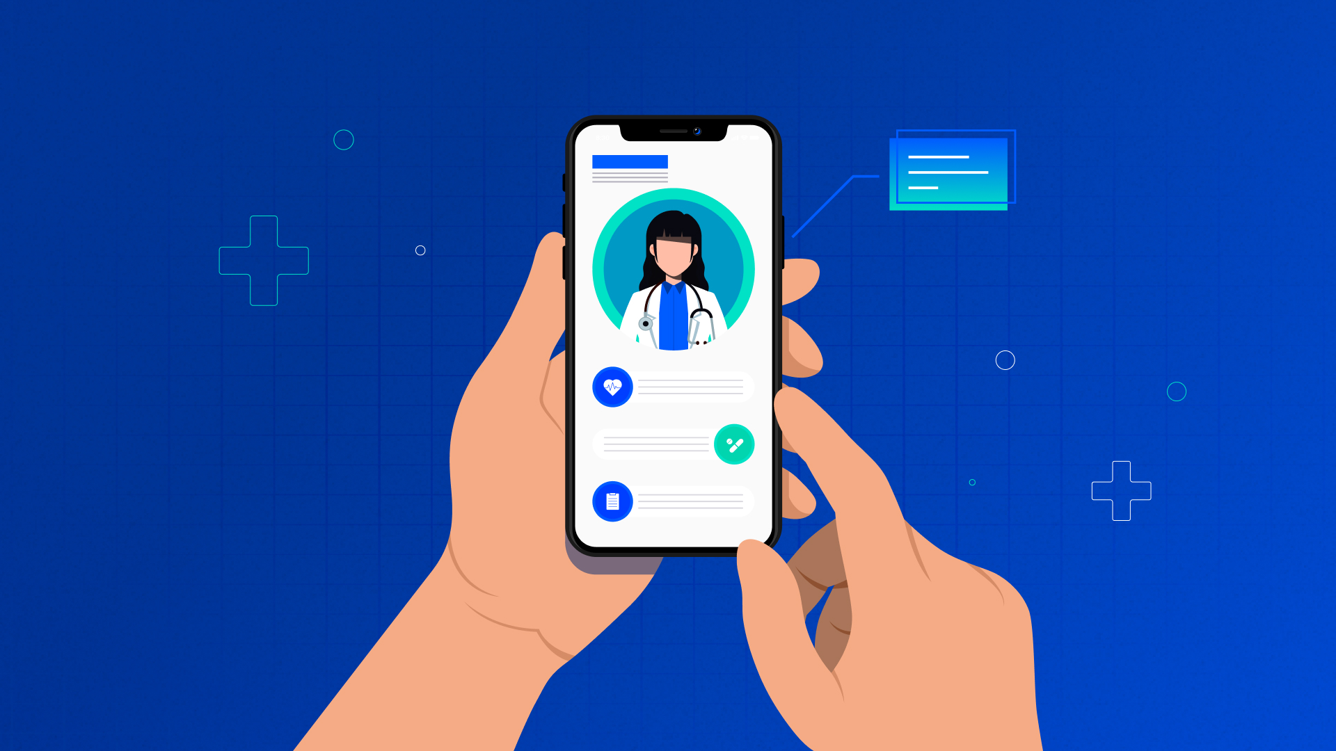
Healthcare design is entering a sharper phase in 2026. Patients expect speed, clarity, and continuity across digital and in-person care. Clinicians expect tools that don’t slow them down. Product teams are dealing with hybrid care journeys, wearable data, remote monitoring, and AI-assisted workflows, while privacy and accessibility expectations keep rising.
This is where ui ux design in healthcare stops being “nice UX” and becomes product safety, adoption, and retention.
This guide is built to be usable. No vague advice. Just practical patterns, checks, and 2026 shifts to consider while shipping healthcare app ui ux design that feels patient-first and still works in real clinical operations.
What “patient-first” means in 2026
Patient-first design isn’t only about “friendly colours” or softer copy. It’s about removing avoidable effort at the exact moments where patients are stressed, distracted, or low on energy.
In 2026, patient-first typically means:
- Care feels continuous across online consults, follow-ups, prescriptions, labs, and in-clinic visits
- The next step is obvious after every action
- Patients understand outcomes, not just data
- Accessibility is built-in, not patched later
- Trust is designed through transparency, consent clarity, and predictable behaviour
2026 healthcare UX conversations are increasingly shaped by hybrid care journeys, AI-enabled experiences, and wearable or remote monitoring usage becoming mainstream product expectations.
The “Care Journey Map” that stops products from feeling fragmented
A healthcare app can look polished and still feel broken if it behaves like separate mini-products stitched together.
Use this simple map while designing user experience design in healthcare:
1. Discovery
What is this service? Who is it for? What happens next?
2. Entry
Login, verification, consent, profile, insurance (where relevant)
3. Care moment
Booking, consultation, assessment, triage, monitoring, messaging
4. Aftercare
Summary, follow-up plan, prescriptions, reminders, progress
5. Support and recovery
Rescheduling, refunds, tech issues, escalation, complaint handling
If any step becomes confusing, patient effort increases. Patient effort is the enemy of engagement.
Design principle #1: Trust is a UI problem first
Patients don’t judge trust through a policy page. They judge it through small interface behaviours:
Trust cues that work quietly
- Clear appointment confirmations and next steps
- Visible clinician identity and context
- Transparent data use summaries in plain language
- Predictable navigation and back behaviour
- “Saved” states that remove anxiety (reports uploaded, forms submitted)
Trust cues that backfire
- Surprise steps after payment
- Unclear consent with forced acceptance
- Too many warnings with no action guidance
- Dead ends after important actions
Also, 2026 products are blending digital and in-person steps more tightly, so trust depends on consistency across the entire journey, not just the app interface.
If people are starting journeys and not finishing them, trust and clarity gaps are usually sitting in the flow.
Design principle #2: “Reduce thinking” beats “add features”
Most patient drop-offs happen because the interface asks for too many decisions.
A practical way to improve healthcare ux design is to lower cognitive load in repeatable areas:
Use guided choice instead of open choice
Bad: “Pick from 14 consultation types”
Better: “What do you need help with today?” + 4 options + “Not sure”
Use progressive detail
Ask essentials first, deeper details only when needed.
Use defaults that reflect real behaviour
- suggest “soonest available” appointment slots
- remember preferred pharmacies
- default to last used patient profile for caregivers
This is one of the fastest ways to hit healthcare ux best practices without rebuilding the product.
Design principle #3: Make errors hard to create and easy to recover from
Healthcare products should expect mistakes. People are tired. Clinicians are multitasking. Patients are anxious.
Build for prevention and recovery:
Prevention patterns
- input masking for dates, phone, dosage
- warnings on risky actions (cancel care plan, delete records)
- smart validation that explains the fix
Recovery patterns
- undo actions where possible
- autosave on forms
- draft states for uploads and messages
- “Resume where you left off” after interruptions
This is where healthcare app usability becomes real-world usability.
The 2026 Healthcare UX Checklist (print this for product reviews)
A) For patients
“What happens next?” is visible after every major action
No long forms before value is clear
Call, chat, and appointment recovery flows are obvious
Health data is explained as meaning + trend, not raw numbers
Consent is readable, skimmable, and honest
Accessibility holds up at larger text sizes
B) For clinicians
One-screen snapshot before the consult starts
Minimal clicks for routine documentation
Smart templates that reflect real cases
Stable workflows during interruptions
Clear task ownership (who does what next)
C) For the system
Edge cases are designed (network drop, device change, missing data)
Role-based permissions are clear
Audit trails exist for sensitive actions
Escalation paths exist for urgent risks
These checks are aligned with where digital healthcare UX in 2026 is heading: integrated journeys, real-time monitoring expectations, and AI-supported workflows that must still stay safe and human-controlled.
2026 trend watch: what’s changing in healthcare UI/UX right now
Trends are only useful if they change product decisions. These are the shifts affecting build priorities in 2026:
1) Hybrid care journeys feel “one journey” or people drop off
Products are moving past “telehealth as a feature” towards blended care journeys across digital touchpoints and physical care.
UX impact: appointment + follow-up + lab + prescription needs to feel connected.
2) Wearables and monitoring need calmer UX
Wearables are expected to “fit into daily life” without feeling intrusive, which pushes UX towards gentle prompts, meaningful summaries, and low-friction logging.
UX impact: focus on habits, not dashboards.
3) Accessibility expectations are rising across healthcare apps
WCAG 2.2 is the current standard many public healthcare services align to, and it’s being referenced in NHS app testing and integration expectations.
UX impact: contrast, focus states, touch targets, readable content at scale must be planned early.
4) Voice and touch-free interactions are becoming more practical
Hands-busy environments and hygiene constraints keep pushing voice-first and touch-free interaction patterns in healthcare contexts.
UX impact: consider voice actions for repetitive tasks, where it truly helps.
Case snapshot: iTHREOS (Women’s PCOS community and support app)
One way to see patient-first UX clearly is to look at how health apps create comfort and continuity.
TheFinch Design team designed an all-in-one app for women with PCOS, built as a space to share experiences, exchange knowledge, and support one another.
What’s interesting from a healthcare UX lens:
- A community-led model reduces isolation, which can improve retention
- The “support + learning + tracking” concept ties into continuity of care
- The dashboard-first approach supports quick orientation without hunting
This is a good reminder: patient-first isn’t always a clinical workflow. Sometimes it’s emotional safety, guidance, and long-term support design.
What a strong healthcare UI/UX partner does differently in 2026
A “nice UI team” can ship screens. A healthcare product partner should be able to handle:
- Complex journeys across roles (patient, caregiver, clinician, admin)
- Information-heavy decisions without clutter
- Risk-aware flows (consent, escalation, errors)
- Behaviour design (follow-ups, monitoring adherence)
- Accessibility by default (not only at QA stage)
This is where ui ux design for healthcare stops being a deliverable and becomes a product capability.
Conclusion
Healthcare UX in 2026 is moving fast, yet patient expectations remain simple: clarity, trust, and ease. The products that win are the ones that guide users through real care moments without friction, support clinicians without adding load, and treat accessibility and safety as core design work.
FAQs
1) What does “UI/UX design in healthcare” cover in 2026?
It covers patient apps, clinician tools, remote monitoring, telehealth journeys, portals, dashboards, and care workflows designed for safety, clarity, and retention.
2) What are the most useful healthcare UX best practices?
Clear next steps, lower cognitive load, predictable flows, strong error recovery, accessibility, and consistent trust cues across the journey.
3) Which healthcare UX trends matter most in 2026?
Hybrid care journeys, wearable and monitoring UX becoming more common, stronger accessibility expectations, and practical voice-first experiences.
4) How can UX reduce clinician burnout?
By reducing clicks, supporting quick documentation, keeping context visible, and designing for interruption-heavy workflows with reliable recovery states.
5) Why should accessibility be planned from day one?
Because healthcare apps serve diverse users, and WCAG 2.2 AA alignment is widely referenced for public services and integration standards.