AI and ML dashboards sit at an awkward intersection: they are expected to explain complex model behaviour, support day to day decisions, and stay readable under pressure. When the UX is off, teams stop trusting the charts, alerts get ignored, and “what changed?” becomes the only question anyone asks. Strong AI data visualisation UX is less about fancy charts and more about clarity, confidence, and action. It helps users understand what the system is doing, why it is doing it, and what they should do next.
This guide covers practical patterns for designing AI dashboards that support both product and operations teams, with a focus on interactive ML data visualisation, data storytelling for AI, and ML model performance visualisation that holds up in real workflows.
Explore our AI product design work or talk to TheFinch Design about your dashboard goals.
1) Start with jobs to be done, not charts
Before deciding on visualisations, map the real questions users ask:
- “Is the model healthy right now?”
- “What changed since yesterday?”
- “Which segment is failing?”
- “Can I trust this prediction for this case?”
- “What action should be taken, and by whom?”
Your layout should mirror these questions. A good pattern is a top level “state of the system” view, followed by drill downs that answer “why” and “where,” and ending with “what to do now.”
If your dashboard has grown organically and feels crowded, a short UX audit can surface the core user questions and remove noise.
CTA Button: Book a dashboard UX audit.
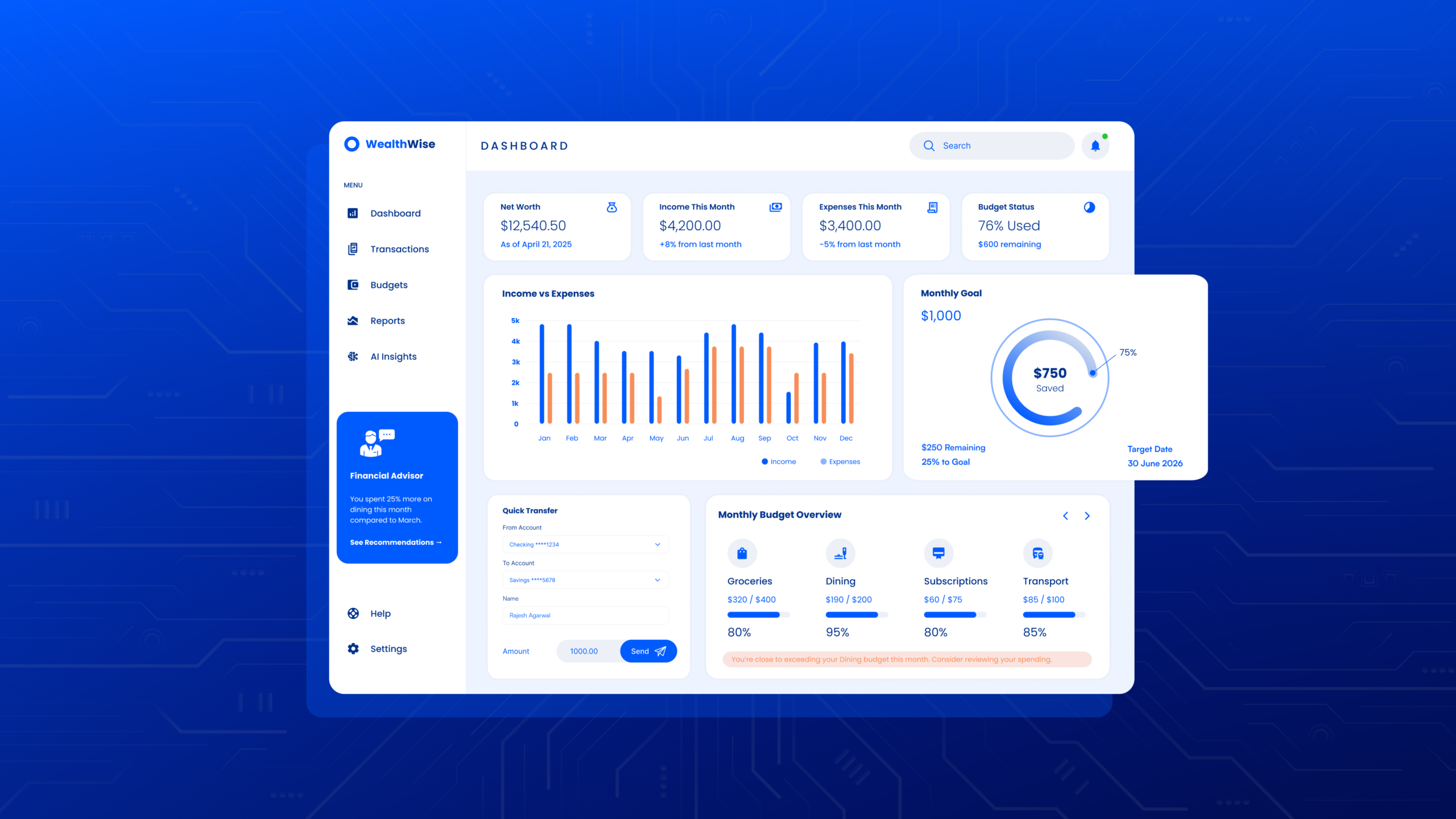
2) Design the information hierarchy for speed
Dashboards are scanned, not read. Build a hierarchy that supports a 10 second scan and a 2 minute investigation.
A strong structure for UX for machine learning platforms:
- Top row: system health, recent change, primary risk, key SLA metrics
- Middle: drivers and segment breakdowns (what is causing the change)
- Bottom: diagnostics and evidence (logs, traces, samples, lineage)
Use consistent card patterns: title, time window, number, delta, confidence cue, drill down.
Avoid:
- placing all metrics at equal visual weight
- mixing business KPIs and model metrics without clear separation
- hiding time windows or refresh cadence
3) Make time, freshness, and context impossible to miss
Teams lose trust when they are not sure what time range a chart covers, or whether the data is current. Every key chart should show:
- time range (last 24h, 7d, 30d)
- last updated time
- data source (batch, streaming, manual)
- timezone and aggregation level
For operational settings, add a “data delay” indicator. If upstream events lag, users need to know before they act.
If your users ask “is this live?” in meetings, it is a UX issue, not a training issue.
CTA button: Let’s fix the dashboard foundations.
4) Treat uncertainty as first class UX
AI outputs are probabilistic. The UI should support that reality.
Ways to show uncertainty without overwhelming:
- confidence bands on forecasts
- probability ranges for classifications
- top contributing features with stability indicators
- “needs review” states when confidence drops below a threshold
Use plain language labels: “High confidence,” “Mixed signals,” “Low confidence.” Pair them with a short tooltip that explains what drives the label.
This is a core part of operational AI UI because the goal is not just insight, it is safer decisions.
5) Prioritise the right ML model performance visualisation
Different roles care about different signals. Keep a role based view or clear tabs.
Common metrics and how to present them:
- Classification: precision, recall, F1, AUC, confusion matrix
- Regression: MAE, RMSE, MAPE, residual plots
- Ranking: NDCG, MAP, click based outcomes
- Forecasting: error bands, drift vs seasonality separation
For leadership views, translate model metrics into impact: “false positives up 12% in Segment B, support tickets increased 8%.” This is where data storytelling for AI is needed: connect performance to outcomes.
6) Build interactive ML data visualisation that answers “where is the problem?”
Interactivity should reduce investigation time, not add playfulness.
High value interactions:
- segment filters (region, device, channel, cohort, model version)
- brushing a time range to update all connected charts
- click to isolate a segment from a bar chart into a detailed view
- compare mode (this week vs last week, version A vs version B)
Keep interaction rules consistent and visible. Use “applied filters” chips with one click removal.
Want a dashboard that supports quick triage and deeper diagnosis without rework?
CTA: Ask about our dashboard UX redesign process.
7) Explain model changes with versioning and lineage
A dashboard that cannot show what version is running and what changed will struggle in production.
Include:
- model version, training date, feature set version
- data pipeline version
- deployment notes
- links to experiment results or run history
A “What changed?” panel can summarise: “Model v3.2 deployed, new feature added, threshold adjusted.” Pair it with before vs after comparisons.
8) Make drift and monitoring understandable to non ML users
Drift dashboards often fail because drift is presented as a single number without meaning.
Improve clarity with:
- drift by feature with top movers highlighted
- drift by segment, not just global
- a short sentence: “User behaviour shifted in Segment X after campaign launch”
- recommended checks: retrain, threshold change, data pipeline review
Use “what it means” and “what to do” blocks near drift indicators. This turns monitoring into action.
9) Design alerts that are actionable, not noisy
Alert fatigue kills trust fast. Good alert UX includes:
- severity levels with clear thresholds
- ownership (who is responsible)
- suggested next step
- evidence attached (linked charts, samples, recent incidents)
Avoid alerts that only say “metric breached.” Users need context and a path forward.
A simple improvement is an “Alert detail page” with timeline, root cause hints, and linked runbooks.
10) Use narrative patterns for data storytelling for AI
Dashboards are still stories, just interactive ones. Structure key views as:
- What is happening
- Where it is happening
- Why it is happening
- What to do next
- What to watch after the fix
Add annotations for known events: launches, data outages, policy changes, seasonality spikes. A single annotation often explains what 10 charts cannot.
11) Accessibility and readability are non negotiable
Data products fail quietly when users cannot read them.
Checklist:
- colour is never the only signal (use icons, labels, patterns)
- font sizes support quick scanning
- keyboard navigation for key interactions
- chart labels are readable on smaller screens
- tables support sorting and searching
This is part of AI data visualisation UX because trust is built through clarity and inclusion.
12) Validate with real scenarios and failure modes
Test the dashboard with realistic prompts:
- “A spike happens at 3pm, show me how to triage it in 2 minutes.”
- “A stakeholder asks why accuracy dropped, show your evidence trail.”
- “A new teammate joins, can they understand what they are seeing?”
Include “empty states” and “data missing” states. Production systems break. Your UX should handle that with dignity.
If you want your dashboard UX validated with scenario based testing, we can run a rapid review with your team and prioritise fixes.
Schedule a working session.
Conclusion
Great AI dashboards are built around decisions, not visualisations. When hierarchy is clear, uncertainty is handled openly, and interactivity supports investigation, teams move faster and trust the system more. The goal is a dashboard that explains model performance, highlights risk early, and guides action without confusion.
Actionable CTA: Share your current dashboard (screenshots are fine) and we will reply with a short, practical list of UX fixes and quick wins for your next iteration.
Contact TheFinch Design.
FAQs
1) What makes AI/ML dashboards different from normal BI dashboards?
AI dashboards must explain probabilistic outputs, model changes, drift, and data lineage. BI dashboards can focus on business metrics, while AI dashboards must also support trust, monitoring, and diagnosis.
2) Which charts work best for ML model performance visualisation?
It depends on the model type. Confusion matrices and precision recall views work well for classification, residual plots for regression, and error bands for forecasting. Segment breakdowns are often more valuable than one global score.
3) How do you design interactive ML data visualisation without making it feel complicated?
Interactivity should map to real questions: filter by segment, compare time ranges, drill down into a metric, and trace an alert to evidence. Keep interactions consistent, visible, and reversible.
4) How can data storytelling for AI be added without turning the dashboard into a report?
Use narrative blocks like “what changed” panels, annotations on timelines, and short “what it means” summaries near drift and performance shifts. Keep it concise and linked to action.
5) What are the most common UX issues in operational AI UI?
Unclear time windows, missing freshness indicators, alert overload, weak drill downs, and uncertainty hidden or ignored. These issues reduce trust and slow response time.