






Dashboard UI/UX & Data Visualisation Services
We design dashboards that turn complex, multi-source data into clear decisions. From executive KPI dashboards and public reporting portals to operational scorecards, GIS maps and analytics products, TheFinch Design creates accessible, responsive and developer-ready experiences for every user role.
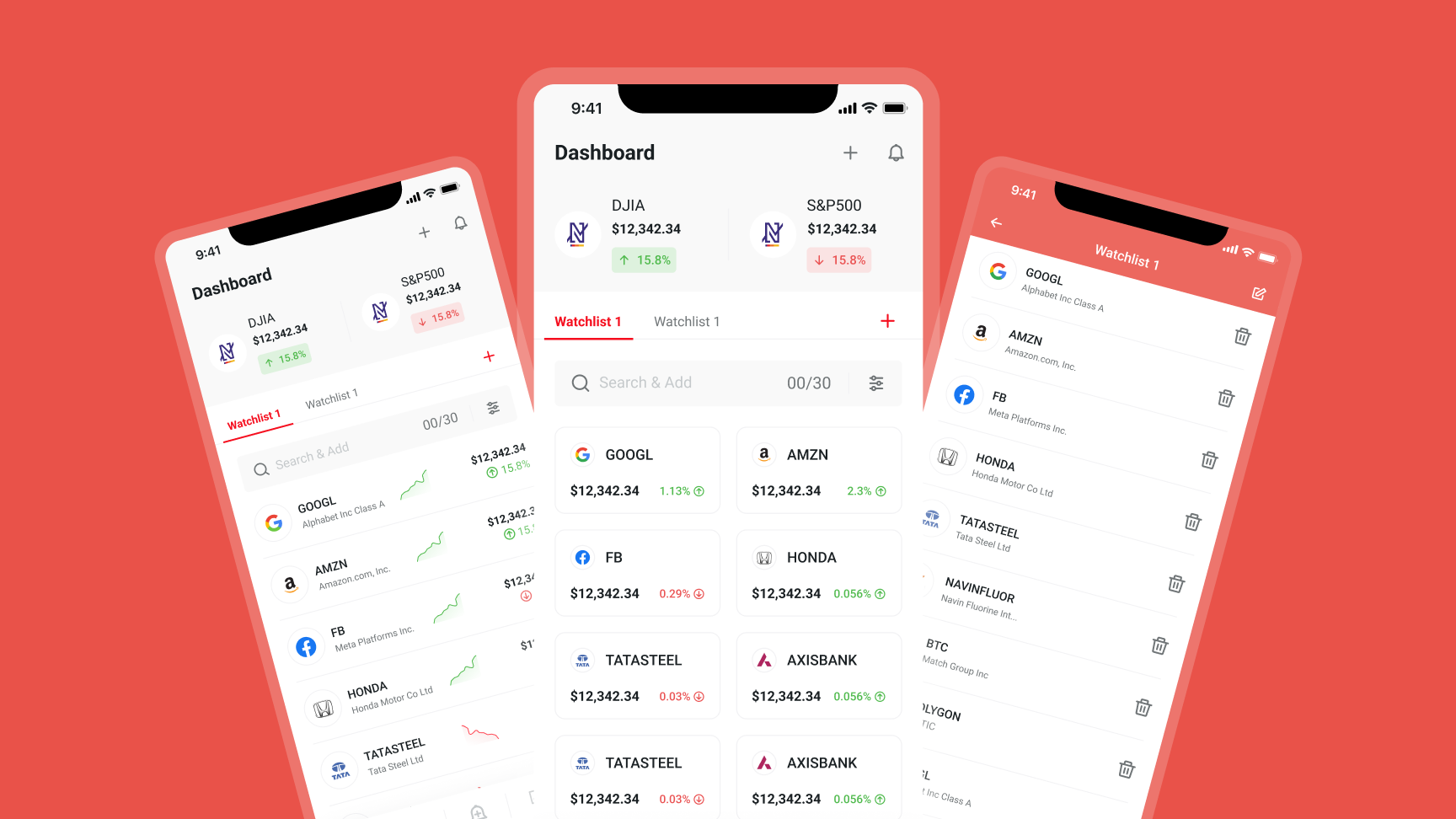
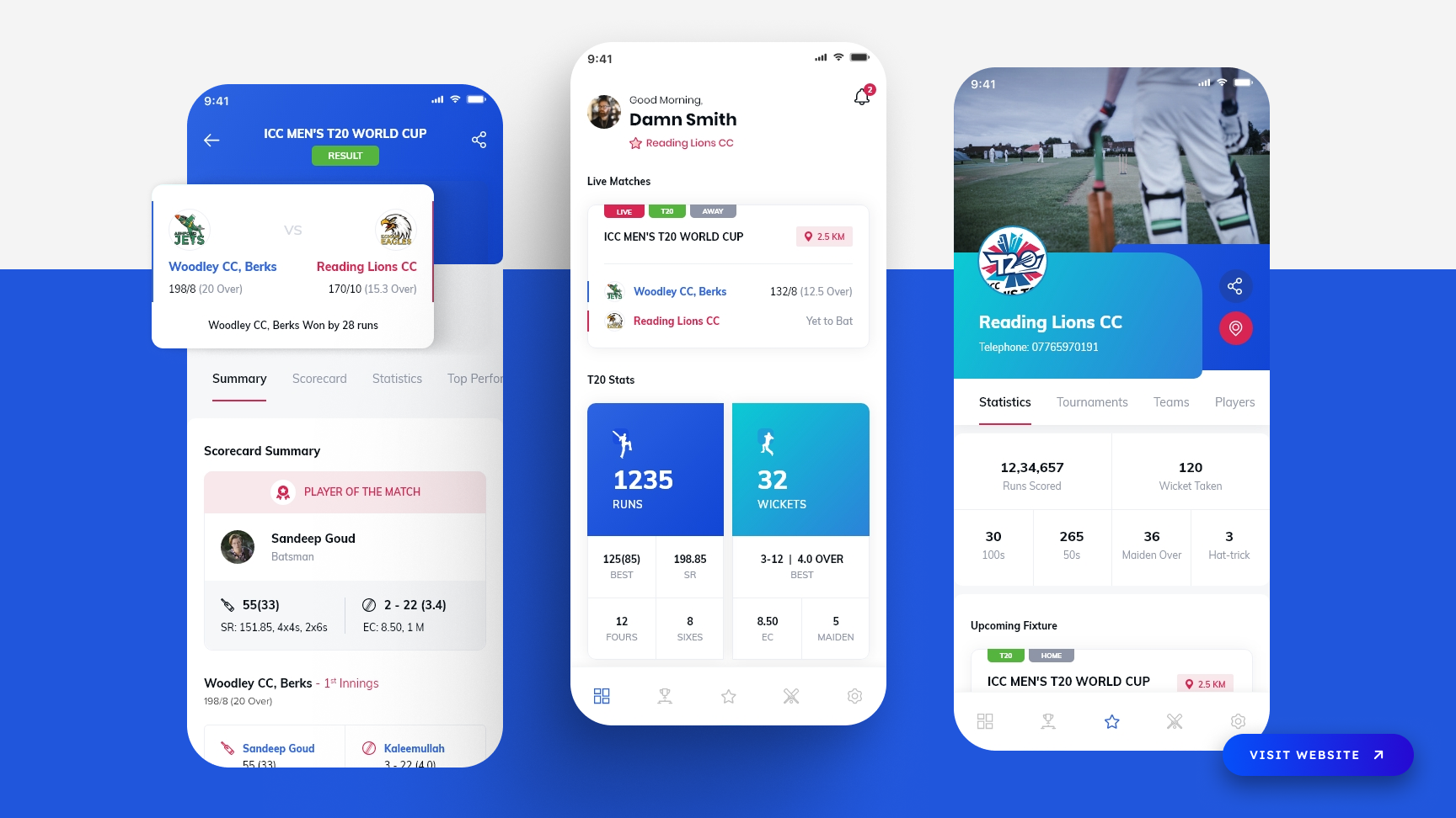
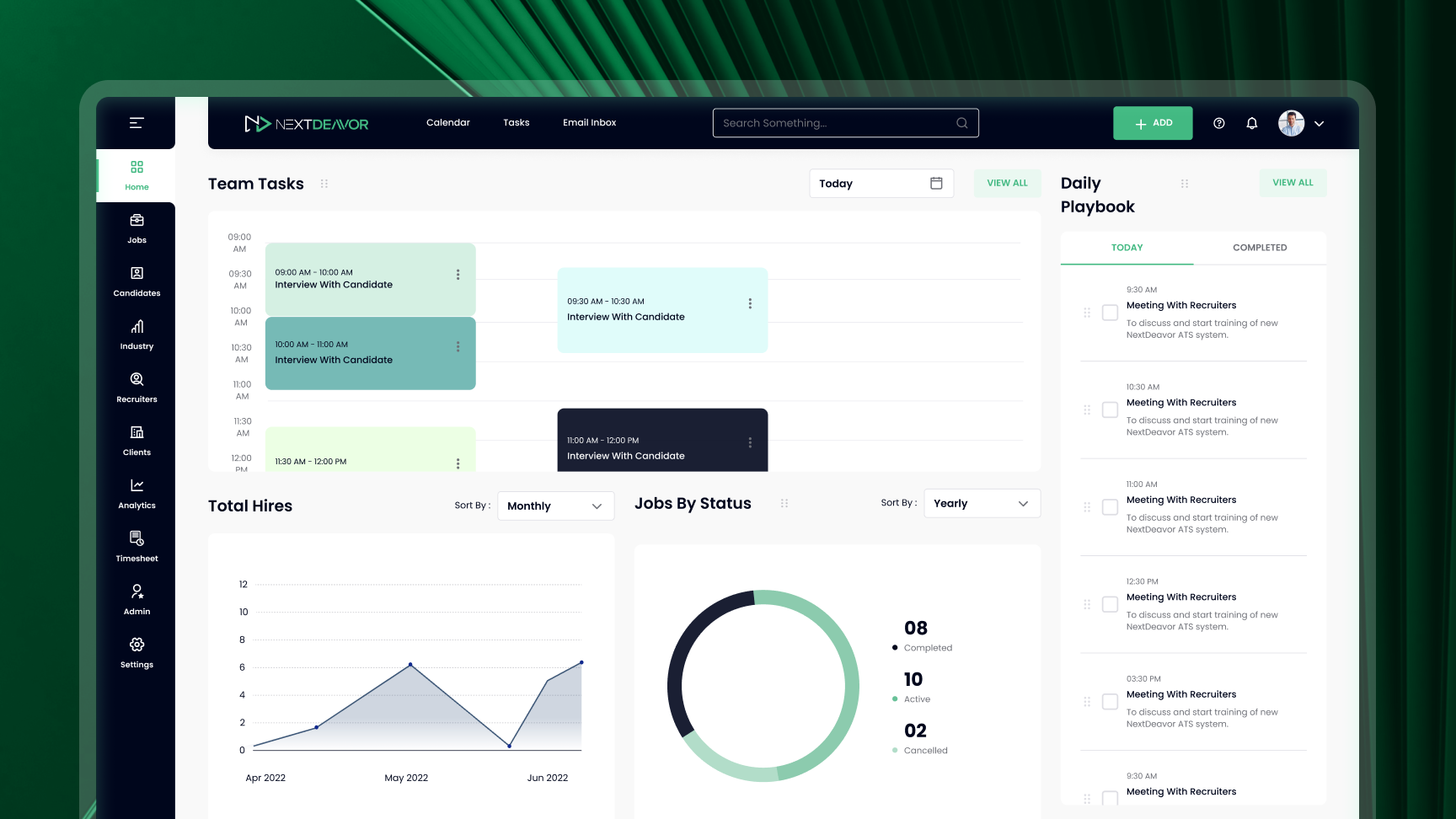
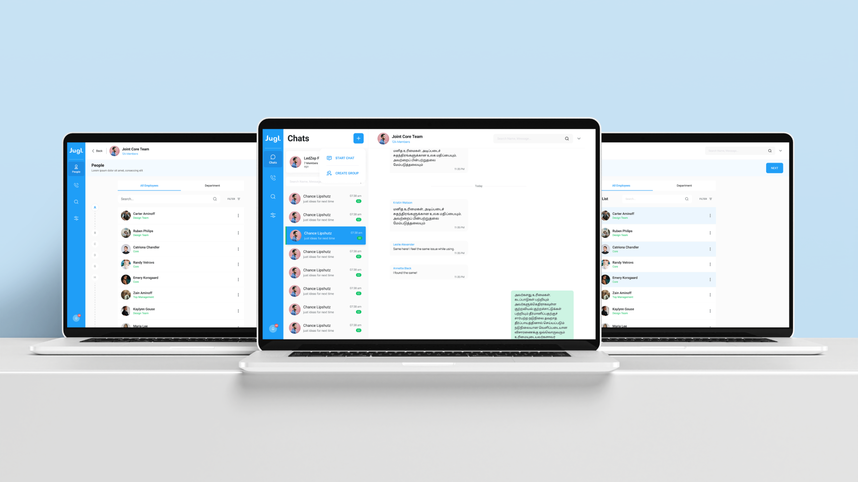
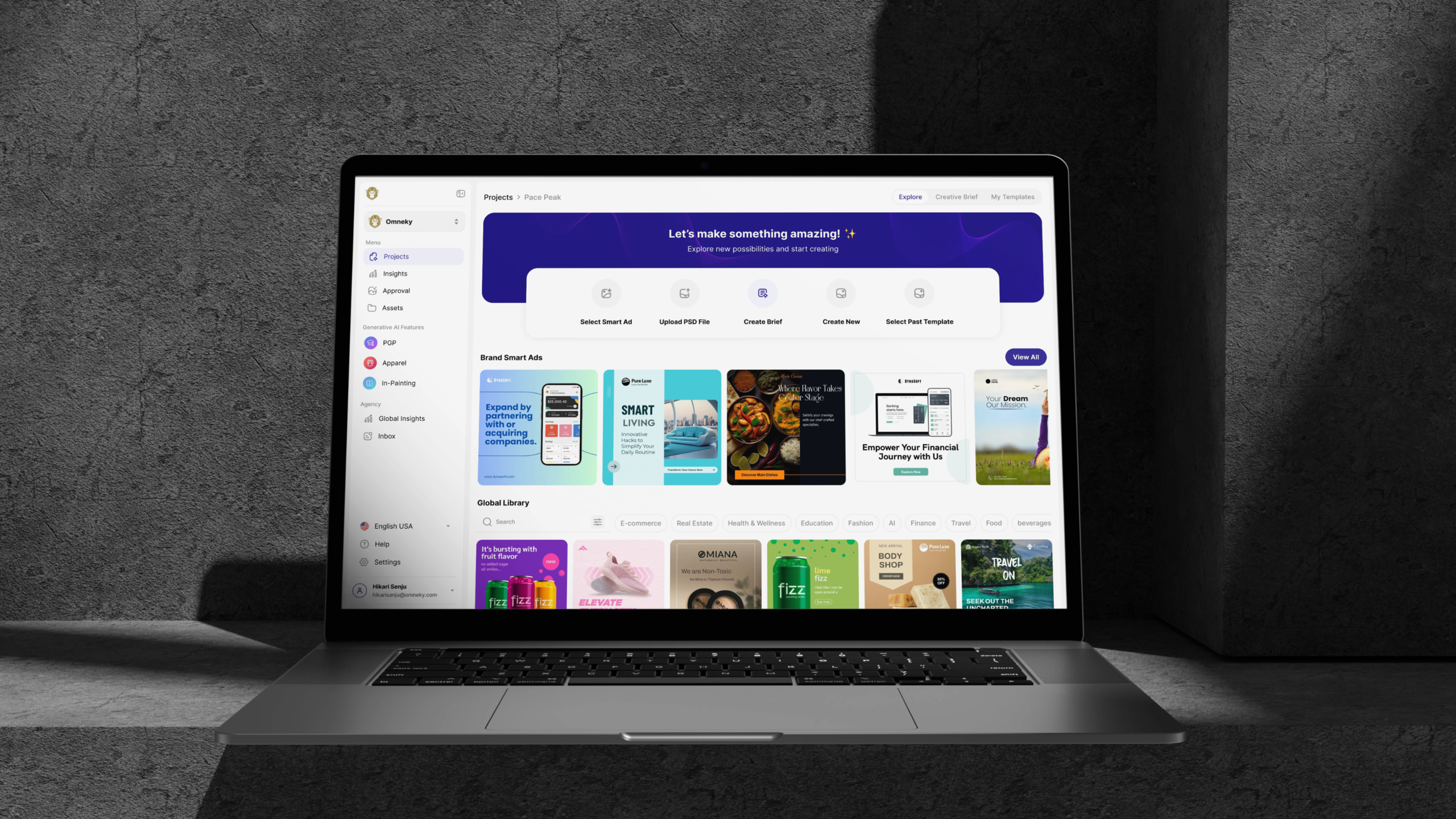
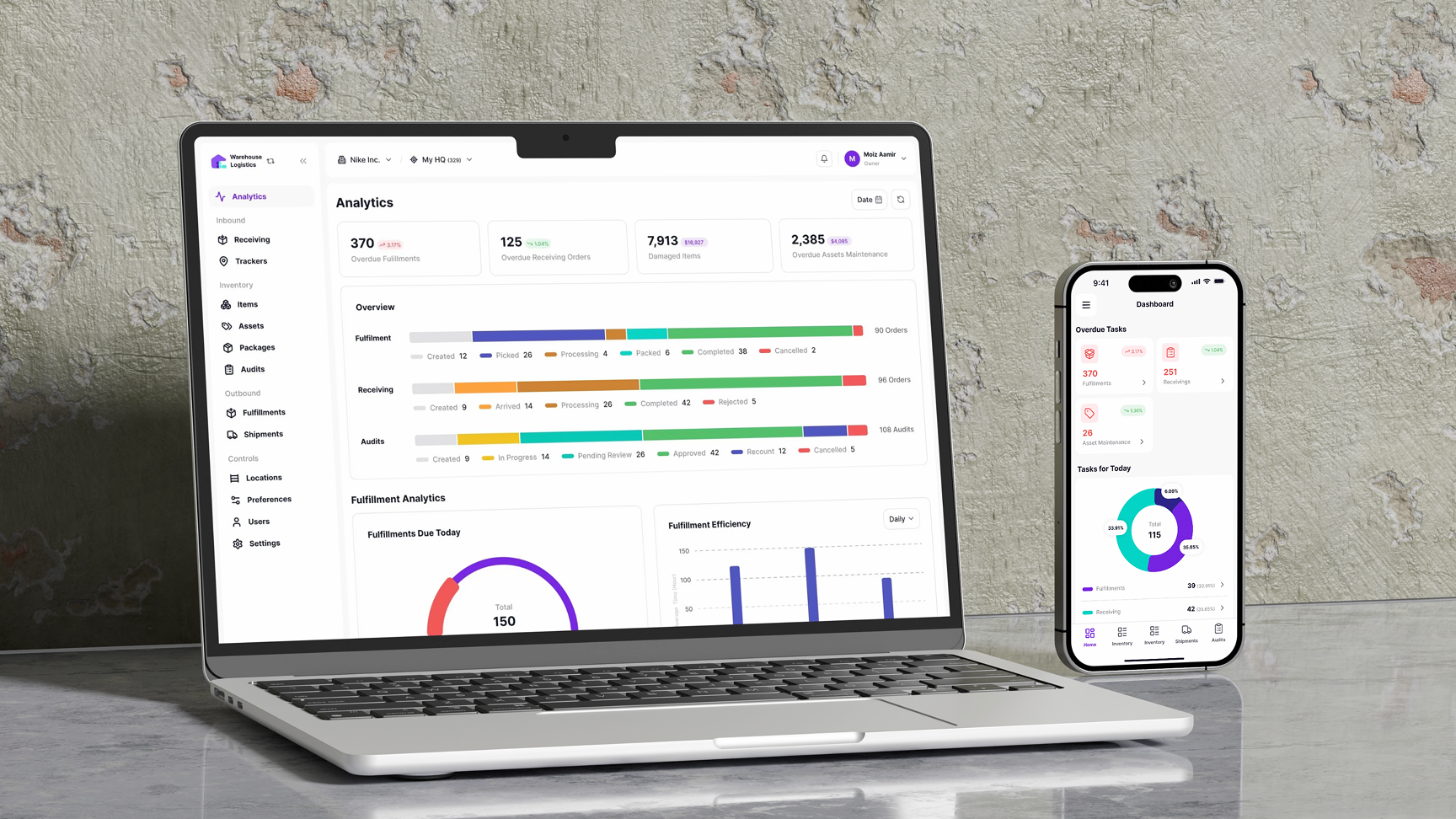
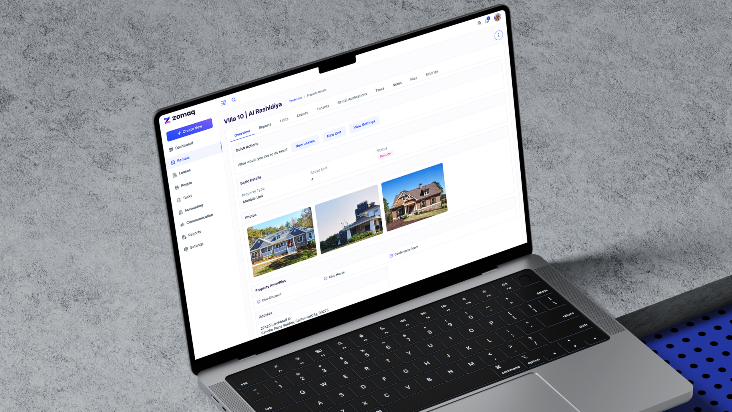
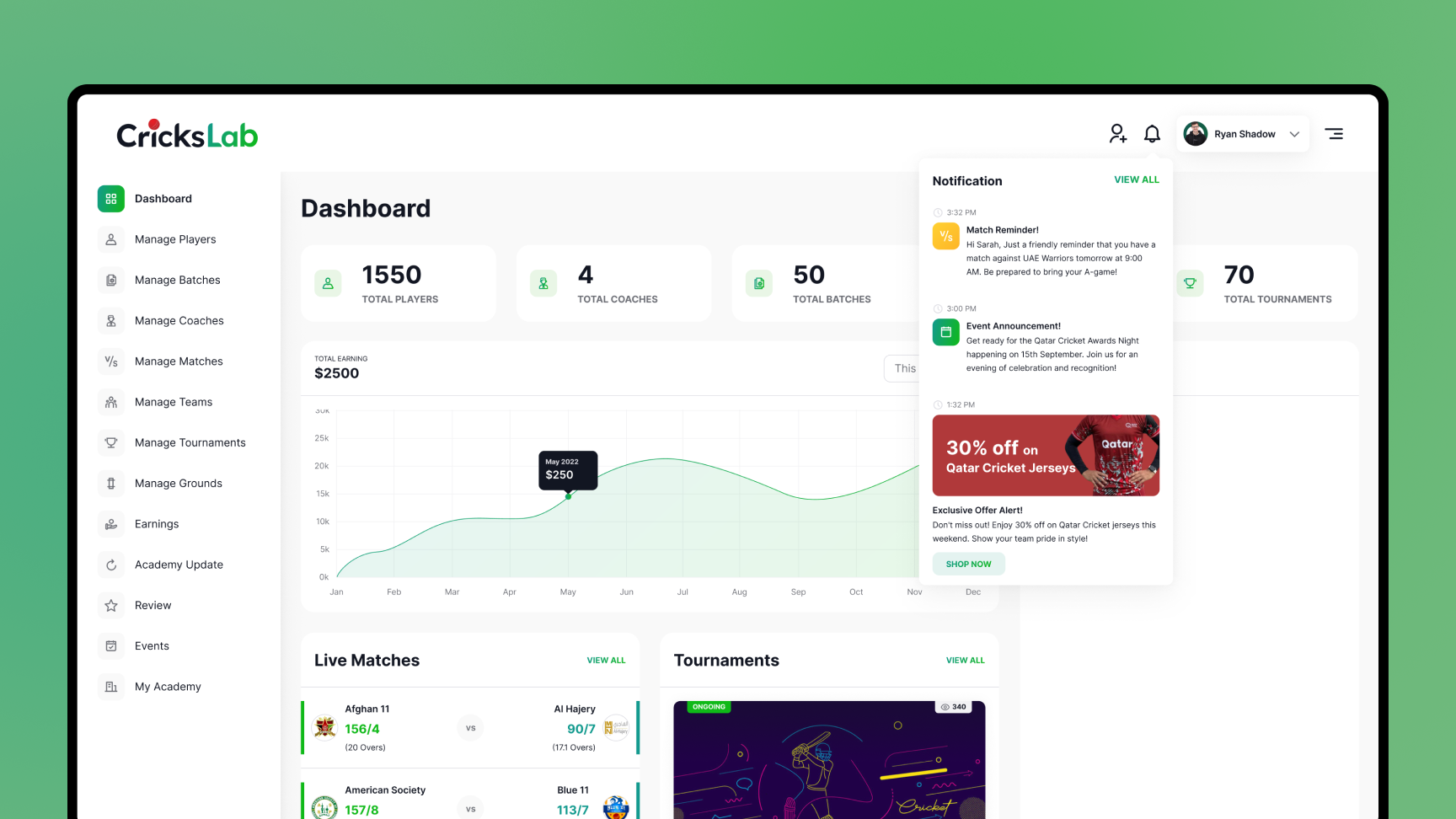
Turn Dashboard Complexity
Into Clear Decisions
Is Your Dashboard
Creating These Problems?
- Critical data is buried: Users cannot see the metrics, changes or exceptions that require attention.
- Reports conflict across teams: Different sources, definitions and layouts make performance hard to compare.
- Filters and drilldowns fail: Users struggle to move from a summary view to the detail behind it.
- Roles and access are unclear: Executives, operators, analysts and public users receive the same overloaded view.
- Reporting is manual and difficult to scale: Teams depend on spreadsheets, recurring exports and one-off charts.
A Clearer Dashboard
Experience Starts Here
- Decision-led dashboard architecture: We organise information around user roles, questions, KPIs and actions.
- Clear KPI scorecards and reporting views: Important performance signals remain easy to scan and compare.
- Interactive data visualisation: Charts, tables, maps, filters and drilldowns reveal patterns without adding noise.
- Accessible, responsive and role-based UX: Each audience receives the information and controls relevant to them.
- Scalable design and delivery: Reusable components, realistic prototypes, documentation and design QA support implementation.
Our Dashboard UI/UX Design and Data Visualization Services
Our dashboard UI/UX and data visualization services cover the decisions, information structure, interface design and implementation guidance needed to build a useful data product.
Dashboard Strategy, Research & Architecture
We define who will use the dashboard, which decisions it must support, what data matters and how users should move from overview to action.
Stakeholder & User Research
Dashboard UX Strategy
KPI & Metric Architecture
Role-Based Dashboard Architecture
Information Architecture & Navigation
User Flows & Task Flows
Dashboard Wireframing
Filters, Search & Sorting UX
Alerts, Notifications & Data States
Accessibility Planning
Dashboard UI & Data Visualisation Design
We turn complex datasets into clear dashboards, scorecards, reports, maps and interactive visualisations for custom products, BI tools and embedded analytics.
Dashboard UI Design
Interactive Data Visualisation
KPI Scorecards & Executive Views
Charts, Graphs & Data Tables
Drilldowns, Comparisons & Trends
GIS, Maps & Location Data
Responsive & Mobile Dashboards
Dashboard Design Systems
Validation, Handoff & Ongoing Design Support
We test critical workflows, document dashboard behaviour and work with product, engineering, BI and data teams through implementation and design QA.
Interactive Prototypes & Usability Testing
Developer Handoff, Documentation & Design QA


Have a dashboard, analytics platform or public reporting brief?
What Our Dashboard UI/UX Capabilities Deliver
Our dashboard UI/UX and data visualization services turn complex data into clear, usable experiences that support faster decisions, improve performance visibility, reduce friction and make critical insights easier to act on.
Faster Decisions
Users can identify what changed, where attention is required and which action should come next.
Clearer Performance
Well-structured KPIs, scorecards, trends and comparisons make progress and exceptions easier to understand.
Lower Cognitive Load
Clear hierarchy, progressive disclosure and focused views reduce the effort needed to interpret complex data.
Virtual Tours and Immersive Visualization
We create AR/VR property walkthroughs, interactive 3D floor plans, and virtual staging experiences that engage users remotely, enhancing property visualization and improving decision-making efficiency.
Easier Reporting
Filters, recurring views, exports and downloadable reports reduce dependence on manual spreadsheets and one-off analysis.
Broader Access
Responsive layouts, accessible visualisation and role-based views make dashboard information usable across audiences and devices.
Scalable Consistency
Reusable components and data-display patterns keep new metrics, modules and reporting views aligned as the product grows.
Our Dashboard UI/UX Design Services for Data-Intensive Industries
SaaS & AI
Product analytics, usage insights, model performance, predictions, admin tools and customer-facing reporting.
Enterprise Operations
Operational KPIs, workforce performance, portfolio management, risks, resources, schedules and internal reporting.
Retailers Expanding Online
Brick-and-mortar retailers transitioning to or expanding their online presence.
Healthcare & Public Health
Programme monitoring, service coverage, facility performance, health indicators, geographic trends and outcome reporting.
Finance & Fintech
Financial performance, portfolio data, transactions, risk signals, audit views and secure role-based reporting.
Logistics & Transportation
Fleet, routes, permits, maintenance, inventory, delivery performance, maps and supply-chain monitoring.
Education
Student outcomes, enrolment, attendance, staffing, finance and multi-school performance dashboards.
Real Estate & Infrastructure
Property portfolios, project funding, maintenance, locations, investment performance and GIS-based reporting.
SaaS & AI
Product analytics, usage insights, model performance, predictions, admin tools and customer-facing reporting.
Enterprise Operations
Operational KPIs, workforce performance, portfolio management, risks, resources, schedules and internal reporting.
Retailers Expanding Online
Brick-and-mortar retailers transitioning to or expanding their online presence.
Healthcare & Public Health
Programme monitoring, service coverage, facility performance, health indicators, geographic trends and outcome reporting.
Finance & Fintech
Financial performance, portfolio data, transactions, risk signals, audit views and secure role-based reporting.
Logistics & Transportation
Fleet, routes, permits, maintenance, inventory, delivery performance, maps and supply-chain monitoring.
Education
Student outcomes, enrolment, attendance, staffing, finance and multi-school performance dashboards.
Real Estate & Infrastructure
Property portfolios, project funding, maintenance, locations, investment performance and GIS-based reporting.
Tourism & Place Intelligence Visitor behaviour, campaign impact, geographic patterns, economic indicators and stakeholder reports.
Why Product Teams Choose TheFinch for Dashboard Design
Decision-First Data UX
We start with the questions users must answer and the actions they must take, then design the dashboard around those decisions.
Role-Based Complexity
We structure different views, permissions and levels of detail without making the overall product feel fragmented.
Platform-Aware Design
Our team works with product, development, data and BI stakeholders so the experience respects implementation realities.
Accessibility & Scale
Responsive behaviour, reusable components and accessible visualisation patterns are considered from the beginning.
Need a design partner for a new dashboard product or a redesign of an existing analytics experience?
Discuss Your Dashboard Requirements