Minimalist UX Design: How Design Minimalism Boost Web Visibility
Posted by Ravi Talajiya on 18 Sep, 2024

Minimalism is a prevalent aesthetic choice in today's digital design landscape. It is a philosophy or a paradigm, that adheres to the proverb "Less is More." For many people, Minimalism simply implies 'cleaner.' As UX design mingles with such a wide range of demographics, Minimalism is considered of greater essence in the subject of UX design. As a result, website design must be structured in such a way that it fulfills its purpose of interacting with clients efficiently. In 2021, how has this philosophy transcended into contemporary design? What exactly is Minimalism, why is it so effective, and why will it continue to play an important role in digital product design. Let’s find out!
A minimalist web design philosophy leverages user experiences by eliminating superfluous items or content that does not support users with their goals. Designers accept an avalanche of possible consequences that affect both the user interface (UI) and the content of a website to mitigate it to only the most critical elements. Most of the other visual design traits often associated with Minimalism are considerations that suit the strategy exceptionally well and have thus been embraced alongside Minimalism in the majority of cases.
Crucial Components of Minimalism in UX Design
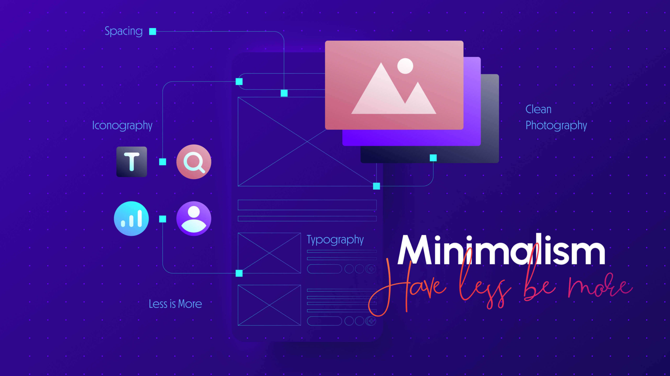
Flat design, according to some designers, evolved from the popularity of minimalist UI design. These two styles - flat & textured and limited or monochromatic color palette are very compatible; removing extraneous shadows, gradients, and textures is in line with Minimalism's main purpose of extracting the extraneous. According to a Nielsen Norman Group assessment, 96 percent of minimalist websites were flat. Textures, icons, and visuals in an interface are all examples of flat design. The larger or underlying content, feature, and layout methods all fall under the minimalist design umbrella.
To produce an impactful minimalist user experience, the elements of highest priority are picked out by the designer to target the behavior and eradicate anything else distracting the consumers. Minimalist has a much larger definition, integrating the layout in general, as well as its composition, color palette, contrast, and other visual performance approaches applied to it. Let’s understand the core principles of Minimalism and the formal characteristics:
Flat Design
Flat design is one of the crucial minimalist design styles powered by simple, two-dimensional elements. This style is adapted to ensure a clean and modern look. It uses a range of things to meet the flat design requirements. For example;
- Simple elements and bright colors: Designers are trained to use simple shapes, icons, and textures without creating distractions or clusters. They also use bright and contrasting colors to make the flat design look more appealing.
- Typography and Layouts: Flat designs often use typography with a pattern that is followed throughout the design. Similarly, they have a grid-based layout that makes things easy to depict throughout the design.
Simplicity and Clarity
Simplicity and clarity are the key principles of minimalist UI/UX design. While the former focuses on the essentials, eliminating distractions, the latter quickly helps users understand what the page is all about. Designers make things happen through cleaner lines, layouts, and color with easy navigation and interaction.
Embracing Negative Space
White space, also known as negative space, sounds odd, but it brings magic to your website. The first thing it does is create a positive user experience. This includes improving usability, highlighting important elements, creating a hierarchy, and providing breathing room. It also makes texts more readable, creates a balance of plus/minus, and creates a sense of professionalism.
It should be unsurprising that the most prevalent minimalist element is none at all. The significant aspect of Minimalism is negative (or white) space, which lends it much of its impact. The vacant area between graphic elements is known as negative space. More blank space provides a stronger focus on the pieces that are already there. It's described as the main principle in Japanese culture: using the space surrounding the objects to highlight the importance of such content.
While negative space is constantly mentioned as the “white space”, it’s not compulsory. To complement a blank canvas, several websites employ full-color backdrops.
Limiting options
Limiting options is one technique to avoid cognitive overload, allowing the user to make wiser selections. The convenience of the users is determined by the context shown to them. Analyzing technologies like Google Analytics assist us to discover more about the users' interactions when it comes to UX designing. There are a variety of methods for gathering qualitative and quantitative data and combining them to construct well-informed adjustments. Even if when it comes to Minimalism, less is more, that doesn't imply we have to compromise the deliverables of the concept. Minimal clutter = maximum impact!
The Ma Principle
It's difficult to implement Minimalism when there's too much information on a page. You may not always be able to alter or remove a large number of words. Everything appears to be vital, and there is no room for negative space, which is a hallmark of minimalist design. However, when your information is minimal as well, such as above the fold on your site, Minimalism with certain contrast and highlighting ought to be great.
These are only a few nuances of minimalist application scenarios. With the amount of Minimalism experimentation going on these days, this movement is oozing into everything. It's critical for you to stay on top of UI UX trends and constantly strive to improve with Minimalism as a designer.
Color
A minimalist color scheme always involves a limited set of shades and colors. This isn't to say that you have to use monochrome or black and white all of the time. Instead, use bright colors and gradients to grab people's attention right away. Also, every brand has its own identity and they choose their colors representing their brands after thorough research. When it comes to negative space, a rich tone often can work just fine.
The goal of minimalist color schemes is to create visual interest without the use of unnecessary design components or even images. Choosing the proper palette will help you build your brand identity and give your designs more adaptability. Colors provide a bridge to your brand by building a visual link to your company, helping you connect your users with your beliefs. The right blend can visually indicate the mood your business is trying to convey to customers. Here are some important numbers to aid you in having a clear understanding of how colors affect client behavior and perceptions:
- Brand memorability: Using the correct color tone can increase brand reach by up to 80%.
- Perceptions of the brand: Within 90 seconds, consumers make decisions regarding products. Furthermore, between 60% and 90% of these decisions are made simply on the basis of color.
- Conversions: Ninety percent of customers consider brand colors while making purchases.
Typography, Numbers, Shapes, & Patterns
Typography might be the most dramatic feature in minimalist design. When used wisely, a bold and experimental typeface may draw immediate attention to the content you want to highlight while also driving the reader to the picture. For uniformity and structure development, you can even match the color scheme of your text to that of the photos and drawings. This is something that even simple typefaces can accomplish. Color, placement, size, and the copy itself will all make a difference.
It's not simply photographs and illustrations; geometric forms and patterns can also be used to fill in the gaps. Unleash your imagination and, if necessary, go insane with shapes. Geometric designs can be found in a variety of genres and can be used as inspiration. Know that Minimalism should apply to your entire design, and shapes must blend in with the other parts.
Why is Minimalism in UX Design Important?
Because clutter is chaotic, the minimalist approach to UI design prioritizes efficiency, seamlessness, and uniformity. Minimalist websites are dominated by clean, uncluttered surfaces. Let's dive deeper to understand how these characteristics influence the customer experience and why it is of significance in the contemporary world:
Loading Times Are Faster With Minimalist Designs
If your product design page does not load quickly, it is useless. Using several colors, too many graphics, and full-featured items will carelessly slow down the performance of your website. The future consumer base - Gen Z, Modern users are impatient and will leave your website if their experience is time-consuming and is constantly interrupted with pop-ups. A survey says that if a website does not load within 3 seconds less than 50% of consumers will skip it.
As there are fewer but necessary features for visitors, a minimalist website loads faster, improving the user experience.
An Optimized User-Friendly Experience
On websites and product pages, the typical consumer is a subject of aggressive sales techniques. Constantly annoying pop-ups, flashing pictures announcing the latest sales, and colorful components persuading you to follow the link on them. Staying ahead of the competition and providing a user-friendly design can be as simple as taking a minimalistic approach and removing these unneeded components.
The users are compelled to return to your website if they enjoyed their short trip across your web pages and the new generation also recommends their experiences.
Attracts and directs attention
In 2022, content owns the crown. It can be found all around you. You're either producing or absorbing stuff. Viewers are constantly on the lookout for fresh content and trends that will broaden their horizons or amuse them. The minimalist design helps you eliminate all distractions, allowing viewers to focus solely on the content. Structure and symmetry are mirrored in a minimalist design. When creating material, make sure it's organized and follows a visual hierarchy. A symmetrical and organized website appeals to customers, creating an efficient sales funnel.
The White Space Promotes Breathability
White spaces highlight the content on your website, making it cleaner, manageable, appealing, and spacious. It allows users to absorb the content and the concept of the design. While it may appear to be a good idea to stuff all the empty areas with items, this will have an unpleasant impact on the user experience. Remember that it is your user’s experience with your brand that puts you ahead of the curve from your competition. They'll bounce back if they feel stuck as soon as they arrive, damaging your search engine ranking and conversions.
Easier Navigation & Smooth Usability
If you have a search site box on your website, make sure it constantly delivers accurate, relevant, and efficient results. It sends the sense that you care about your users' interests and expectations when they can achieve their desired goals without being teased with redundant pop-ups and flashy displays. They may be able to obtain a similar solution elsewhere, but the simple design will guide and encourage them in their voyage around your website.
Users are hooked to your brand because of the encounters that get stuck with them. And everyone loves a great, hassle-free experience.
Additional to Read: How to Hire UI/UX Designer for Your Next Project
How Does The Finch Design Help?
We are top rated UI/UX design agency, helping you design appealing and user centric UI/UX for your business' facing app and website. We also help clients with UI/UX consultancy to help you understand the scope of your projects. It includes, cost estimation, trimlines and deliverables.
Wrapping Up:
There is a thin line between creating a minimalist User Interface and removing the important features and it happens in a blink. However, with the repetitive application, you will become better at it. Minimalism is a refreshing change in our world of extremes and kitschy. This enduring design has been embraced by numerous cultures and ages throughout human history, although Minimalism, as we perceive it now, is a fairly flexible, new notion in terms of designing for a seamless user interface. Minimalism is always a reaction to needlessness that, due to its fixation with decoration, can mask brilliant design. This has happened in art, engineering, web design. In the digital world where technology is evolving, the aim of every designer is to create an extraordinary experience for the users with frictionless design. And only when a designer blends utility with good visual aesthetics can this happen.
Index
Would you like to Listen?
Related Articles
Get the inside scoop on the latest UX industry happenings and trends from our expert UI UX professionals.


